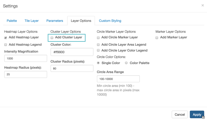
Cluster Layer Options
The cluster layer is on by default, along with the heatmap layer. It shows aggregate values within a certain cluster radius, so changing the radius changes the aggregation grouping. Note that this radius is relative to the magnification on the map, so the number of aggregations change as you zoom in and out. The cluster color specifies the color of the circle that reports the number of items in each aggregate.
At sufficiently high magnifications, when individual data points are visible as marks, the cluster layer supports click behavior.
-
The Cluster Layer appears on interactive map visuals by default. To remove it, unselect Add Cluster Layer, and click Apply.
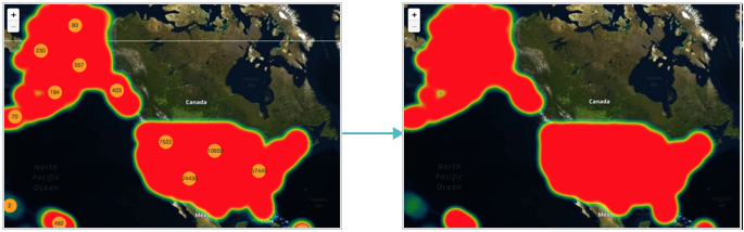
Note that after you disable the Cluster layer option, Google map renders only with the Heatmap layer option, the other default.
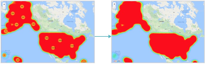
Similarly, the Mapbox map renders without the Cluster layer option.
-
To change the color of the cluster, which is by default
#ff9900(a shade of orange), enter another color's hexadecimal code under Cluster Color. Alternatively, select another color from the color-select interface; we used#42a9b9.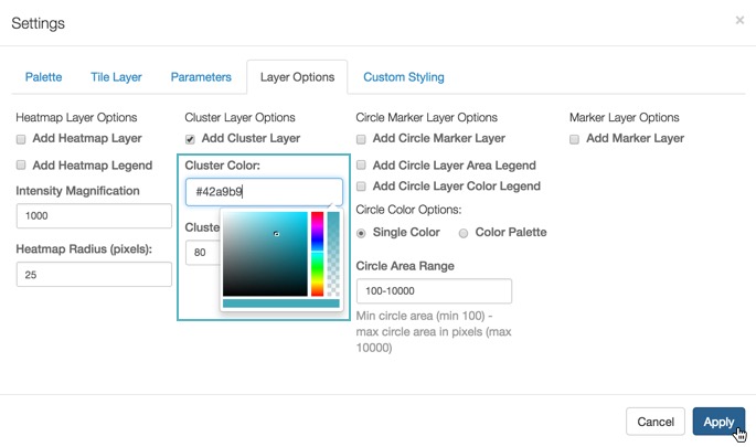
Note the cluster color change from the default of
#ff9900to custom#42a9b9on the Google map rendering. We turned off the Heatmap layer option.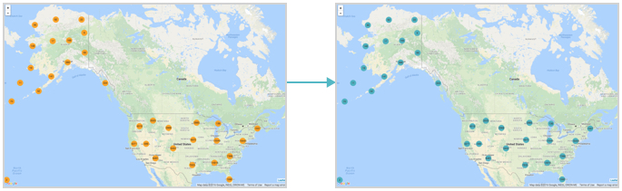
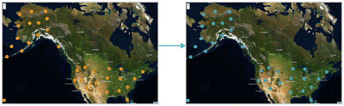
Similarly, note the color change for cluster layer on the Mapbox map.
-
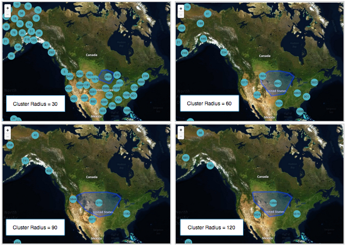
To change the cluster radius, which is
80pixels by default, adjust the Cluster Radius. Note that this is not the measurement of the circle size, but of the region on the map that is aggregated into the cluster total.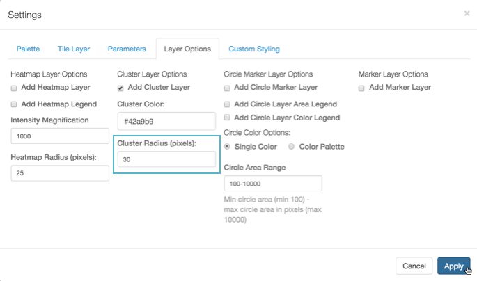
The default cluster radius value is
80. Compare the results of setting cluster radius on Google Map to30,60,90, and120.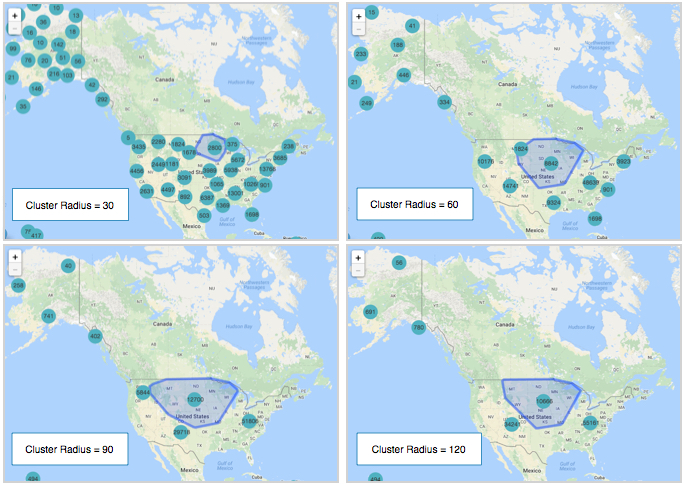
Similarly, note the change for the same cluster sizes on the Mapbox map.