Trendlines

Applies to Line charts, Area charts, and Bar Charts.

To show trendlines in visuals,

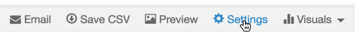
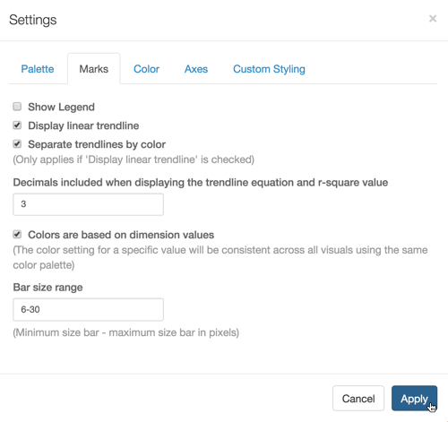
  1. Click Settings on the right side of the Visuals menu.

    selecting visual settings menu

    The Settings modal window appears.

  2. In the Settings modal window, click Marks.
  3. Check Display linear trendline.
  4. [Optional] Check Separate trendlines by color.

    Settings modal for line chart, open on Marks tab; checkbox for 'Show Legend', checkbox for 'Display linear trendline' (active), textbox for 'Separate trendlines by color' (active), textbox for 'Decimals included when displaying the trendline equation and r-square value' set to '3', checkbox 'Colors are based on dimension values' (active), checkbox 'Show Points', Cancel button, and Apply button (active)
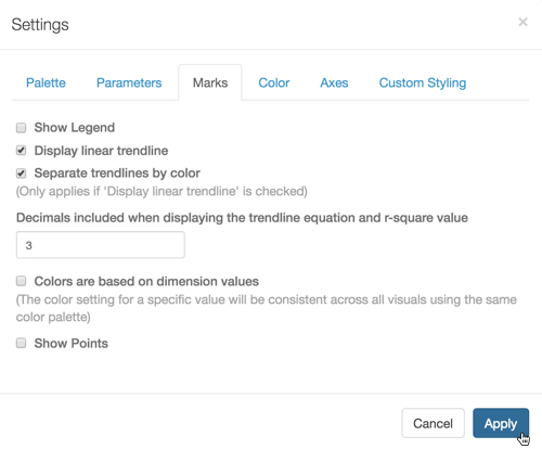
    Showing Trendlines for a Line Graph; Settings Marks
  5. Click Apply.

  6. Click Refresh Visual.

  7. Note that the trendlines appear on the visual.

    Line chart for world population: sum(population) on Y axis, year on X axis, country generating different upward trending lines, calculated trend lines as dashed lines, matching colors
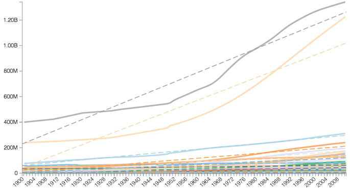
    Line Chart with Trendlines Showing
  8. To see the specific values related to the calculation of the trendline, hover your mouse over the trendline and examine the information in the Tooltip window.

    Line chart for world population: sum(population) on Y axis, year on X axis, country generating different upward trending lines, calculated trend lines as dashed lines, matching colors, two tooltips showing calculations for trendline and country 'China', to 3 decimal places
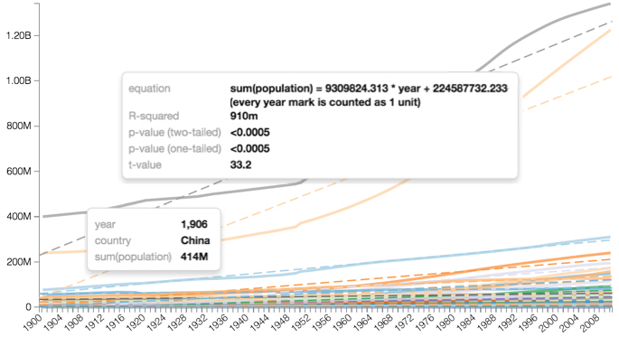
    Line Chart with Trendlines Tooltips, 3 Decimal Places
  9. [Optional] By default, trendline calculations for the equation and r-square value show 3 decimal places. To change this, make the adjustment on the Settings Marks window modal.

    For example, the following image shows the trendline equation to 2 decimal places.

    Line chart for world population: sum(population) on Y axis, year on X axis, country generating different upward trending lines, calculated trend lines as dashed lines, matching colors, two tooltips showing calculations for trendline and country 'China', to 2 decimal places
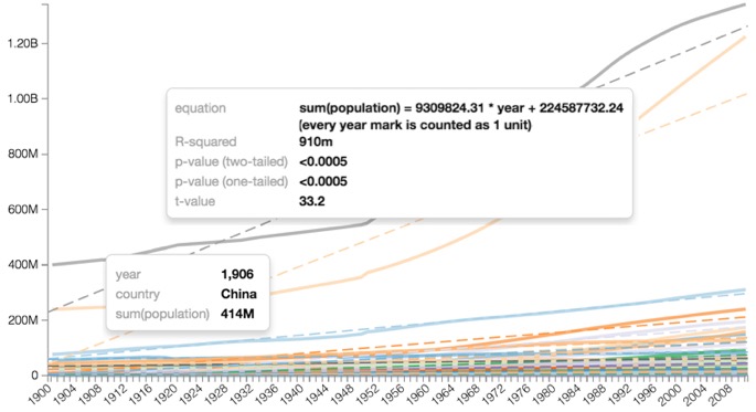
    Line Chart with Trendlines Tooltips, 2 Decimal Places
  10. Setting trendline options on bar charts is just as easy.

    In the Settings modal window, click Marks, and then check Display linear trendline. Click Apply.

    This example shows a stacked bar chart for population trends across UN regions.

    Settings modal for bar chart, open on Marks tab; checkbox for 'Show Legend', checkbox for 'Display linear trendline' (active), textbox for 'Separate trendlines by color' (active), textbox for 'Decimals included when displaying the trendline equation and r-square value' set to '3', checkbox 'Colors are based on dimension values' (active), textbox 'Bar size range' set to '6-30', Cancel button, and Apply button (active)
    Showing Trendlines for a Bar Chart; Settings Marks
    Stacked bar chart for world population: sum(population) on Y axis, year on X axis, UN subregion generating the bars, calculated trend lines as dashed lines, matching colors, two tooltips showing calculations for trendline and UN subregion 'Southern Asia'
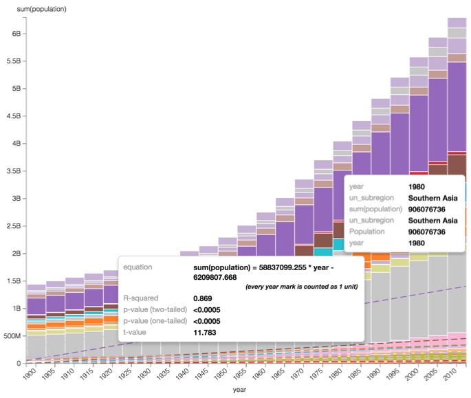
    Stacked Bar Chart with Trendlines Showing, and Tooltips for Southern Asia UN Subregion