Horizontal Bar Visual; Bar Visual Example
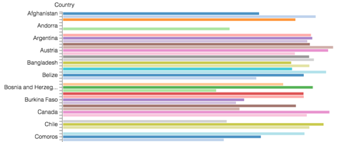
In general, a dimensions of the dataset represent categories that are placed on the horizontal axis (and therefore, the X shelf). The result set is rendered as vertical bar chart. If your business requirements include the use of a horizontal bar chart, Arcadia Enterprise gives you the ability to quickly create one from an existing vertical bar chart.
Tip. This demonstration uses the visual previously created in Bar Visuals.
To use this visual to see a horizontal bar chart, follow these steps.
- Click and drag
Countryfield from X shelf to Y shelf. - Click and drag
Life Expectancyfield from Y shelf to X shelf. On the X shelf, on
Life Expectancyfield, click the icon (down arrow), select Aggregates, and then select Average.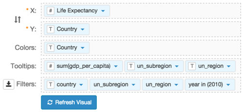
- Click Refresh Visual.
Note how the graph changed, with country categories on the Y axis, and horizontal bars.