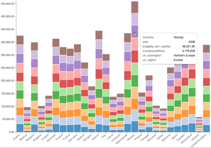
Stacked Bars; Bar Visuals Example
While bar charts show comparisons among categories, stacked bar charts show the bars divided into sub-parts. This demonstrates the cumulative effect of the component parts of a particular category.
Tip. This demonstration uses the visual previously created in Bar Visuals.
To use this visual to see a stacked bar representation for Europe, follow these steps.
- On the Y shelf, remove
avg(life_expectancy)by clicking it and dragging it off the shelf. - Under Measures, select
gdp_per_capita, and drag it over Y shelf on the main part of the screen. Drop to add it to the shelf. - Select the Average aggregation, so that the value appears as
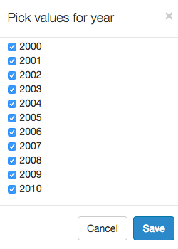
avg(gdp_per_capita). - On the Filters shelf, click
year, then click Pick values from a list. Select several values from the list, such as values
2000through2010, then click Save.This will ensure that you can see specific categories.
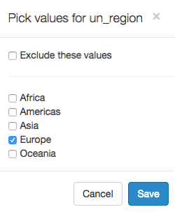
In the Pick values for un_region modal window, select Europe, then click Save.
- [Optional] Add all fields of interest to the Tooltips shelf.
- {optional] Adjust display format for the values you wish to see in the Tooltip.
- Click Refresh Visual.
Note how the graphic changed.
If you hover the mouse over the graph, you can see the tooltip text.