Cross Tabulation Visuals
Cross tabulation is a tool that allows you to compare the relationship between two variables in table format. Arcadia Enterprise enhances the understanding of relative value size by assigning more saturated colors to the table fields with larger values.
The following steps demonstrate how to create a new cross-tabulation visual on a dataset World Life Expectancy [data source samples.world_life_expectancy].
- Start a new visual based on dataset
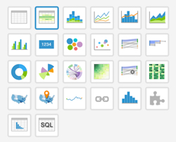
World Life Expectancy[data sourcesamples.world_life_expectancy]; see Creating Visuals. In the visuals menu, find and click cross-tabulation (row 1, column 2).
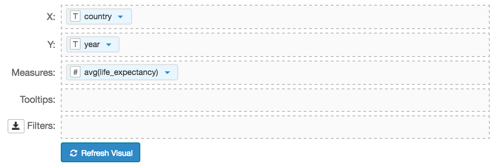
- Note that the shelves of the visual changed. They are now X, Y, Measures, Tooltips, and Filters.
To show specific items, populate the shelves from the available Fields (Dimensions, Measures, and so on) listed in the left navigation menu.
- Under Dimensions, select
countryand drag it over X shelf on the main part of the screen. Drop to add it to the shelf. - Under Dimensions, select
yearand drag it over Y shelf on the main part of the screen. Drop to add it to the shelf. Under Measures, select
life_expectancyand drag it over Measures shelf on the main part of the screen. Drop to add it to the shelf.Note that by default, the sum aggregate of the field appears on the shelf, as
sum(life_expectancy).
- Under Dimensions, select
-
On the shelf of the visual, on
sum(life_expectancy)field, click the icon (down arrow), select Aggregates, and then select Average.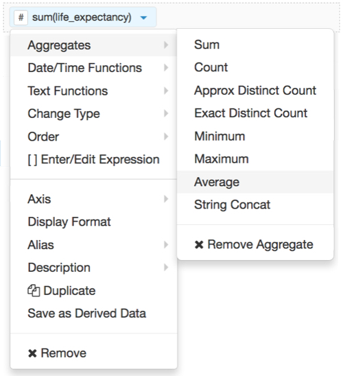
-
Note that the shelf now contains the modified field
avg(life_expectancy).
Click Refresh Visual.
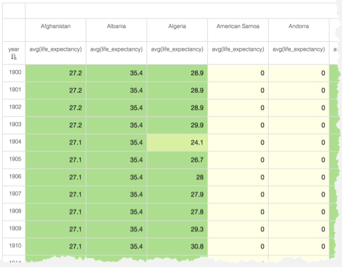
The default cross-tabulation visual appears. As you can see, it shows life expectancy information for each row of the dataset.
[Optional] On the Filters shelf, add several fields from Dimensions and Measures.
This enables you to dynamically control the data input, and discover the data at a more granular level.
For example, from Dimensions, drag
country,un_subregion,un_region, andyearonto the Filters shelf. Note that the filter selection wizard appears each time you place a field on a Filters shelf; you can specify filter values at this time, or click Cancel and select them later.On the Filters shelf, click (down arrow) on the
un_subregionfield, then click Select values.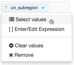
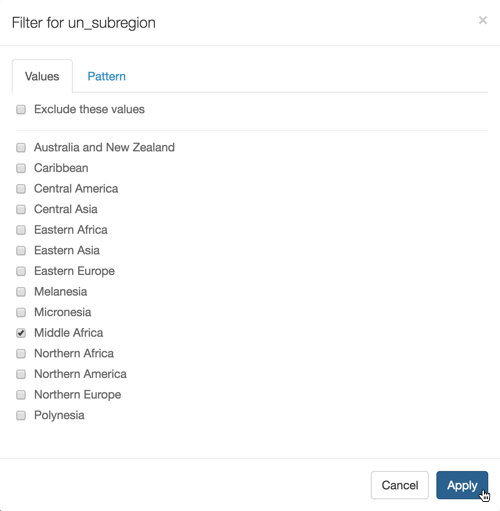
In the Filter for un_subregion modal window, select Middle Africa, then click Apply.
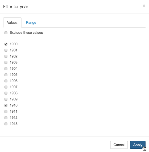
- On the Filters shelf, click (down arrow) on the
yearfield, then click Select values. -
In the Filter for year modal window, select 1900, 1910, 1920, 1930, 1940, 1950, 1960, 1970, 1970, 1980, 1990, 2000, and 2010, then click Apply.
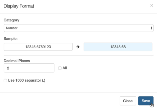
- On the Measures shelf, click (down arrow) on the
avg(life_expectancy)field, and select Display Format. In the Display Format modal window, select Category Number, and enter 2 under Decimal Places; click Save.
Click Refresh Visual.
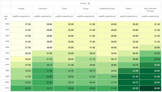
The new cross-tabulation visual appears. As you can see, it clearly demonstrates the relative size of populations by assigning a progressively more saturated color to represent increasingly larger values.
Click Edit next to the title of the visualization.

- Change the title to
World Life Expectancy - Cross Tabulation. Above the left navigation bar, click Save.