Grouped Bar Visuals
While bar charts show comparisons among categories, grouped bar charts show clustered groups of related bars.
The following steps demonstrate how to create a new grouped bar visual representation on dataset World Life Expectancy [data source samples.world_life_expectancy].
- Start a new visual based on dataset
World Life Expectancy[data sourcesamples.world_life_expectancy]; see Creating Visuals. -
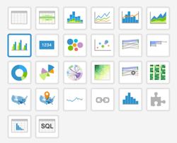
In the visuals menu, find and click bars (row 2, column 1).
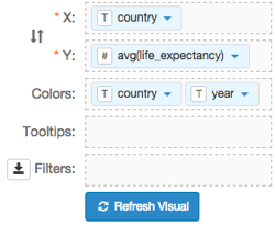
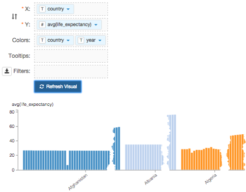
Note that the shelves of the visual changed. They are now X, Y, Colors, Tooltips, and Filters.
The mandatory shelves for grouped bar visuals are X and Y, representing the X-axis and Y-axis.
Populate the shelves from the available fields (Dimensions, Measures, and so on) listed in the left navigation menu.
- Under Dimensions, select
countryand drag it over X shelf on the main part of the screen. Drop to add it to the shelf. Under Measures, select
life_expectancyand drag it over Y shelf on the main part of the screen. Drop to add it to the shelf.Note that the field appears as
sum(life_expectancy).This is necessary because the grouped bars chart type uses aggregated measurements.
- Under Dimensions, select
-
On the shelf of the visual, on
sum(life_expectancy)field, click the icon (down arrow), select Aggregates, and then select Average.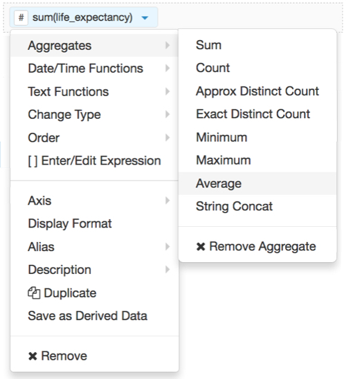
-
Note that the shelf now contains the modified field
avg(life_expectancy).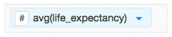
Click Refresh Visual.
The grouped bars graph appears.
Notice that it is very long, as each country reports data for many years.
[Optional] On the Tooltips shelf, add several fields from Dimensions and Measures.
This enables you to see specific descriptive information in your visuals, such as input values, segment affiliation, and calculations.
For example,
- From Measures, drag
gdp_per_capitaonto the Tooltips shelf. - From Dimensions, drag
un_subregion, andun_regiononto the Tooltips shelf. - For all items on the Tooltips shelf, click the icon (down arrow), select Aggregates, and then select Remove Aggregate.
For all numeric items on the Y shelf and the Tooltips shelf, click the icon (down arrow), select Display Format, and enter
,.2f.Note that these fields are typically from the Measures menu, and in this example include
gdp_per_capitaandlife_expectancy.
- From Measures, drag
[Optional] On the Filters shelf, add several fields from Dimensions and Measures.
This enables you to dynamically control the data input, and discover the data at a more granular level.
For example, from Dimensions, drag
country,un_subregion,andun_regiononto the Filters shelf.From Measures, drag
yearonto the Filters shelf.- On the Filters self, on the
yearfield, click the icon (down arrow), and select Pick values from a list. In the Pick values for a year modal window, select a small number of years.
In this example, we selected
1980,1990,2000, and2010.Alias the
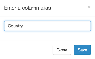
countryfield:On the shelf, on
countryfield, click the icon (down arrow), select Alias, and then select Set.In the Enter a column alias modal window, enter Country.
Click Save.
Alias the
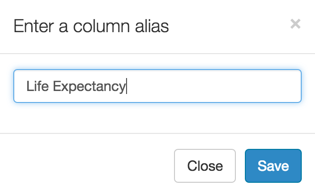
life_expectancyfield:On the shelf, on
life_expectancyfield, click the icon (down arrow), select Alias, and then select Set.In the Enter a column alias modal window, enter Life Expectancy.
Click Save.
Click Refresh Visual.
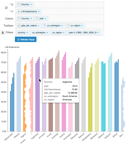
The revised grouped bars graph appears.
Notice that it shows only the years specified on the Filters shelf.
- Click Save.
Click Edit next to the title of the visualization.

- Change the title to
World Population - Grouped Bars. Above the left navigation bar, click Save.