Sparkline Visuals
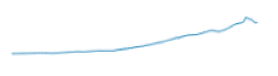
A sparkline chart shows the general shape of the variation in measurement (usually over time) in a simple, condensed, and memorable manner. Sparklines are small and succinct, and can be easily located with the text where they are discussed. You can contrast this with typical X/Y charts that are designed to show as much data as possible.
The following steps demonstrate how to create a new sparkline visual representation on dataset World Life Expectancy [data source samples.world_life_expectancy].
- Start a new visual based on dataset
World Life Expectancy[data sourcesamples.world_life_expectancy]; see Creating Visuals. -
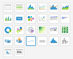
In the visuals menu, find and click sparkline (row 4, column 3).
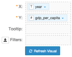
Note that the shelves of the visual changed. They are now X, Y, Tooltips, and Filters.
The mandatory shelves for sparkline visuals are X and Y, representing the X-axis and Y-axis.
Populate the shelves from the available fields (Dimensions, Measures, and so on) listed in the left navigation menu.
- Under Dimensions, select
yearand drag it over X shelf on the main part of the screen. Drop to add it to the shelf. - Under Measures, select
gdp_per_capitaand drag it over Y shelf on the main part of the screen. Drop to add it to the shelf.
- Under Dimensions, select
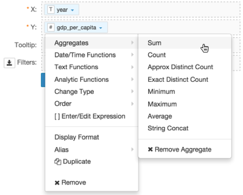
On the Y shelf, on
gdp_per_capitafield, click the icon (down arrow), select Aggregates, and then select Sum.This is necessary because the sparkline chart type uses aggregated measurements.
-
Note that the Y shelf now contains the modified field
sum(gdp_per_capita).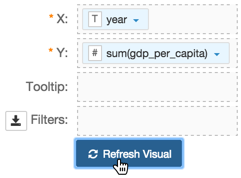
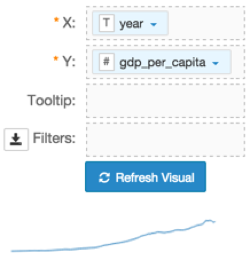
Click Refresh Visual.
The sparkline visual graph appears.
[Optional] On the Filters shelf, add several fields from Dimensions and Measures.
This enables you to dynamically control the data input, and discover the data at a more granular level.
For example, from Dimensions, drag
country,un_subregion,andun_regiononto the Filters shelf.Click Edit next to the title of the visualization.

- Change the title to
World Population - Sparkline. Above the left navigation bar, click Save.

Sparkline Visuals in Action
To use this visual to see a sparkline for a specific country, such as Haiti, follow these steps.
On the Filters shelf, click
country, then click Pick values from a list.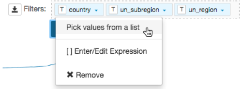
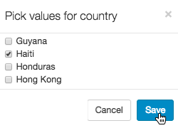
In the Pick values for a country modal window, select Haiti, then click Save.
- Click Refresh Visual.
Note how the line changed compared to the previous display (world-wide).

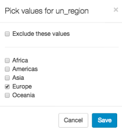
To use this visual to see a sparkline for a region, such as Europe, follow these steps.
- Clear the selection in the existing filters.
- On the Filters shelf, click
un_region, then click Pick values from a list. In the Pick values for un_region modal window, select Europe, then click Save.
- Click Refresh Visual.
Note how the line changed.