Adjusting Application Settings
It is often helpful to make some changes to the appearance of the application. This section describes how to control the appearance of borders around visuals in an app and the alignment of control elements within the visual, how to enable download of PNG snapshots, how to define custom styling options, and how to adjust the relative position and size of each visual in the app.
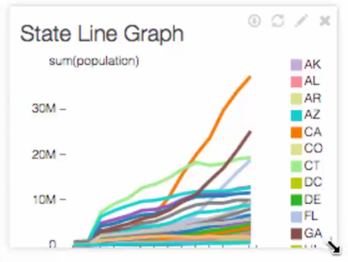
In this demonstration, we make adjustments to the appearance of an app. We used State Data, Filtered; to see how to construct this app, refer to Creating Applications with Controls.
-
Open a new or existing app. We used State Data, Filtered.
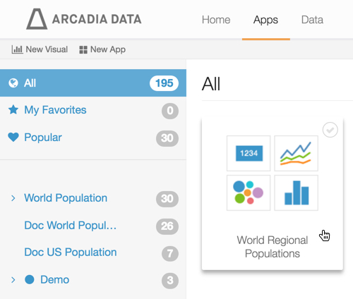
- In the main navigation bar, click Apps.
In the search bar, enter the name of the previously defined visual you wish to use.
Alternatively: in the left navigation bar, click All, then browse to find the previously saved visual.
-
Click the icon that represents the visual or the app.
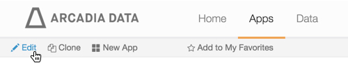
Click Edit in the top left corner, to edit the app.
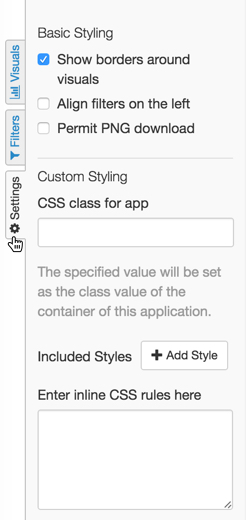
In the left navigation, click the Settings tab.
- Select Perform one or more of the actions described in the next sections.
- In the top left corner of the screen, click Save to save State Data, Filtered to save the application.
Show Borders Around Visuals
This option is on by default.
- To set borders around the visuals in the application, check the option Show borders around visuals.
- To remove borders around the visuals in the application, un-check the option Show borders around visuals.
Align Filters on the Left
This option enables the placement of filters on the left of the app. By default, they are positioned across the top. Note also that individual filters may be moved to the grid area.
- To align filters on the left of the application, check the option Align filters on the left.
- To align filters on the top of the application (default behavior), un-check the option Align filters on the left.
Permit PNG Download
This option enables screen shot capture of apps at runtime, and saves them as a files titled snapshot.png. For instructions on saving snapshots, see Saving Apps as PNG Files.
- To enable PNG download, check the option Permit PNG download.
- To disable PNG download, un-check the option Permit PNG download.
Custom Styling Options
To understand custom styling at a deeper level, see our documentation in Customizing Styles for Apps.
Moving Visuals
To move the visual within an application, click your mouse on the title of the visual, hold, and drag the visual into the desired position.
Resizing Visuals
To change the size of a specific visual, hover your mouse near the bottom right corner of the visual frame until a diagonal arrow appears. Click and drag to change the size of the visual frame.