Creating Application Filters that Control Variable Measures
- Open the application Population by Different Aggregation Levels in edit mode.
- Ensure that you are using the most recently saved visual, Average population by <<dim>> and <<agg>>.
- In left navigation, switch to Filters tab.
- Click Create Parameter to create a second filter.
- Hover over the new filter until the controls appear on the top right, and click the icon (gear).
In the Settings modal window, switch to Values tab, and enter the following:
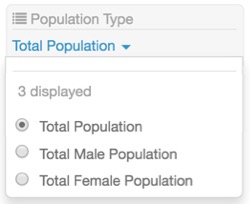
- Under Title, enter Population Type.
-
Under Output Parameter, enter agg.
Note that this is the parameter from Creating Visuals with Variable Measures.
Under Specified values, enter the following two rows:
- Value:
avg(tot_pop), Label: Total Population - Value:
avg(tot_male), Label: Total Male Population - Value:
avg(tot_female), Label: Total Female Population
- Value:
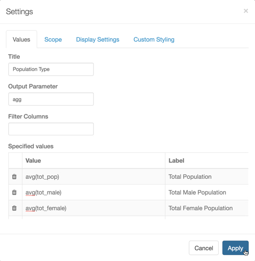
In the Settings modal window, switch to Display Settings tab, and check the option next to Permit only one item to be selected.
Ensure that the other options are not checked.
Click Apply.
-
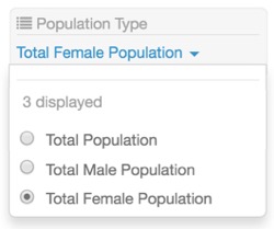
In the Population Type filter, select Total Female Population.
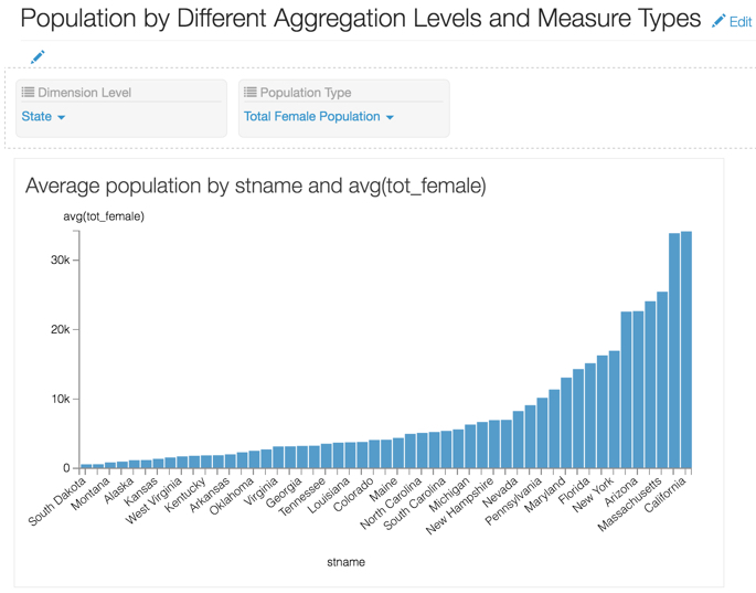
Note that the title of the graph and the axis changed to include avg(tot_female).
Change the name of the application to Population by Different Aggregation Levels and Measure Types.
- Click Save.
-
Switch to application viewing mode, and select Population by Different Aggregation Levels and Measure Types.
-
In the Population Type filter, select Total Population.
You may notice that your graph changes somewhat, but the most telling indication is that the Y axis changes from upper limit of 300k when showing female population, to upper limit of twice that, 600k.
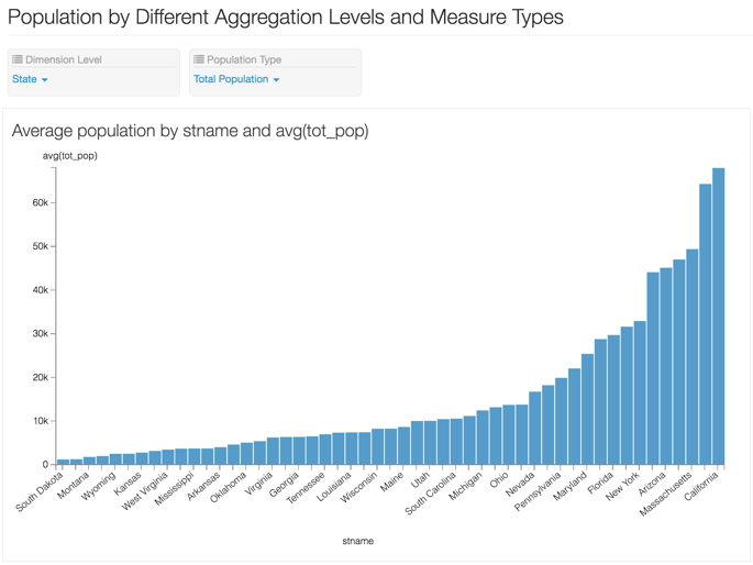
- Notice that you can operate the two filters, Aggregation Level and Population Type, independently.
-
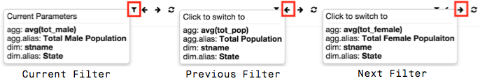
[Optional] You can easily navigate between the permutations of filter outputs you create by using filter navigation controls at the top right corner.