Area Visuals
Area charts are a good choice for representing related values over time because they emphasize the relative proportions of totals or percentage relationships. With volume stacked beneath the line, the chart clearly demonstrates both the total of the fields and their relative size.
The following steps demonstrate how to create a new area visual on dataset World Life Expectancy [data source samples.world_life_expectancy].
Start a new visual based on dataset
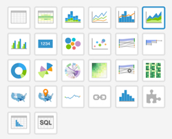
World Life Expectancy[data sourcesamples.world_life_expectancy]; see Creating Visuals.In the visuals menu, find and click areas (row 1, column 6).
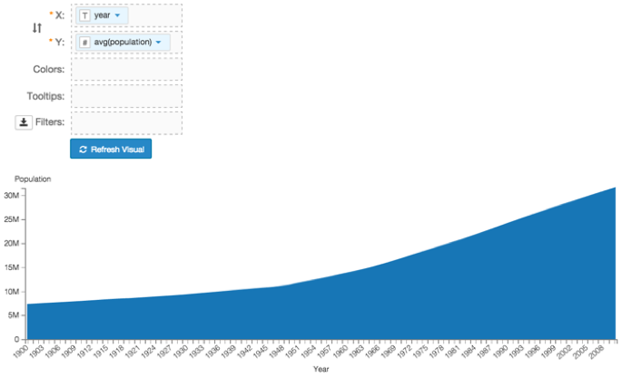
Note that the shelves of the visual changed. They are now X, Y, Colors, Tooltips, and Filters.
The mandatory shelves for area visuals are X and Y, representing the X-axis and Y-axis.
Populate the shelves from the available fields (Dimensions, Measures, and so on) listed in the left navigation menu.
- Under Dimensions, select
yearand drag it over X shelf on the main part of the screen. Drop to add it to the shelf. - Under Measures, select
populationand drag it over Y shelf on the main part of the screen. Drop to add it to the shelf.
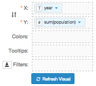
- Under Dimensions, select
On the Y shelf, on
sum(population)field, click the icon (down arrow), select Aggregates, and then select Average.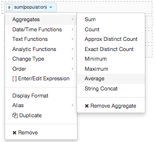
Note that the Y shelf now contains the modified field
avg(population).
Click Refresh Visual.
The area visual appears.
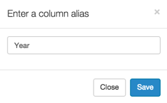
Alias the
yearfield:On the shelf, on
yearfield, click the icon (down arrow), select Alias, and then select Set.In the Enter a column alias modal window, enter Year.
Click Save.
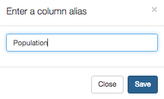
Alias the
populationfield:On the shelf, on
avg(population)field, click the icon (down arrow), select Alias, and then select Set.In the Enter a column alias modal window, enter Population.
Click Save.
- To see the individual countries, select the
countryfield from the list of Dimensions and drag it onto the Colors shelf. [Optional] On the Tooltips shelf, add several fields from Dimensions and Measures.
This enables you to see specific descriptive information in your visuals, such as input values, segment affiliation, and calculations.
For example,
- From Measures, drag
gdp_per_capitaandlife_expectancyonto the Tooltip shelf. - From Dimensions, drag
country,un_subregion, andun_regiononto the Tooltip shelf. - For all items on the Tooltip shelf, click the icon (down arrow), select Aggregates, and then select Remove Aggregate.
For all numeric items on the Y shelf and the Tooltip shelf, click the icon (down arrow), select Display Format, and enter
,.2f.Note that these fields are typically from the Measures menu, and in this example include
gdp_per_capitaandlife_expectancy.
- From Measures, drag
[Optional] On the Filters shelf, add several fields from Dimensions and Measures.
This enables you to dynamically control the data input, and discover the data at a more granular level.
For example, from Dimensions, drag
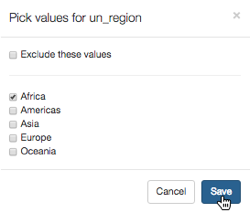
country,un_subregion,un_region, andyearonto the Filters shelf.- On the Filters shelf, click the icon (down arrow) on the
un_regionfield. - Select Pick values from a list.
In the Pick values for un_region modal window, select Africa, then click Save.
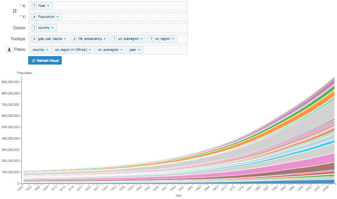
Click Refresh Visual.
The updated area visual appears.
Click Edit next to the title of the visualization.
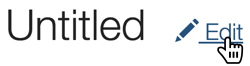
- Change the title to
World Population - Area. Above the left navigation bar, click Save.