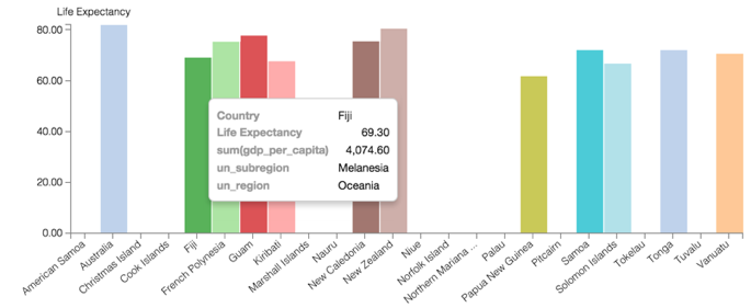
Filtering by Region; Bar Visual Example
When working with a very large set of data, it is necessary to quickly access and examine a specific subset of information. Arcadia Enterprise gives you the ability to filter information on all fields of the dataset. This example shows how to use such a filter to limit the result set and visualization to a particular geographic region.
Tip. This demonstration uses the visual previously created in Bar Visuals.
To use this visual to see a bar chart for a region, such as Oceania, follow these steps.
- On the Filters shelf, click (down arrow) on the
un_regionfield, then click Pick values from a list. In the Pick values for un_region modal window, select Oceania, then click Save.
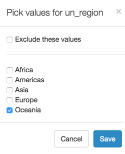
- Click Refresh Visual.
Note how the line changed.
If you hover the mouse over the graph, you can see the tooltip text.