Creating Basic Bar and Line Visuals
The following steps demonstrate how to create a new combined bar and line chart on dataset World Life Expectancy [data source samples.world_life_expectancy].
- Start a new visual based on dataset
World Life Expectancy[data sourcesamples.world_life_expectancy]; see Creating Visuals. -
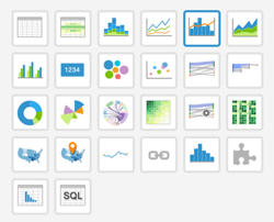
In the visuals menu, find and click combined bar/line (row 1, column 5).
-
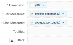
Note that the shelves of the visual changed. They are now Dimension, Bar Measures, Line Measures, Tooltips, and Filters.
The mandatory shelves for bar and line visuals are Dimension that maps to the X-axis, and Bar Measures and Line Measures that both map to the Y-axis.
Populate the shelves from the available fields (Dimensions, Measures, and so on) listed in the left navigation menu.
- Under Dimensions, select
yearand drag it over Dimension shelf on the main part of the screen. Drop to add it to the shelf. - Under Measures, select
life_expectancyand drag it over Bar Measures shelf on the main part of the screen. Drop to add it to the shelf. - Under Measures, select
gdp_per_capitaand drag it over Line Measures shelf on the main part of the screen. Drop to add it to the shelf.
- Under Dimensions, select
-
On the shelf of the visual, on
sum(life_expectancy)field, click the icon (down arrow), select Aggregates, and then select Average.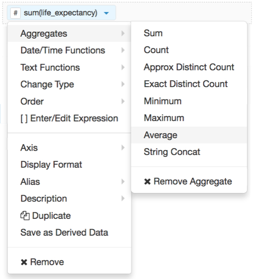
-
Note that the shelf now contains the modified field
avg(life_expectancy).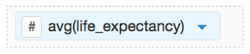
-
On the shelf of the visual, on
sum(gdp_per_capita)field, click the icon (down arrow), select Aggregates, and then select Average.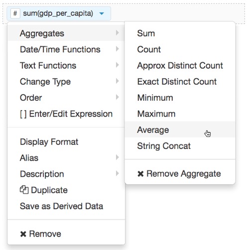
-
Note that the shelf now contains the modified field
avg(gdp_per_capita).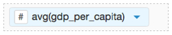
The shelves of your visual should now look something like the following image:
Click Refresh Visual.
The bar and line visual appears.
Note that the two legends for the Y axis match the color of the plot: the orange line for
sum(gdp_per_capita), and the blue for the blue bars foravg(life_expectancy). However, you may not be able to see the bars because the values of that measure are so much smaller than the values for the line measure.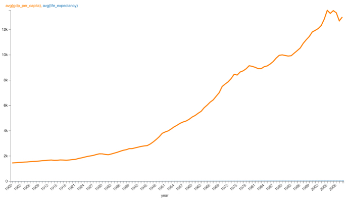
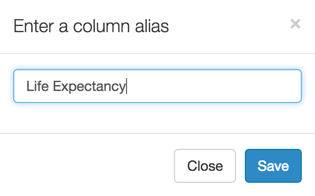
Alias the
life_expectancyfield:On the shelf, on
life_expectancyfield, click the icon (down arrow), select Alias, and then select Set.In the Enter a column alias modal window, enter Life Expectancy.
Click Save.
-
Alias the
gdp_per_capitafield:On the shelf, on
gdp_per_capitafield, click the icon (down arrow), select Alias, and then select Set.In the Enter a column alias modal window, enter GDP per Capita.
Click Save.

- Click Refresh Visual again.