Line Visuals
A line chart reveals trends or change over time. Line charts show relationships within a continuous data set, and can be applied to a wide variety of categories. A line chart displays information as a series of data points, or markers, connected by straight line segments. It is a basic type of chart common in many fields. While it is similar to a scatter plot, the line chart orders the measurements along the primary axis and is often used to visualize a time series.
The following steps demonstrate how to create a new line visual on dataset World Life Expectancy [data source samples.world_life_expectancy].
- Start a new visual based on dataset
World Life Expectancy[data sourcesamples.world_life_expectancy]; see Creating Visuals. -
In the visuals menu, find and click lines (row 1, column 4).
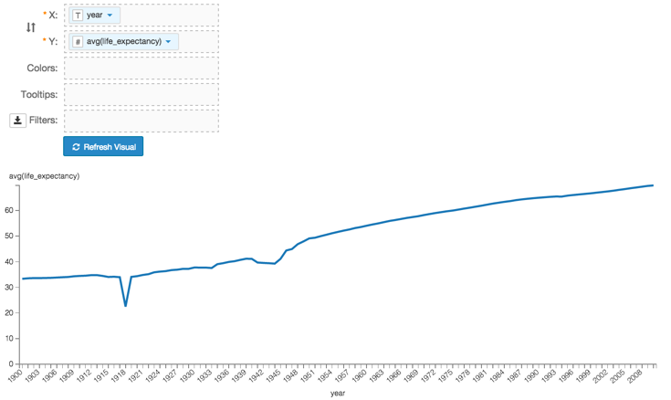
Note that the shelves of the visual changed. They are now X, Y, Colors, Tooltips, and Filters.
The mandatory shelves for line visuals are X and Y, representing the X-axis and Y-axis.
Populate the shelves from the available fields (Dimensions, Measures, and so on) listed in the left navigation menu.
- Under Dimensions, select
yearand drag it over X shelf on the main part of the screen. Drop to add it to the shelf. - Under Measures, select
life_expectancyand drag it over Y shelf on the main part of the screen. Drop to add it to the shelf.
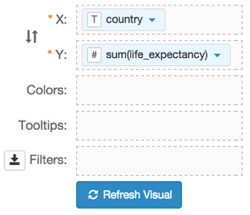
- Under Dimensions, select
-
On the shelf of the visual, on
sum(life_expectancy)field, click the icon (down arrow), select Aggregates, and then select Average.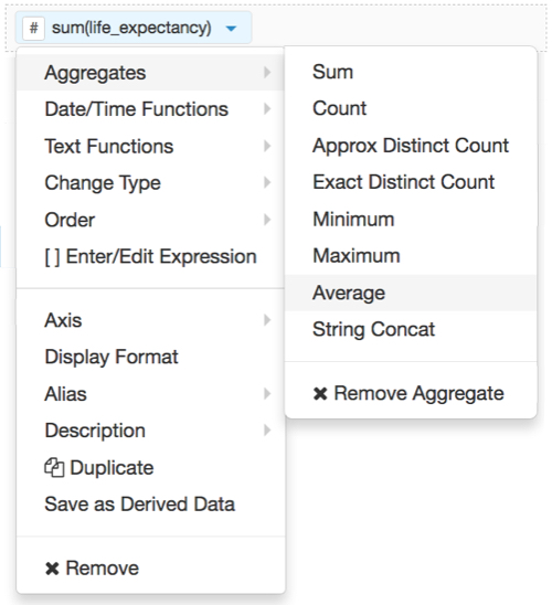
-
Note that the shelf now contains the modified field
avg(life_expectancy).
Click Refresh Visual.
The line visual appears.
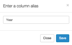
Alias the
yearfield:On the shelf, on
yearfield, click the icon (down arrow), select Alias, and then select Set.In the Enter a column alias modal window, enter Year.
Click Save.
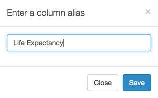
Alias the
life_expectancyfield:On the shelf, on
life_expectancyfield, click the icon (down arrow), select Alias, and then select Set.In the Enter a column alias modal window, enter Life Expectancy.
Click Save.
To see the individual countries, and in different colors, you must place
countryfield on the Colors shelf.On the
Countryfield, click the icon (down arrow), then select Duplicate.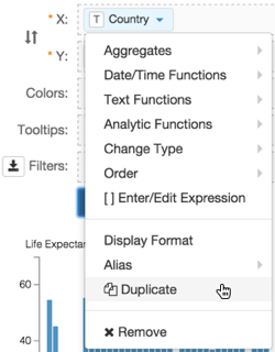
Click one of the
Countryfields on X shelf, drag it to the Colors shelf, and drop it.
[Optional] On the Tooltips shelf, add several fields from Dimensions and Measures.
This enables you to see specific descriptive information in your visuals, such as input values, segment affiliation, and calculations.
For example,
- From Measures, drag
gdp_per_capitaonto the Tooltip shelf. - From Dimensions, drag
country,un_subregion, andun_regiononto the Tooltip shelf. - For all items on the Tooltip shelf, click the icon (down arrow), select Aggregates, and then select Remove Aggregate.
For all numeric items on the Y shelf and the Tooltip shelf, click the icon (down arrow), select Display Format, and enter
,.2f.Note that these fields are typically from the Measures menu, and in this example include
gdp_per_capitaandlife_expectancy.
- From Measures, drag
[Optional] On the Filters shelf, add several fields from Dimensions and Measures.
This enables you to dynamically control the data input, and discover the data at a more granular level.
For example, from Dimensions, drag
country,un_subregion,un_region,year, andpopulationonto the Filters shelf.On the Filters shelf,
- Click the icon (down arrow) on the
populationfield. - Select []Enter/Edit Expression.
- Enter
[population]>10000000. - Click Save.
- Click the icon (down arrow) on the
Click Refresh Visual.
The updated line visual appears. Note that some of the lines do not originate at the beginning of the time series. This is because their population did were below the
10,000,000threshold that was set in the population filter.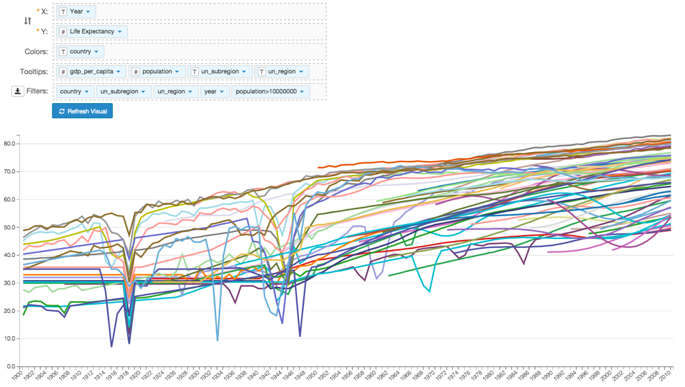
Click Edit next to the title of the visualization.
- Change the title to
World Population - Lines. Above the left navigation bar, click Save.