Country Map with Bubbles
A world map may use bubbles to show relative measurement values for countries.
The following steps demonstrate how to create a new map visual on the dataset World Life Expectancy [data source samples.world_life_expectancy]. It produces bubbles with area that corresponds to the relative population in each country.
- Start a new visual based on dataset
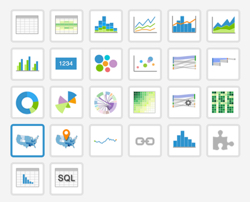
World Life Expectancy[data sourcesamples.world_life_expectancy]; see Creating Visuals. In the visuals menu, find and click map, the sixth choice on the third row.
-
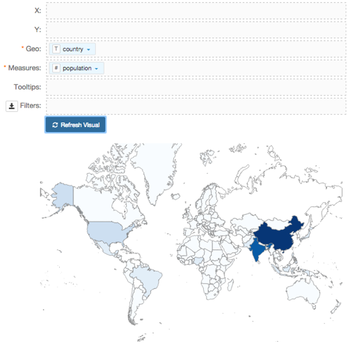
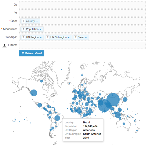
Note that the shelves of the visual changed. They are now X, Y, Geo, Measures, Tooltips, and Filters.
The mandatory shelves for map visuals are Geo and Measures.
Populate the shelves from the available fields (Dimensions, Measures, and so on) listed in the left navigation menu.
- Under Dimensions, select
countryand drag it over the Geo shelf on the main part of the screen. Drop to add it to the shelf. - Under Measures, select
populationand drag it over the Measures shelf on the main part of the screen. Drop to add it to the shelf.
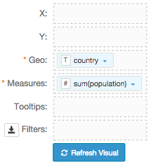
- Under Dimensions, select
-
On the shelf, on
sum(population)field, click the icon (down arrow), select Aggregates, and then select Remove Aggregate.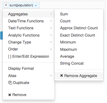
Note that the shelf now contains the modified field
population.
Click Refresh Visual.
The map visual graph appears.
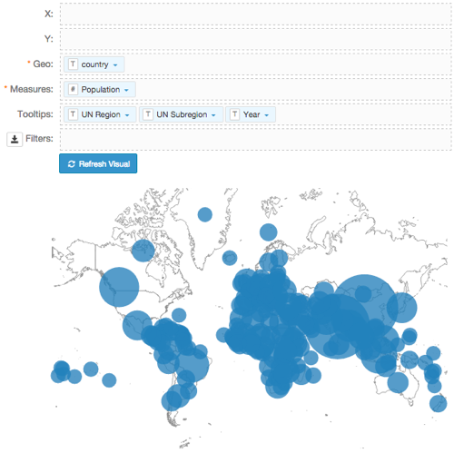
[Optional] On the Tooltips shelf, add several fields from Dimensions and Measures.
This enables you to see specific descriptive information in your visuals, such as input values, segment affiliation, and calculations.
For example,
- From Dimensions, drag
un_subregion,un_region, andyearonto the Tooltips shelf. - For all items on the Tooltips shelf, click the icon (down arrow), select Aggregates, and then select Remove Aggregate.
- From Dimensions, drag
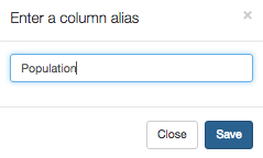
Alias the
populationfield:On the shelf, on
avg(population)field, click the icon (down arrow), select Alias, and then select Set.In the Enter a column alias modal window, enter Population.
Click Save.
- Alias
un_subregion,un_region, andyearasUN Subregion,UN Region, andYear, respectively. - For
Population, click the icon (down arrow), select Display Format, and enter,. - [Optional] Enable panning and zooming option, as described in Customizing Zoom.
- [Optional] Change the color palette to blue, as described in Change Color Palette.
- Change the map from choropleth to bubble marks, as described in Marks as Bubbles.
Click Refresh Visual.
The map visual appears. You can move the visual (pan), zoom in and out, and see the details in the Tooltips text.
Notice that the bubbles are very large, and it is difficult to see which bubble represents each country.
- Change the size of the bubbles to the range
1-30, as described in Mark Size Range. Click Refresh Visual.
Notice that the relative size of bubbles is smaller, and there is less overlap.
Click Edit next to the title of the visualization.

- Change the title to
World Population - Map with Bubbles. Above the left navigation bar, click Save.