US County Map, Choropleth
A county map of the United States shows a comparison of measurement values across US States.
The following steps extend the work completed in State Map, Choropleth, and demonstrate how to create a map visual on the dataset US County Populations [data source samples.us_counties]. It produces colored regions for the measurements that correspond to the county field.
county. This article demonstrates how to use the Alias setting to make the dataset field ctname conform to this requirement.- Open
US State Population - Choropleth Mapvisual in edit mode. Under Dimensions, select
ctnameand drag it over the Geo shelf on the main part of the screen. Drop to add it to the shelf, to the right ofstatefield.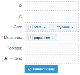
- If you click Refresh Visual at this time, it generates an error.
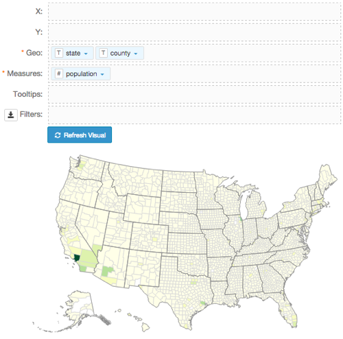
Alias the field
ctnameascounty, and click Refresh Visual.The map visual appears.
- Enable the Zoom to active area option, as described in Customizing Zoom.
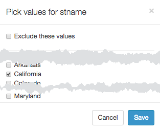
- Under Dimensions, select
stnameand drag it over the Filters shelf on the main part of the screen. - On the Filters shelf, click the icon (down arrow) on the
stnamefield, and select Pick values from list. In the Pick values for stname modal window, select California and click Save.
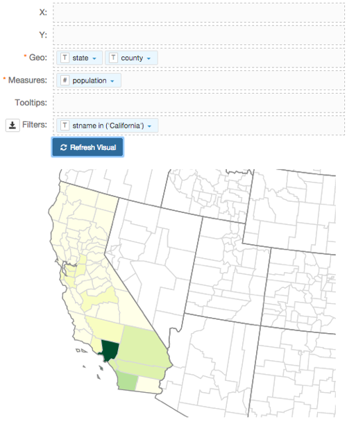
Click Refresh Visual.
Note that the map automatically zooms in to show detail of California.
Click Edit next to the title of the visualization.

- Change the title to
US County Population - Choropleth Map. Above the left navigation bar, click Save.