US State Map with Bubbles
A map of the United States shows a comparison of measurement values among US States.
The following steps demonstrate how to create a new map visual on the dataset US County Population [data source samples.us_counties]. This produces a map with bubble marks that correspond to the total population of each state.
state. This article demonstrates how to use the Alias setting to make the dataset field stname conform to this requirement.- Start a new visual based on dataset
US County Population[data sourcesamples.us_counties]; see Creating Visuals. In the visuals menu, find and click map, the sixth choice on the third row.
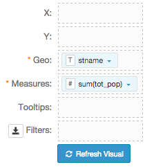
Note that the shelves of the visual changed. They are now X, Y, Geo, Measures, Tooltips, and Filters.
The mandatory shelves for map visuals are Geo and Measures.
Populate the shelves from the available fields (Dimensions, Measures, and so on) listed in the left navigation menu.
- Under Dimensions, select
stnameand drag it over the Geo shelf on the main part of the screen. Drop to add it to the shelf. - Under Measures, select
tot_popand drag it over the Measures shelf on the main part of the screen. Drop to add it to the shelf.
- Under Dimensions, select
- If you click Refresh Visual at this time, it generates an error.
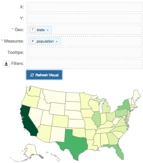
Alias the field
stnameasstate, andsum(tot_pop)aspopulation, and click Refresh Visual.The map visual appears.
- For
population, click the icon (down arrow), select Display Format, and enter,(comma). - [Optional] Enable panning and zooming option, as described in Customizing Zoom.
- [Optional] Change the color palette, as described in Change Color Palette.
- Change the map from choropleth to bubble marks, as described in Marks as Bubbles.
Click Refresh Visual.
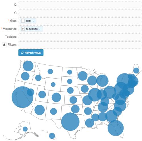
The map visual appears. You can move the visual (pan), zoom in and out, and see the details in the Tooltips text.
Notice that the bubbles are very large, and it is sometimes difficult to see which bubble represents each state, particularly along the Atlantic Coast.
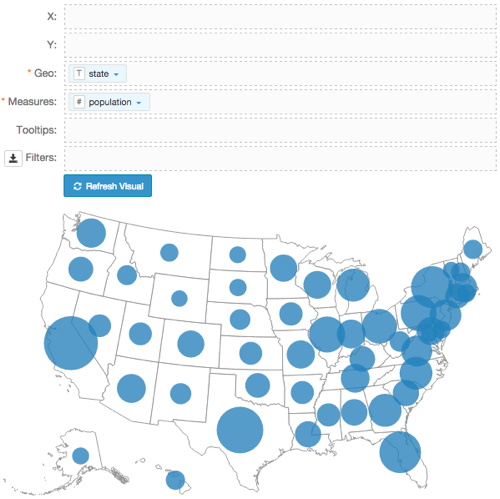
- Change the size of the bubbles to the range
10-35, as described in Mark Size Range. Click Refresh Visual.
Notice that the relative size of bubbles is smaller, and there is less overlap.
Click Edit next to the title of the visualization.

- Change the title to
US State Population - Choropleth Map. Above the left navigation bar, click Save.