Radial Visuals
In Arcadia Enterprise, radial charts are a good approach for comparing the relative values of several measures. These measures are assigned an equal angle of rotation, and the relative values are represented through the areas of each wedge.
The following steps demonstrate how to create a new radial visual representation on dataset Cereals [data source samples.cereals].
- Start a new visual based on dataset
Cereals[data sourcesamples.cereals]; see Creating Visuals. In the visuals menu, find and click radial (row 3, column 2).

Note that the shelves of the visual include Dimensions, Measures, Tooltips, and Filters.
The mandatory shelves for radial visuals are Dimensions and Measures.
Populate the shelves from the available fields (Dimensions, Measures, and so on) listed in the left navigation menu.
- Under Dimensions, select
cereal_nameand drag it over Dimensions shelf on the main part of the screen. Drop to add it to the shelf. - Under Measures, select the following fields and drop them on the Measures shelf:
complex_carbohydrate_grams,fat_grams,dietary_fiber_grams,sugars_grams, andprotein_grams.
- Under Dimensions, select
- For each field on the Measures shelf, remove the aggregate.
For each field on the Measures shelf, alias the field name.
For example, change
complex_carbohydrate_gramstoCarbohydrates.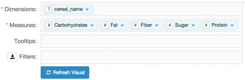
Click Refresh Visual.
The radial visual graph appears.
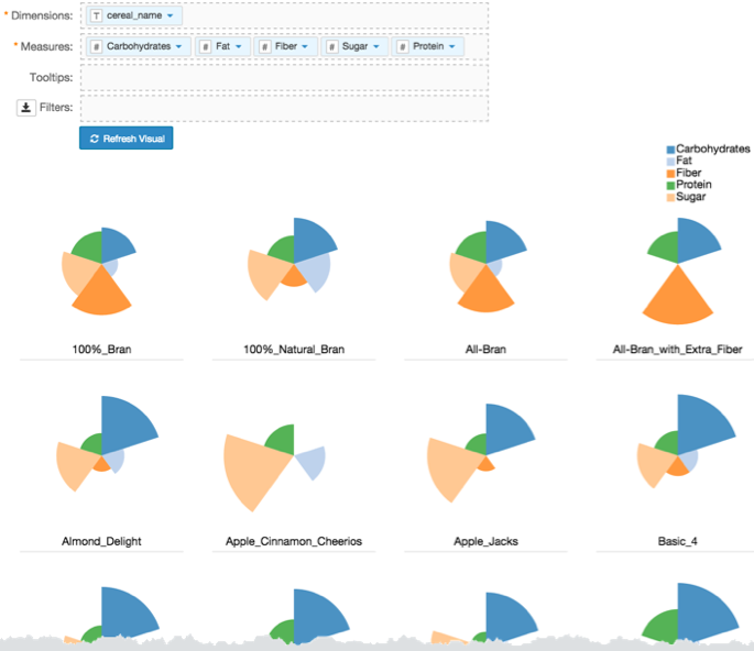
Click Edit next to the title of the visualization.

- Change the title to
Cereal Nutritional Categories - Radial. Above the left navigation bar, click Save.

- [Optional] Adjust the axes depending on what your visual demonstrates: comparison of measures within same dimension, relative values of measure compared to same measure across all dimensions, or relative values of measures compared to all measures across all dimensions. See Radial Chart Axes.
- [Optional] You can replace the default 'wedge' representation of the radial chart with complete circles by enabling the overlap option on the Marks menu. See Radial Chart Overlap.