Table Visuals
By default, a new table visual in Arcadia Enterprise displays all the fields of the underlying dataset. A table may be sorted along any measure or dimension, and its cells may be formatted using format strings.
The following steps demonstrate how to create a new table visual representation on a dataset World Life Expectancy [data source samples.world_life_expectancy].
- Start a new visual based on dataset
World Life Expectancy[data sourcesamples.world_life_expectancy]; see Creating Visuals. -
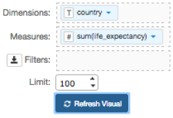
Note that by default, the table shows all fields in the dataset.
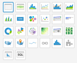
If your starting point is another visual type, then in the visuals menu, find and click table (row 1, column 1).
To show only specific items, populate the shelves from the available fields (Dimensions, Measures, and so on) listed in the left navigation menu.
- Under Dimensions, select
countryand drag it over Dimensions shelf on the main part of the screen. Drop to add it to the shelf. - Under Measures, select
life_expectancyand drag it over Dimensions shelf on the main part of the screen. Drop to add it to the shelf.
- Under Dimensions, select
-
On the shelf of the visual, on
sum(life_expectancy)field, click the icon (down arrow), select Aggregates, and then select Average.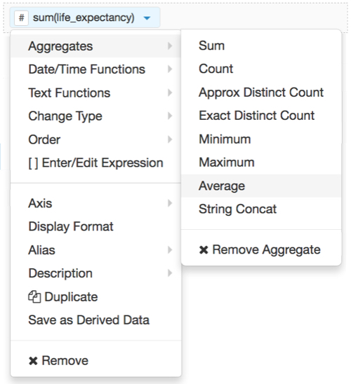
-
Note that the shelf now contains the modified field
avg(life_expectancy).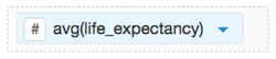
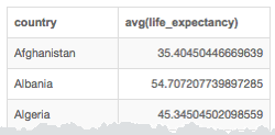
Click Refresh Visual.
The default table visual appears.
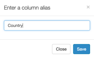
Alias the
countryfield:On the shelf, on
countryfield, click the icon (down arrow), select Alias, and then select Set.In the Enter a column alias modal window, enter Country.
Click Save.
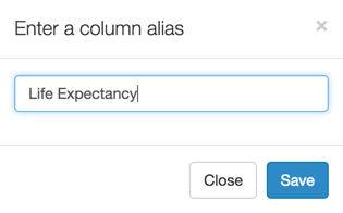
Alias the
life_expectancyfield:On the shelf, on
life_expectancyfield, click the icon (down arrow), select Alias, and then select Set.In the Enter a column alias modal window, enter Life Expectancy.
Click Save.
[Optional] On the Filters shelf, add several fields from Dimensions and Measures.
This enables you to dynamically control the data input, and discover the data at a more granular level.
For example, from Dimensions, drag
country,un_subregion,un_region, andyearonto the Filters shelf.Click Edit next to the title of the visualization.

- Change the title to
World Population - Table. Above the left navigation bar, click Save.