Cluster Layer Options
The cluster layer is on by default, along with the Heatmap layer.
It shows aggregate values within a certain cluster radius, so changing the radius changes the aggregation grouping. Note that this radius is relative to the magnification on the map, so the number of aggregations change as you zoom in and out. The cluster color specifies the color of the circle that reports the number of items in each aggregate. At sufficiently high magnifications, when individual data points are visible as marks, the cluster layer supports click behavior.
To use the Cluster layer options, navigate to Layer Options, and make the appropriate changes under the heading Cluster Layer Options.
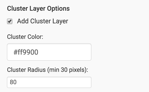
The options are:
Showing or Hiding the Cluster Layer
To show the legend for the Heatmap layer, navigate to the Layer Options menu, and under the Cluster Layer Options, select or unselect Add Cluster Layer option. This option is on by default.
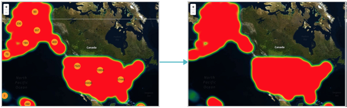
After you disable the Cluster layer option, Google map renders only with the Heatmap layer option, the other default.
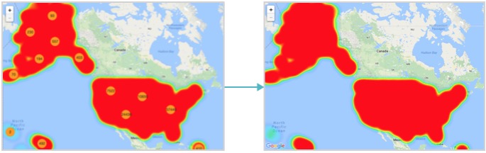
Similarly, the Mapbox map renders without the Cluster layer option.
Changing the Cluster Color
To show the legend for the Heatmap layer, navigate to the Layer Options menu, and under the Cluster Layer Options, change the value of the Cluster Color option, either by changing the hexadecimal value, or by selecting a color from the color palette.
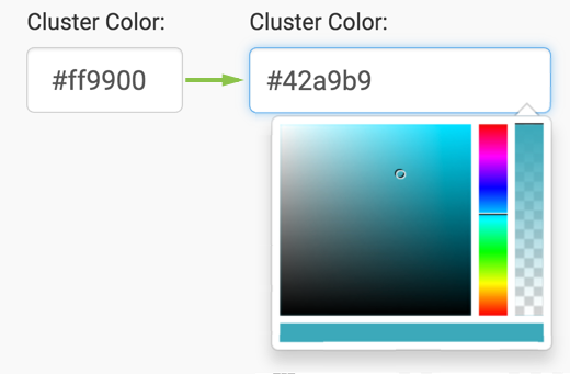
Note the cluster color change from the default of #ff9900 to custom
#42a9b9 on the Google map rendering. We turned off the Heatmap layer
option.
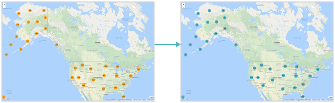
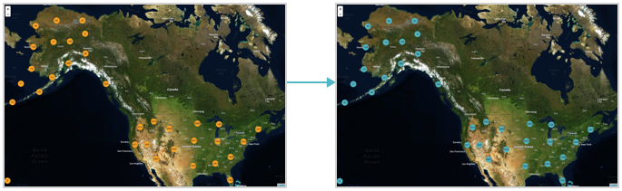
Similarly, note the color change for cluster layer on the Mapbox map.
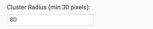
Changing the Cluster Radius
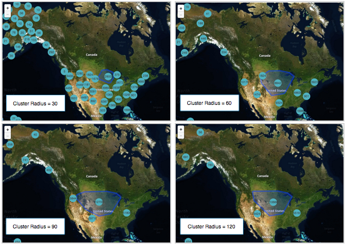
To show the legend for the Heatmap layer, navigate to the Layer Options menu, and under the Cluster Layer Options, change the value for the Cluster Radius option. The default value is 80, and the minimum value is 30.
The default cluster radius value is 80. Compare the results of setting cluster radius on Google Map to 30, 60, 90, and 120.
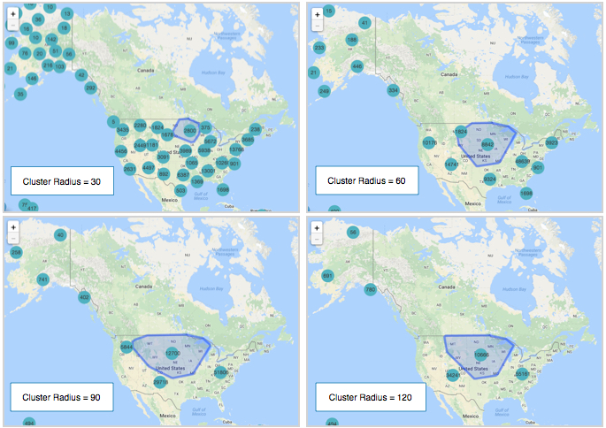
Similarly, note the change for the same cluster sizes on the Mapbox map.