Visual Designer for Dashboards
The Visual Designer Interface enables you to build visuals and dashboards in Arcadia Enterprise.
The following illustration is a basic Visual Designer interface for dashboards.
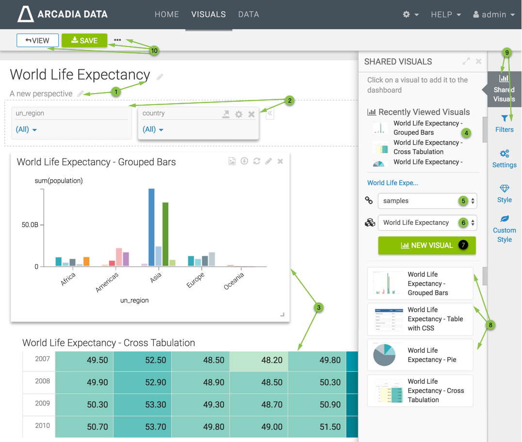
- Dashboard Preview pane shows the contents of the dashboard: the Filters and the Visuals. At this stage, it is empty. This pane also shows the editable Title and Subtitle of the dashboard.
- The Filter area houses the filter controls that allow the user to dynamically change the dashboard presentation at run time. These filters may be defined on any column of the dataset simply by pulling the appropriate field from the Filters menu.
- The Visuals area, the largest portion of the preview pane, contains the visuals of the dashboard. To add visuals, select them in the Shared Visuals menu.
- Recently Viewed Visuals are part of the Shared Visuals menu.
- The name of the Connection for the dashboard is in both the Shared Visuals and Filters menus. It can be changed by making a different selection in the select list. Note, however, that a dashboard can contain visuals from only one connection.
- The name of the Dataset for the dashboard is in both the Shared Visuals and Filters menus. It can be changed by making a different selection in the select list. Note that a dashboard can contain visuals from multiple datasets, as long as they share the same connection. When you change the dataset, a new set of Existing Visuals appears in the menu.
- The New Visual button enables you to start a new visual from within the dashboard.
- The Existing Visuals listed lower on the menu belong to the specified dataset. Changing the dataset gives access to other visuals. To add these visuals to the dashboard, simply click on them. You can then move and resize them in the dashboard preview.
-
The Menu Selector enables you to switch between the primary menus:
- Shared Visuals (default)
- Filters
- Settings; see Customizing Dashboard Settings
- Style; see Customizing Dashboard Style
- Custom Style; see Adding Custom Styles to Dashboards
You can also minimize this menu to see the full dashboard preview pane.
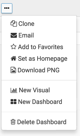
The top bar contains the View button, the Save button, and a supplemental menu that includes the following actions:
- Clone
- Add to Favorites
- Set as Homepage
- Download PNG
- New Visual
- New Dashboard
- Delete Dashboard