Interactive Map Visuals
An interactive map paints geographic maps sourced from a 3rd party provider, with several optional overlay layers for data display. It is an excellent choice for displaying large amounts of geo-based information in relevant detail.
- The base, or tile layers, include either Google Maps or Mapbox.
- The overlay layers that display data include Heatmap, Cluster, Circle Marker, and Marker layer options.
- To use this feature, an Admin user must first specify, through the Site Settings interface, the API keys granted to your organization. This is described in Enabling API Keys for Interactive Map Visuals.
- This visual type supports zero, one, or two field aggregations on the measures shelf. If no measure is supplied, the map will paint with an assumed value of 1. With one measure, all layers use that measure. With two measures, the Heatmap, Cluster and Marker layers use the first measure only, while the Circle Marker displays both measures.
The following steps demonstrate how to create an interactive map visual on the dataset
National Geographic Features. The data for this dataset came from the United States Board on Geographic Names; we recommend choosing the download of the
AllStates zip file because it is easier to process. Additionally, you may wish to use
Feature Class Definitions and State Abbreviations to supplement the dataset.
- Start a new visual based on dataset
National Geographic Featuresdataset; see Creating Visuals. -
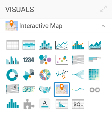
In the visuals menu, find and click interactive map, the second choice on the fourth row.
-
Note that the shelves of the visual changed. They are now Geo, Measures, Dimensions, Tooltips, and Filters.
The only mandatory shelf for interactive map visuals is Geo.
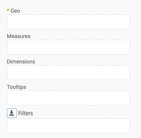
Populate the shelves from the available fields (Dimensions, Measures, and so on) in the Data menu.
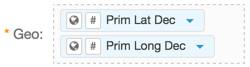
- Under Measures, select
Prim Lat Decand drag it over the Geo shelf on the main part of the screen. Drop to add it to the shelf. - Under Measures, select
Prim Long Dec, and drag it over the Geo shelf on the main part of the screen. Drop to add it to the shelf.
- Under Measures, select
-
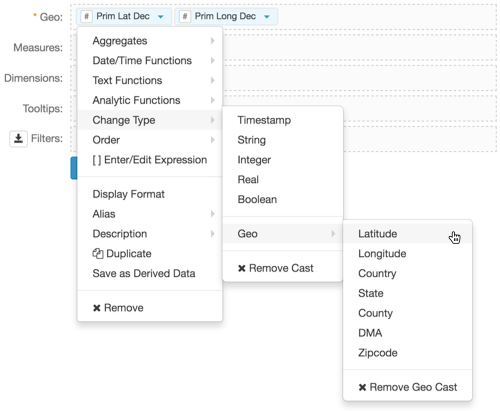
On the Geo shelf, cast the field
Prim Lat DectoLatitude, by selecting Change Type Geo Latitude.See Change Type and Geo Datatype.
-
Similarly, cast the field
Prim Long DectoLongitude, by selecting Change Type Geo Longitude.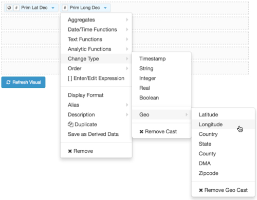
-
Notice that the two converted measurements have a (globe) icon tag. This indicates that these feels can be 'understood' as geographic fields.
Under Dimensions, select
Feature Id, and drag it over the Measures shelf. Drop it on the shelf.If you leave the Measures shelf empty, the system uses the value of
1, and does not require an aggregate.- On the Measures shelf, change the aggregation from
sum(Feature Id)tocount(Feature Id), by selecting Aggregates Count. -
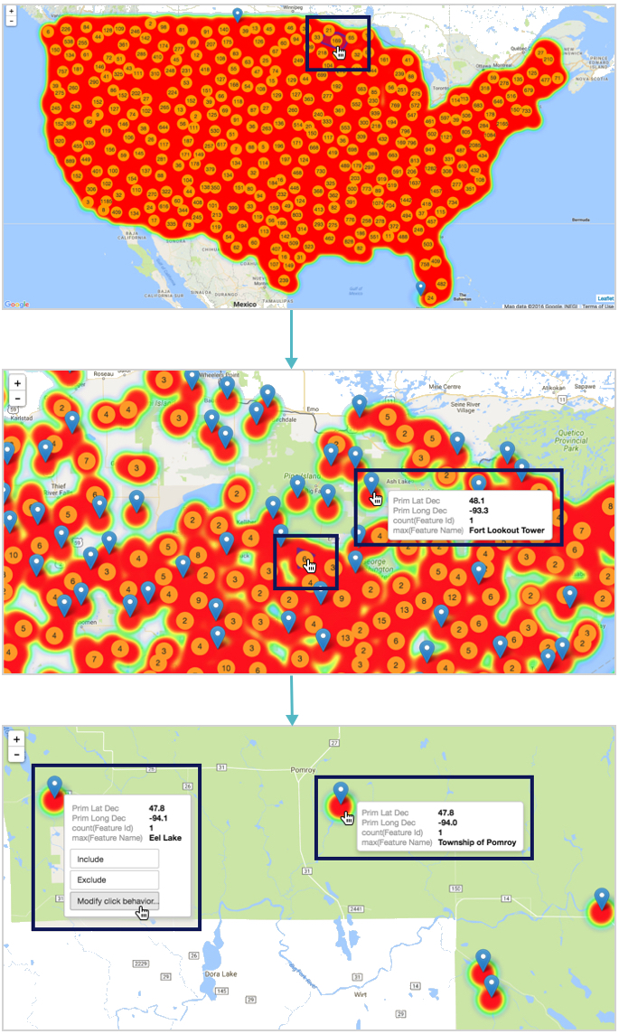
Click Refresh Visual to see the basic interactive map.
The one we have here is a Google INEGI map.
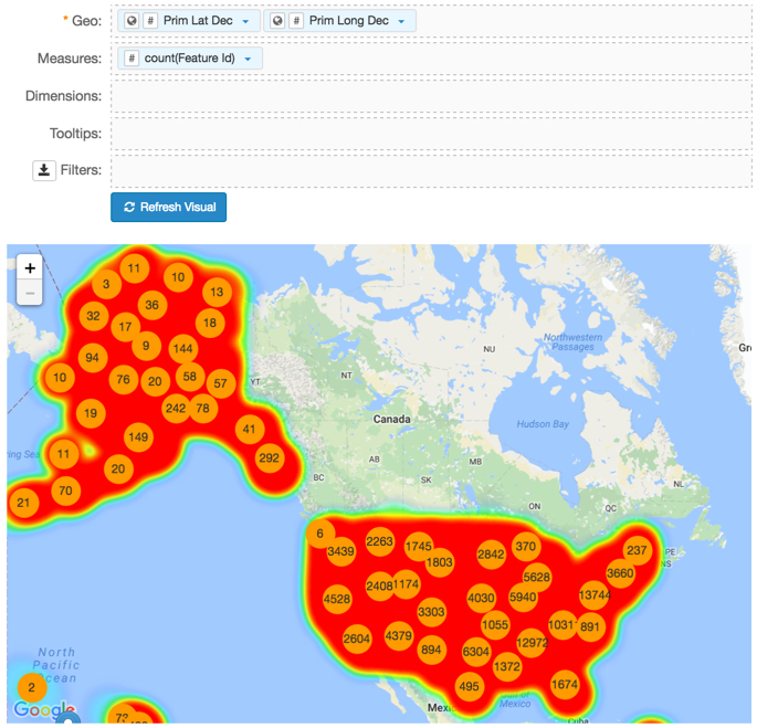
-
Notice that in this representation, there is significant overlap from on the Heatmap Layer. However, you can see the boundaries of each region by hovering the pointer over a section of the map. The total count of measurements in each region is in the circle inside the region. This comes from the Cluster Layer. Both the Heatmap and Cluster layers are on my default.
-
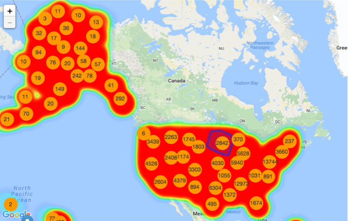
To see more detail, manipulate the map through magnification changes. You can also click on the map and manually 'pan' it to the area of interest. The following image shows that the regions automatically adjust into smaller sections, and you can see both greater detail and more individual 'totals'.
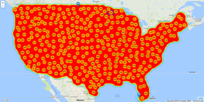
The 'interactive' part of this visual is that after clicking on a region to zoom-in and reposition, to the level of an individual marker, you can enable click behavior.
- Change the title to
All Geographical Features. At the top left corner of the Visual Designer, click Save.

There are many interesting visualization options. To change the tile layer, or the base map from Google to Mapbox, see Interactive Maps; Tile Layers. To configure the layer options, see Interactive Maps; Layer Options.