Line Visuals with Dual Axis
It is often enlightening to see related dimensions on the same line chart; it clearly shows both correlation and pattern. However, values may be measuring completely different things, or the range of values (scale) is too different to show both lines clearly. Arcadia Enterprise offers a dual axis option for situations like these.
The following steps demonstrate how to create a line visual that uses a double axis; it is based on dataset World Life Expectancy [data source samples.world_life_expectancy].
- Start a new visual based on dataset
World Life Expectancy[data sourcesamples.world_life_expectancy]; see Creating Visuals. - In the visuals menu, find and click lines, the fourth choice on the first row.
Populate the shelves from the available fields (Dimensions, Measures, and so on) in the Data menu.
- Under Dimensions, select
yearand place it on the X shelf. - Under Measures, select
life_expectancyand place it on the Y shelf. - Under Measures, select
populationand place it on the Colors shelf.
- Under Dimensions, select
Change the aggregate of the
life_expectancyfield fromsum(life_expectancy)toavg(life_expectancy):-
On the shelf of the visual, click the icon to the right of the field.
-
In the Column Properties menu, click the icon next to Aggregates.
-
From the list of aggregate functions, select Average.
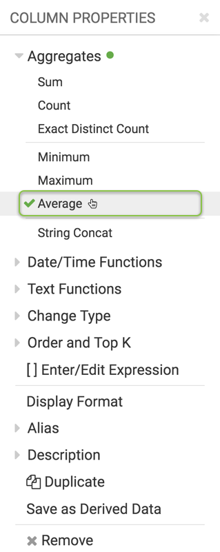
-
Click icon at the top of the Column Properties menu to close it.
-
Note that the shelf now contains the modified field with
avg()aggregation function.
-
-
Click Refresh Visual.
The line visual appears.
It is impossible to see the values on the life expectancy line because the population line sets the scale for the Y axis. In fact, the label does not correspond to the scale shown.
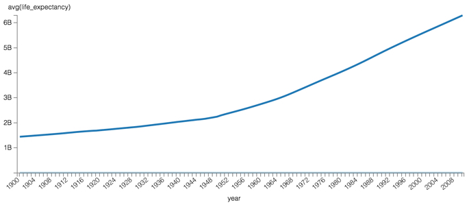
Linear Plot of Population and Life Expectancy, on the Same Axis On the Colors shelf, on
sum(population)field, click the icon (down arrow), select Axis, and then select Secondary Axis.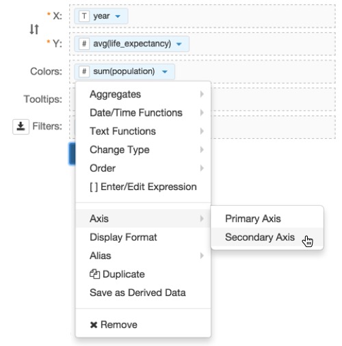
Assigning a Measure to the Secondary Axis. - Click Refresh Visual.
-
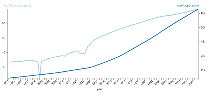
The two lines can now be seen clearly.
Notice that there is now a Y axis both on the left and the right side of the visual.
For convenience, the color of the axis labels match the line.
Linear Plot of Population and Life Expectancy, Each on its own Axis - Change the title to
World Population - Lines, Dual Axis. - Save the visual.