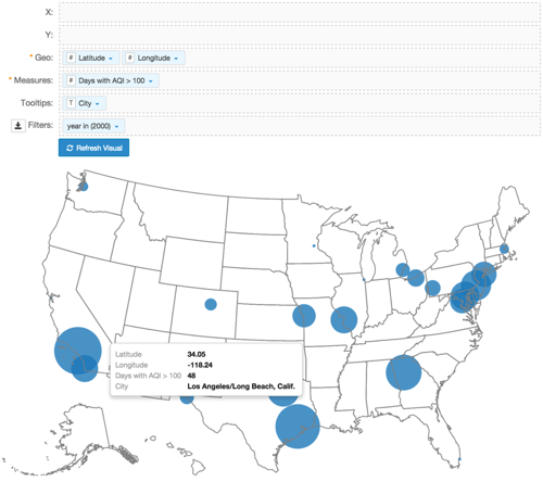
Latitude and Longitude Map with Bubbles
A geographic coordinate map of the United States, based on degrees of latitude and longitude, shows a comparison of measurement values across US States.
- Download the datafile air-quality-over-time.csv.
- Import this data into Arcadia Enterprise.
- Create dataset
Air Quality US Cities; see Creating Datasets.
The following steps demonstrate how to plot the yearly Air Quality Index data for select US cities. It uses a custom dataset Air Quality US Cities [data source samples.air_quality_over_time], and produces a map with bubble marks that correspond to the relative size of the measurement at each latitude and longitude pair.
- Start a new visual based on dataset
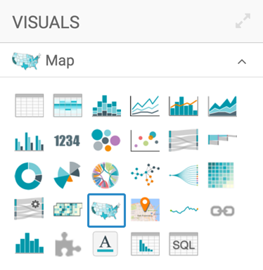
Air Quality US Cities[data sourcesamples.air_quality_over_time]; see Creating Visuals. In the visuals menu, find and click map, the sixth choice on the third row.
-
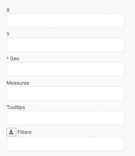
Note that the shelves of the visual changed. They are now X, Y, Geo, Measures, Tooltips, and Filters.
The only mandatory shelf for map visuals is Geo.
Populate the shelves from the available fields (Dimensions, Measures, and so on) in the Data menu.
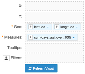
- Under Dimensions, select
latitudeand drag it over the Geo shelf on the main part of the screen. Drop to add it to the shelf. - Under Dimensions, select
longitudeand drag it over the Geo shelf on the main part of the screen. Drop to add it to the shelf. - Under Measures, select
days_aqi_over_100and drag it over the Measures shelf on the main part of the screen. Drop to add it to the shelf.
- Under Dimensions, select
- Under Dimensions, select
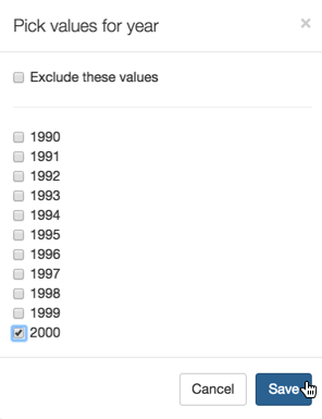
yearand drag it over the Filters shelf on the main part of the screen. - On the Filters shelf, click the icon (down arrow) on the
yearfield, and select Pick values from list. In the Pick values for year modal window, select 2000 and click Save.
- Change the size of the bubbles to the range
1-30, as described in Changing the Mark Size Range. [Optional] To improve information that appears in the Tooltips text, do the following:
- From Dimensions, add the field
metropolitan_statistical_areato the Filters shelf, and alias the field asCity. - Alias the field on the Measures shelf as
Days with AQI > 100. - Alias the fields on the Geo shelf as
LatitudeandLongitude. - For
LatitudeandLatitudefields, click the icon (down arrow), select Display Format, and enter.2f.
- From Dimensions, add the field
Click Refresh Visual.
The map visual appears.
-
Click (pencil icon) next to the title of the visualization to edit it, and enter the new name.
- Change the title to
US Air Quality by Latitude and Longitude. At the top left corner of the Visual Designer, click Save.