Trellis on Measures
Some visual types (bars, lines, areas, and grouped bars) may be trellised on measures, simply by adding more fields to the measurement shelf.
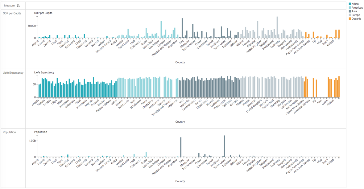
Here, we can change the chart developed in Bar Visuals
(Country vs. Life Expectancy) into a visual trellised on
three measures: Life Expectancy, Population, and GDP
per Capita. We accomplish this by placing all three measurements on the
Y Axis shelf.
- Click on the Y Axis shelf.
Life Expectancyis already on the shelf. - With the shelf active, click on the
populationfield in the Data menu. - Click on the
gdp_per_capitafield in the Data menu. -
Click Refresh Visual.

Because the magnitudes of the measurements vary, we recommend that you specify independent measurements as described in Enabling Independent Axis Scale, and then click Refresh Visual, again.
This setup produces a measurement-trellised bar chart visual.
Contrast this approach with plotting two measures onto the same line chart, Line Visuals with Dual Axis.