Horizontal Bars
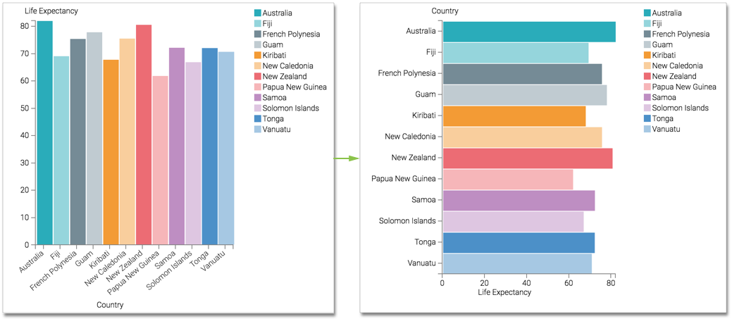
In general, a dimensions of the dataset represent categories that are placed on the horizontal axis (and therefore, the X shelf). The result set is rendered as vertical bar chart. If your business requirements include the use of a horizontal bar chart, Arcadia Enterprise makes it very easy to switch from an existing vertical bar chart to a horizontal one.
Tip. This demonstration uses the visual previously created in Bar Visuals. Clone it, and
make the changes to the duplicate visual.
To use this visual to create a horizontal bar chart, follow these steps.
Click the (switch) icon between the X Axis and Y Axis shelves.
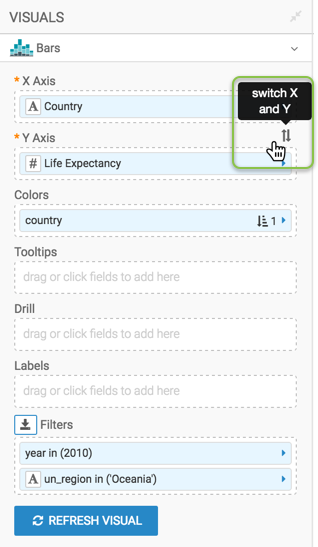
Click Refresh Visual.
Note how the graph changed, with country categories on the Y axis, and horizontal bars.
- Rename the visual.
At the top left corner of the Visual Designer, click Save.