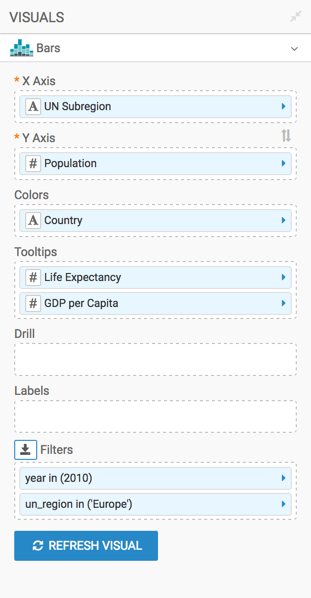
Stacked Bars
While bar charts show comparisons among categories, stacked bar charts show the bars divided into sub-parts. This demonstrates the cumulative effect of the component parts of a particular category.
To develop a stacked bar representation of European population, divided by its subregions, follow these steps.
- Remove
Life Expectancyfrom the Y Axis shelf andun_regionfrom the Colors shelf. - From Dimensions in the Data menu, pull
un_subregiononto the X Axis shelf. - Under Measures, select
population, and drop it onto the Y Axis shelf. - Pull
Countryfrom the X Axis shelf onto the Colors shelf. - On the Filters shelf, set
yearto 2010, andun_regionto Europe. - [Optional] Add all fields of interest to the Tooltips shelf. For
example, add
life_expectancyandgdp_per_capita. [Optional] Adjust Display Format for the values on the main shelves of the visual and in the Tooltip shelf.
For example, set the
gdp_per_capitato Currency, with $ symbol.Alias the fields on the shelves as UN Subregion, Population, GDP per Capita, and so on:
-
On the shelf of the visual, click the icon to the right of the field.
-
In the Field Properties menu, click the icon next to Alias.
-
In the text box below Alias, enter the alias name of column, as it should appear in the visual.
-
Click icon at the top of the Field Properties menu to close it.
-
Note that the shelf now shows the column with its alias name.
-
- Click Refresh Visual.
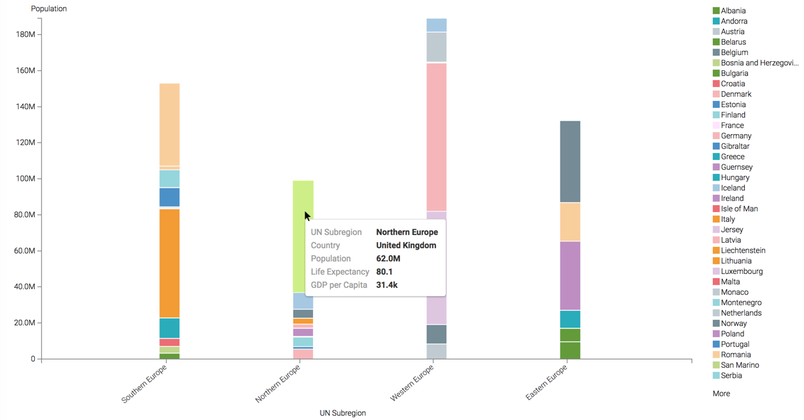
Note how the visual changed. You can see the relative size of total populations for the subregions, and the component countries for all subregions.
If you hover the mouse over the graph, you can see the tooltip text for each country.
- Rename the visual.
At the top left corner of the Visual Designer, click Save.