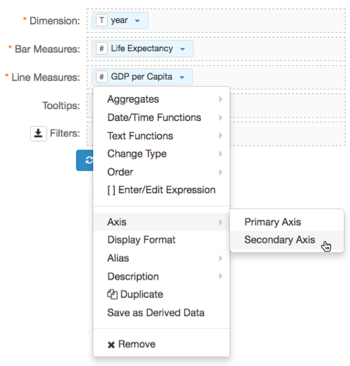
Assigning a Measure to a Secondary Axis
As we just demonstrated, sometimes plotting two measures on the same axis doesn't work because of their relative values, or because of their incompatible units of measurement. The following steps demonstrate how to specify a different axis for each of the measures in the bar and line chart.
-
To assign the GDP per Capita to the secondary axis, click the icon (down arrow) on the
GDP per Capitafield. Select Axis, and then select Secondary Axis.
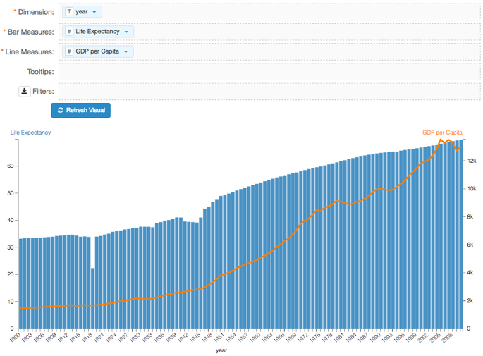
- Click Refresh Visual.
-
Notice that the both the blue bars ad the orange line are now clearly visible.
The graph lists Life Expectancy on the left-hand vertical axis, in the range of 0 through approximately 70, and the GDP per Capita on the right-hand vertical axis, in the range of 0 to just under 14k.
-
Click (pencil icon) next to the title of the visualization to edit it, and enter the new name.
- Change the title to
World Population - Dual Bar and Line. At the top left corner of the Visual Designer, click Save.