Cross Tabulation Visuals
Cross tabulation is a tool that allows you to compare the relationship between two variables in table format. Arcadia Enterprise enhances the understanding of relative value size by assigning more saturated colors to the table fields with larger values.
The following steps demonstrate how to create a new cross-tabulation visual on a dataset
World Life Expectancy [data source
samples.world_life_expectancy].
- Start a new visual based on dataset
World Life Expectancy[data sourcesamples.world_life_expectancy]; see Creating Visuals. -
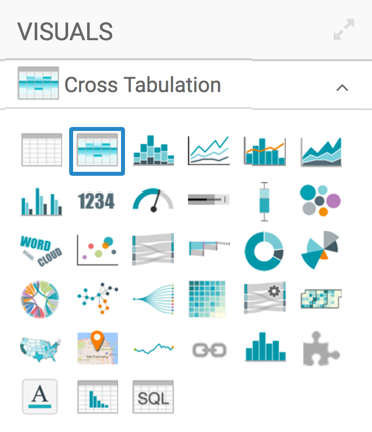
In the visuals menu, find and click Cross Tabulation (row 1, column 2).
-
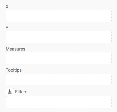
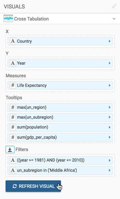
Note that the shelves of the visual changed. They are now X, Y, Measures, Tooltips, and Filters.
There are no mandatory shelves.
-
To show specific items, populate the shelves from the available Fields (Dimensions, Measures, and so on) in the Data menu.
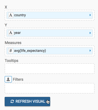
- Under Dimensions, select
countryand drag it over X shelf on the main part of the screen. Drop to add it to the shelf. - Under Dimensions, select
yearand drag it over Y shelf on the main part of the screen. Drop to add it to the shelf. -
Under Measures, select
life_expectancyand drag it over Measures shelf on the main part of the screen. Drop to add it to the shelf.Note that by default, the sum aggregate of the field appears on the shelf, as
sum(life_expectancy).
- Under Dimensions, select
-
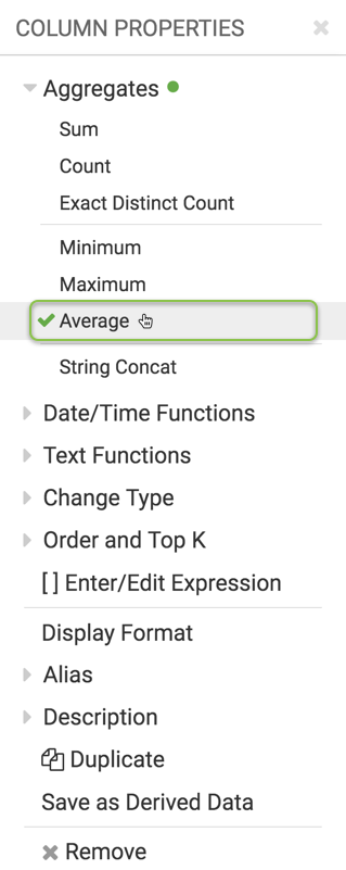
Change the aggregate of the
life_expectancyfield fromsum(life_expectancy)toavg(life_expectancy):-
On the shelf of the visual, click the icon to the right of the field.
-
In the Column Properties menu, click the icon next to Aggregates.
-
From the list of aggregate functions, select Average.
-
Click icon at the top of the Column Properties menu to close it.
-
Note that the shelf now contains the modified field with
avg()aggregation function.
-
-
Click Refresh Visual.
-
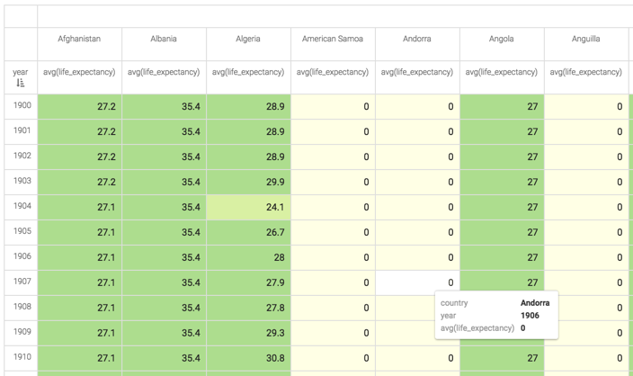
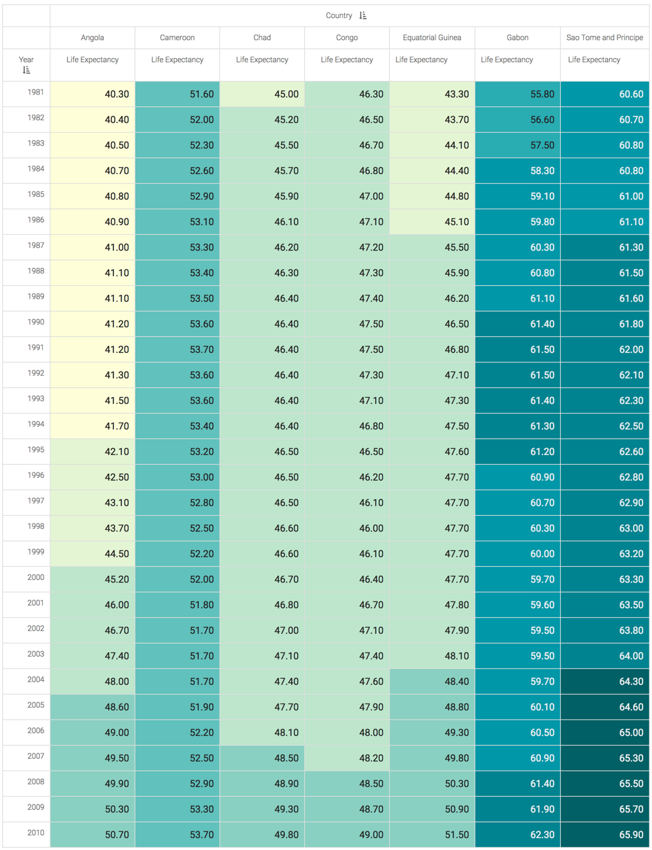
The default cross-tabulation visual appears. As you can see, it shows life expectancy information for each row of the dataset. By default, cross-tabulation visuals show smaller values in light colored cells, and larger values in darker colored cells.
-
On the Filters shelf, add several Dimensions and Measures from the Data menu.
This enables you to dynamically control the data input, and discover the data at a more granular level.
For example, from Dimensions, drag
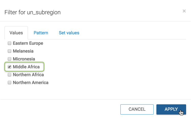
un_subregiononto the Filters shelf. Note that the filter selection wizard appears each time you place a field on a Filters shelf; you can specify filter values at this time, or click Cancel and select them later.Here, let's set the filter value to Middle Africa:
-
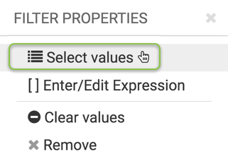
On the Filter shelf of the visual, click the icon to the right of the field.
-
In the Filter Properties menu, click Select values.
-
In the Filter for un_subregion modal window, select Middle Africa, then click Apply.
-
-
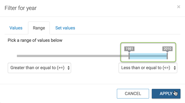
To limit the time interval in this visual, add the
yearfield to the Filters shelf.In the Filter for year modal window, click the Range tab, and then select the last 30 years of the dataset, 1981 through 2010. Click Apply.
-
To improve the appearance of the visual, alias the
countryfield asCountry, and thelife_expectancyfield asLife Expectancy:-
On the shelf of the visual, click the icon to the right of the field.
-
In the Field Properties menu, click the icon next to Alias.
-
In the text box below Alias, enter the alias name of column, as it should appear in the visual.
-
Click icon at the top of the Field Properties menu to close it.
-
Note that the shelf now shows the column with its alias name.
-
- Adjust the display format for
Life Expectancyfield to use a comma thousands separator, and to carry only 2 decimal places:-
On the shelf of the visual, click the icon to the right of the field.
-
In the Field Properties menu, click Display Format.
-
In the Display Format interface, select the Category Number, select the Use 1000 separator option, and click Save.
-
Click icon at the top of the Field Properties menu to close it.
-
-
To enhance detailed information, add some fields to the Tooltips shelf.
For example, drag the Dimensions
un_regionandun_subregion, and the Measurespopulationandgdp_per_capitaonto the Tooltips shelf. -
Click Refresh Visual.
-
The updated cross-tabulation visual appears. As you can see, it clearly demonstrates the relative size of populations by assigning a progressively more saturated color to represent increasingly larger values.
-
Click (pencil icon) next to the title of the visualization to edit it, and enter the new name.
-
Change the title to
World Life Expectancy - Cross Tabulation.-
Click (pencil icon) next to the title of the visualization to edit it, and enter the new name.
[Optional] Click (pencil icon) below the title of the visualization to add a brief description of the visual.
-
At the top left corner of the Visual Designer, click Save.
At the top left corner of the Visual Designer, click Close.