Field Statistics Visuals
The field statistics visual describes the dataset in statistical terms. It works across all data connections, and on datasets that contain table joins.
- Start a new visual based on dataset
US County Population[data sourcesamples.us_counties]; see Creating Visuals. -
In the visuals menu, find and click Field Statistics (row 6, column 2).
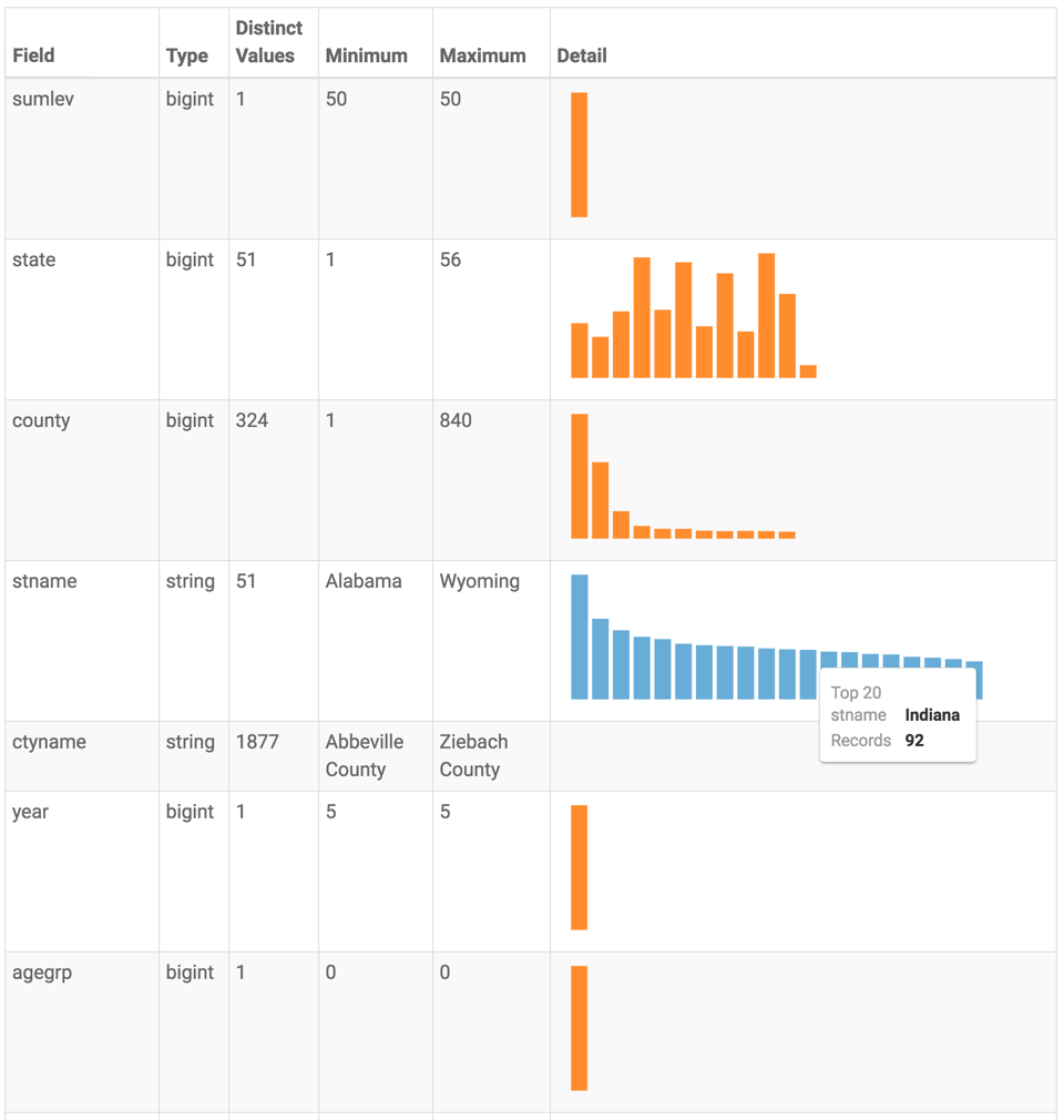
Note that the visual appears as a table that shows statistical information for each field in the dataset:
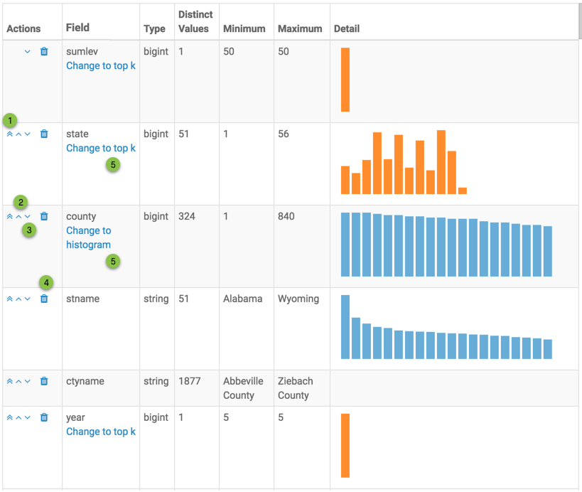
- Actions column contains some widgets for making changes to the appearance of the table.
- Field column indicates the name of the dataset field, and provides an option to include only a limited number of top values, when applicable.
- Type column indicates the datatype of the dataset field.
- Distinct Values column reports the number of distinct values for this field. This is typically a good indication of the field's suitability as a dimension.
Minimum column reports the smallest (lowest) value in the dataset field. For strings, this would be the 'least' in alphabetical sort.
In our example, for field
stname(state name), this would be Alabama, and for fieldctyname(county name), this would be Abbeville County.Maximum column reports the largest (highest) value in the dataset field. For strings, this would be the 'greatest' in alphabetical sort.
In our example, for field
stname(state name), this would be Wyoming, and for fieldctyname(county name), this would be Zieback County.- Detail column holds a graphic that is either a bar chart of top K values, or a distribution histogram of these values, for each column.
At this point, you can make changes to the visual through the following actions:
- Under Actions column, click (double up) icon to move the field to the very top of the table.
- Under Actions column, click (up) icon to move the field up one row in the table.
- Under Actions column, click (down) icon to move the field down one row in the table.
- Under Actions column, click (trash) icon to remove the field from the table.
- Under Field column, toggle between:
- Change to top k to change the Detail column to show a bar representation of the top 20 values (default) for the dataset field
- Change to histogram to change the Detail column to show a distribution histogram for the dataset field
-
Change the title to
US County Populations - Field Statistics.-
Click (pencil icon) next to the title of the visualization to edit it, and enter the new name.
[Optional] Click (pencil icon) below the title of the visualization to add a brief description of the visual.
-
At the top left corner of the Visual Designer, click Save.
At the top left corner of the Visual Designer, click Close.
Note that in View mode, the field statistics visual does not have actions, or contain the Actions column.