Gauge Visuals
Gauge visuals resemble simple speed dials in automobile dashboards, but they are powerful tools for communicating performance against set targets, projected trends, and a qualitative assessment of the measurement. Gauges show minimum and maximum values on an evenly distributed scale, and qualitative ranges for classifying the primary measurement as different colors, which is very useful for visually distinguishing them from one another.
Gauges are semi-circular by default, and include many setting adjustments.
Consider these three examples of gauge charts, to illustrate their structure.
- Example 1: Measure < Projection < Compare To
-
In this scenario, both the measurement and its projected future value are less than the target value.
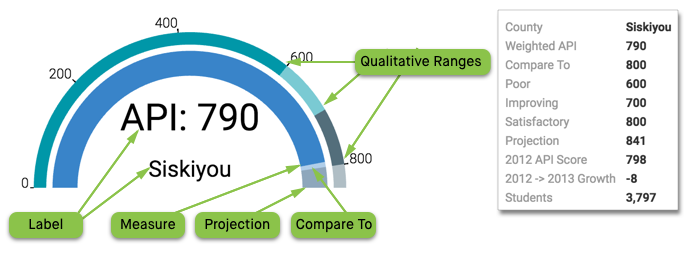
- Example 2: Measure < Compare To < Projection
-
In this scenario, the measurement is less than the target value, but its projection is expected to exceed the target.
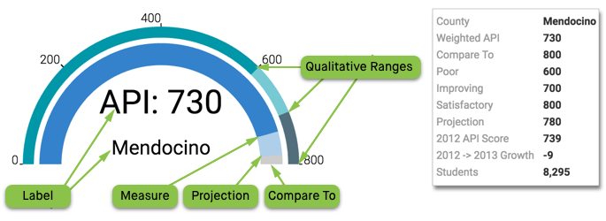
- Example 3: Compare To < Measure < Projection
-
In this scenario, the measurement has already exceeded the target value, and the projection is even greater.
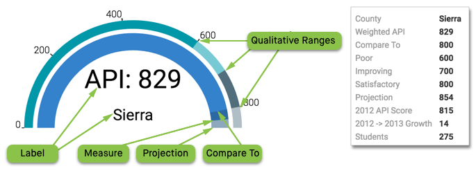
- The long dark inner arc of the visual represents the value on the Measure shelf. It is the feature measurement of the visual. Note that in Example 3, the last section appears in dark blue because the value of Measure is greater than the Compare To value.
- The extension of the same arc is the expected value of the measure at a future date,
supplied by the Projection shelf of the visual. Note that the
overlay of colors and their opacity leads to different effects depending on the relative
values of Measure, Projection, and
Compare To shelves:
- In Example 1, this appears in pale blue and does not terminate the arc; this is because the value on the Projection shelf is less than the Compare To value.
- In Example 2, Projection appears in darker grey as extension beyond the lower Compare To value (in pale blue).
- In Example 3, Projection again appears in darker grey, but this time as an extension beyond the darker blue arc that shows by how much the Measure exceeds the lower Compare To value.
- The Compare To shelf shows the target value for the measurement. In
this article, it has a value of
800for all gauges. - The secondary outer arc shows the Qualitative Ranges that form the upper limits of the 'goodness' for the current measurement. From the origin to the upper value, they specify relative levels of performance success. You may define anywhere from 0 to 4 qualitative ranges.
- The Label shelf overrides default labeling taken from the Measure shelf. This is an opportunity to clarify what is being measured, as well as the units of measurement. This shelf accepts a maximum of two values.
Like other Arcadia Enterprise visuals, the gauge visual may be trellised using X and Y shelves, have additional fields on the Tooltips shelf, and use Filters.
This example uses the 2012 and 2013 API Scores for California School Districts.
We are working with the dataset District Performance, built on the ca-district-apis.csv datafile that contains the California School District APIs from 2012 and 2013. The range of possible scores varies from a low of 200 to a high of 1000; however, the statewide API performance target is 800.
-
Start a new visual based on dataset District Performance.
See Importing Data, Creating Datasets, and Creating Visuals.
-
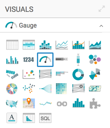
In the visuals menu, find and click Gauge (row 2, column 3).
-
Note that the shelves of the visual changed. They are now X, Y, Measures (mandatory), Compare to, Qualitative Ranges, Projection, Label, Tooltips, and Filters.
-
Populate the shelves from the available fields (Dimensions, Measures, and so on) in the Data menu.
-
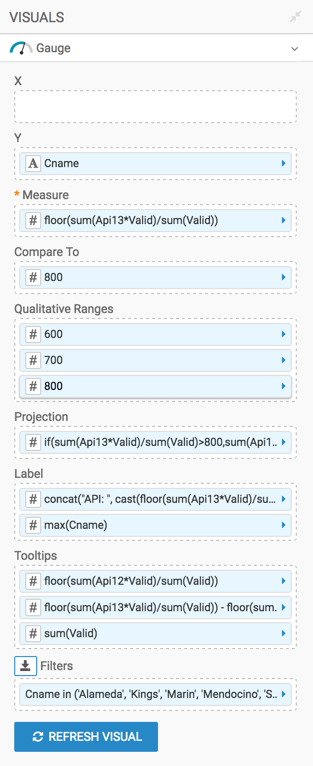
Measure shelf: add the field
Api13. Then customize the expression to calculated the waited average of the field, based on the number of students tested in each district (fieldValid).- Click the (right-arrow) icon to the left of the field, and select the [] Enter/Edit Expression option.
In the Enter/Edit Expression modal window, change the expression to the following formula:
floor(sum([Api13]*[Valid])/sum([Valid]))- Click Validate & Save to ensure that everything works.
Compare To field: add the field
Click the (right-arrow) icon to the left of the field, and select the [] Enter/Edit Expression option. Change the expression to the scalar value ofApi13. Then customize the expression to change it to the state-wide target ofAPI=800.800, and click Validate & Save to ensure that everything works.-
Qualitative Ranges shelf: add the field
Api13. Then, specify the equation that returns the upper limit of the first qualitative range. For this visual, we are using simple scalar values.Click the (right-arrow) icon to the left of the field, and select the [] Enter/Edit Expression option. Change the expression to the scalar value
600, and click Validate & Save.To create other ranges, simply click the (right-arrow) icon to the left of this field, and select the Duplicate option. Then open the Enter/Edit Expression modal window for the duplicate, change the value, and click Validate & Save. In this example, we defined three ranges: at
600,700. and800.Later, we aliased the qualitative ranges as
Poor,Improving, andSatisfactory, in that order. -
Projection field: add the field
Api13. Then, specify the equation that projects the current measurement to some future date by clicking the (right-arrow) icon to the left of the field, selecting the [] Enter/Edit Expression option, and changing the expression to the following SQL clause:if( sum([Api13]*[Valid])/sum([Valid])>800, sum([Api13]*[Valid])/sum([Valid])+25, sum([Api13]*[Valid])/sum([Valid]) + 50) -
Label field: add the field
Api13, and convert the expression to the following SQL clause:concat("API: ", cast(floor(sum([Api13]*[Valid])/sum([Valid])) as string))[Optional] Add the field
Cnamebelow the first field, and change its aggregation tomax([Cname]). - Tooltips shelf: add more fields here to provide additional
information. We created the following tooltips:
floor(sum([Api12]*[Valid])/sum([Valid]))floor(sum([Api13]*[Valid])/sum([Valid])) - floor(sum([Api12]*[Valid])/sum([Valid]))sum([Valid])
We suggest that you apply an Alias to these fields. We later named them
2012 API Score,2012 -> 2013 Growth, andStudents. - Filters shelf: add the filters here. We used
Cnamefor name of the County, selecting the values Alameda, Kings, Marin, Mendocino, Sierra, and Siskiyou. - Y shelf: add the field
Cname(county name) to trellis the visual. Alias it asCounty.
-
- [Optional] Click the Settings menu, select Marks, and de-select the Show trellis borders option. See Showing Trellis Borders.
- [Recommended] Click the Settings menu, select Marks, and select the Include a gauge line option. See Displaying Gauge Lines.
- [Optional] Click the Colors menu, and select different options for Foreground Color, Pointer Color, and Background Color from the color palette menu. You may change the Projection Opacity and Background Opacity options, too; we left them alone.
- [Optional] Alias the fields. We used the names of the shelves for each alias.
-
Click Refresh Visual.
-
The new gauge visual appears.
Notice that the gauge line makes it easier to recognize
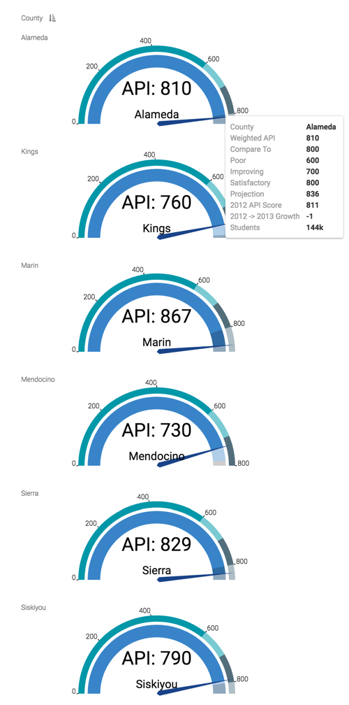
-
Change the title to
District Performance, by County - Gauge.-
Click (pencil icon) next to the title of the visualization to edit it, and enter the new name.
[Optional] Click (pencil icon) below the title of the visualization to add a brief description of the visual.
-
At the top left corner of the Visual Designer, click Save.
At the top left corner of the Visual Designer, click Close.
To adjust the gauge display, check all the available settings for this visual.