Grouped Bar Visuals
While bar charts show comparisons among categories, grouped bar charts show clustered groups of related measurements as bars.
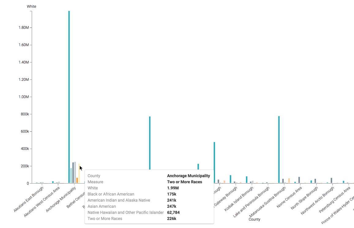
The following steps demonstrate how to create a new grouped bar visual representation of ethnic distribution of population in some US Counties. We are using the US Counties dataset [data source us-counties.csv.zip]. See Importing Data and Creating Datasets.
- Start a new visual based on dataset US Counties; see Creating Visuals.
-
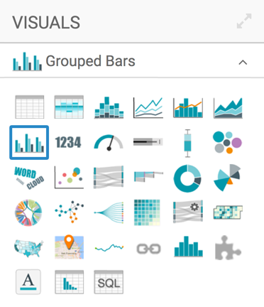
In the visuals menu, find and click Grouped Bars (row 2, column 1).
-
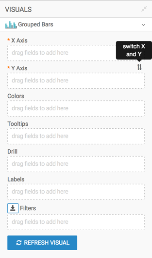
Note that the shelves of the visual changed. They are now X Axis, Y Axis, Colors, Tooltips, Drill, Labels, and Filters.
The mandatory shelves are X Axis and Y Axis. Note also that the fields placed on these two shelves may be easily swapped by switching X and Y. Doing this produces a horizontal chart.
-
Populate the shelves from the available fields (Dimensions, Measures, and so on) in the Data menu.
- Under Dimensions, select
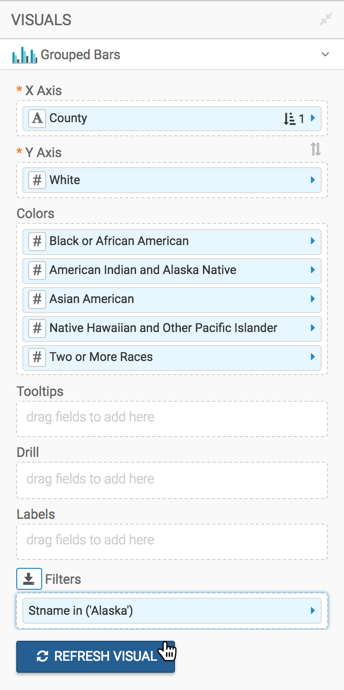
Ctynamefield and drag it over X Axis shelf on the main part of the screen. Drop to add it to the shelf. At this point, we recommend that you alias the field as County; see Alias. -
Select
Wa malefield and drag it to the Y Axis shelf. This first measurement provides the axis definition. -
Add the other measurements to the Colors shelf. Together with the measurement on the Y Axis, this creates the 'group' Arcadia Enterprise uses to draw grouped bars.
For this visual, add
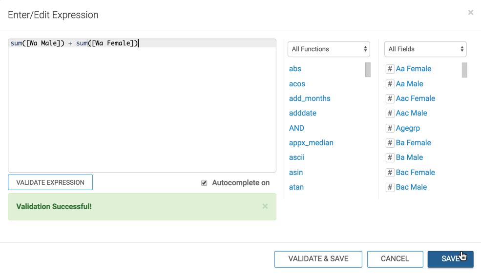
Ba Male,Ia Male,Aa Male,Na Male, andTom Male. On the Y Axis shelf, click the field, and from the Field Properties menu choose [] Enter/Edit Expression.
In the Enter/Edit Expression modal window, edit the expression to the following:
sum([Wa Male]) + sum([Wa Female])Click Validate Expression, and then click Save.
-
Repeat the change in the expression on all the fields placed on the color shelves.
sum([Ba Male]) + sum([Ba Female]) sum([Ai Male]) + sum([Ai Female]) sum([Aa Male]) + sum([Aa Female]) sum([Na Male]) + sum([Na Female]) sum([Tom Male]) + sum([Tom Female]) -
Alias the field on the Y Axis shelf as 'White', and alias the fields on the Colors shelf as 'Black or African American', 'American Indian and Alaska Native', 'Asian American', 'Native Hawaiian and Other Pacific Islander', and 'Two or More Races'.
-
Add the field
Stnameto the Filters shelf, and select the value 'Alaska'.
- Under Dimensions, select
-
Click Refresh Visual.
The grouped bars visual appears.
-
Click (pencil icon) next to the title of the visualization to edit it, and enter the new name.
- Change the title to
World Population - Grouped Bars. At the top left corner of the Visual Designer, click Save.