Histogram Visuals
Histogram visuals enable quick visual analysis of the distribution of numerical data. It is an estimate of the frequency distribution of a continuous quantitative variable, accomplished by splitting it into consecutive, non-overlapping intervals, referred to as "buckets".
population, not for avg(population). To work around this limitation, first save the calculated metric as derived data, and then use this field as a measure in a histogram. See Derived Data.When you change the number of buckets (the default is 10), Arcadia Enterprise determines the data range and splits it equally among the buckets, groups the metric into these buckets, and plots vertical bars to represent it.
Histograms support both normalized and cumulative forms, and may be used in a trellis formation.
The following steps demonstrate how to create a new histogram visual on a dataset World Life Expectancy [data source samples.world_life_expectancy].
- Start a new visual based on dataset
World Life Expectancy[data sourcesamples.world_life_expectancy]; see Creating Visuals. -
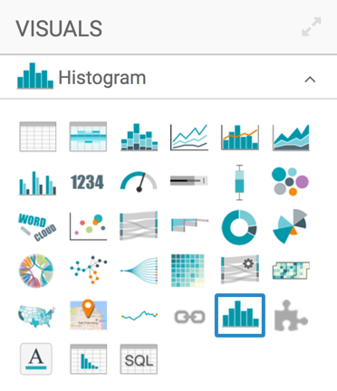
In the visuals menu, find and click histogram (row 5, column 5).
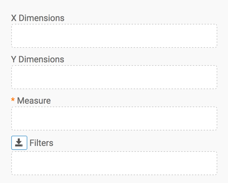
Note that the shelves of the visual changed. They are now X Dimensions, Y Dimensions, Measure (mandatory), and Filters.
To show specific items, populate the shelves from the available fields (X Dimensions, Y Measures, and so on) in the Data menu..
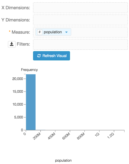
Under Measures, select
populationand drag it over the Measures shelf on the main part of the screen. Drop to add it to the shelf.Click Refresh Visual.
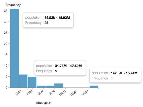
The default histogram visual appears, dividing the data into 10 buckets. As you can see, most the data is in the first bucket, and this visual is not very enlightening.
Histogram Visual On the Filters shelf, add several Dimensions and Measures from the Data menu.
This enables you to dynamically control the data input, and discover the data at a more granular level.
For example, from Dimensions, drag
yearonto the Filters shelf, and select the year 2010.You can also add
un_regionto the Filters shelf, and select Africa.Click Refresh Visual, and note the new shape of the histogram.
Hovering the mouse over the histogram shows the data ranges and frequency for each bucket of the histogram.
Notice that the filtering options significantly reduced result set.
Histogram, with year=2010 and un_region='Africa' -
Click (pencil icon) next to the title of the visualization to edit it, and enter the new name.
- Change the title to
World Population - Histogram. At the top left corner of the Visual Designer, click Save.
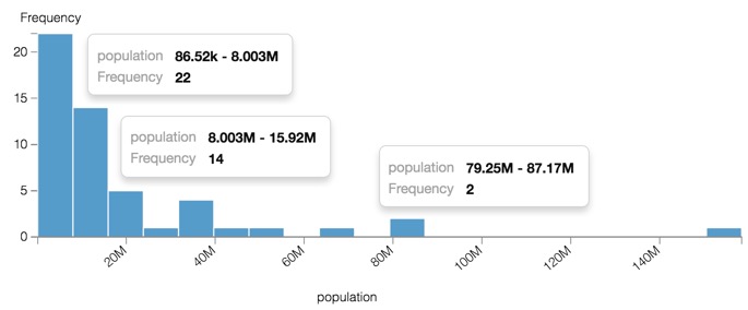
Specifying the Bucket Count
The default number of histogram buckets is 10, but you can easily change this.
Follow the instructions in Customizing Basic Settings and Changing the Bucket Count to double the number of buckets in the histogram.
Note the appearance of the histogram when the number of buckets doubles, and the range of values covered by each bucket is therefore reduced by half.
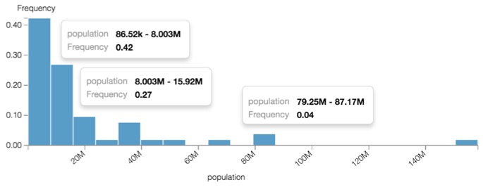
Normalizing the Histogram
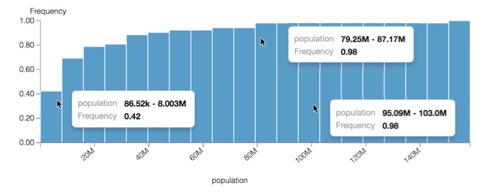
The default vertical axis of a histogram represents the count of values that map to a particular bucket. To report the histogram as a percentage of a whole, the histogram count is normalized to add up to 1, and then the bars represent the proportionate frequency.
Follow the instructions in Customizing Basic Settings and Showing Normalized Histograms to double the number of buckets in the histogram.
Note the appearance of the normalized histogram, where the vertical axis and the Tooltips report Frequency as a percentage.
Cumulative
By default, the histogram reports each bucket individually. The cumulative option adds each bucket's count or frequency to the running total, so that the right-most bucket reports the total count or 1 (100%), depending on whether the normalized histogram option is active.
Follow the instructions in Customizing Basic Settings and Showing Cumulative Histograms to double the number of buckets in the histogram.
Note the appearance of the histogram when the buckets report cumulative values.