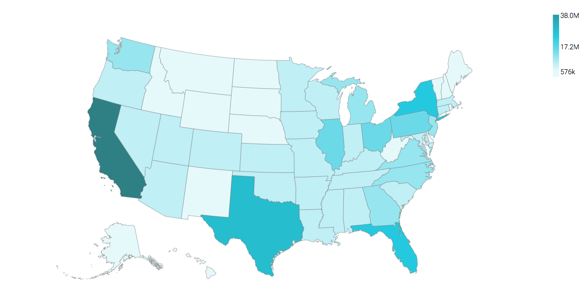
US State Map, Choropleth
A map of the United States shows a comparison of measurement values among US States.
The following steps demonstrate how to create a new map visual on the dataset US County Population [data source samples.us_counties]. It produces colored regions for the measurements that correspond to the state field.
state. This article demonstrates how to use the Alias setting to make the dataset field stname conform to this requirement.- Start a new visual based on dataset
US County Population[data sourcesamples.us_counties]; see Creating Visuals. -
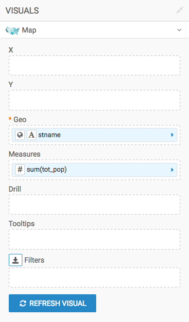
In the visuals menu, find and click Map (row 5, column 1).
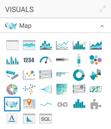
-
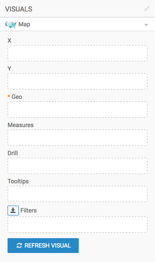
Note that the shelves of the visual changed. They are now X, Y, Geo, Measures, Drill, Tooltips, and Filters.
The only mandatory shelf for map visuals is Geo.
-
Populate the shelves from the available fields (Dimensions, Measures, and so on) in the Data menu.
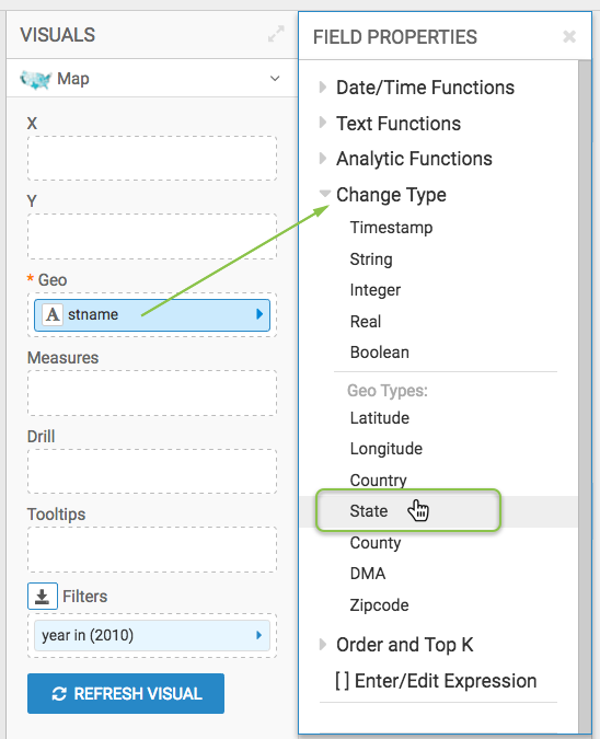
Under Dimensions, select
stnameand drag it over the Geo shelf on the main part of the screen. Drop to add it to the shelf.Click on the field to open the Field Properties menu, expand the Change Type option, and select the Geo Type State.
- Under Measures, select
tot_popand drag it over the Measures shelf on the main part of the screen. Drop to add it to the shelf.
For
population, click the icon (down arrow), select Display Format,Category Number, remove decimal places, and select the thousands separator option. Click Save.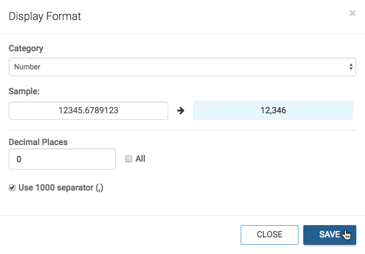
-
[Optional] Alias the field
stnameasState, andsum(tot_pop)asPopulation; see Alias. - [Optional] Enable panning and zooming option, as described in Customizing Zoom.
- [Optional] Change the color palette, as described in Change Color Palette.
-
Click Refresh Visual.
The map visual appears.
-
Click (pencil icon) next to the title of the visualization to edit it, and enter the new name.
- Change the title to
US State Population - Choropleth Map. At the top left corner of the Visual Designer, click Save.

Your visual should look something like this: