Enabling Trellising for Map Visuals
At times, it is useful to contrast maps visuals for different data segments. For example, you can trellis on different calendar years.
Tips:
- This demonstration uses the visual US Air Quality by Latitude and Longitude, from Latitude and Longitude Map with Bubbles, to create trellis charts.
- Any chart type that uses the X and Y axes explicitly, as X and Y shelves, may be trellisable.
The following steps demonstrate how to create a new trellised map on dataset Air Quality US Cities [data source samples.air_quality_over_time].
- If you have not done so yet, create US Air Quality by Latitude and Longitude visual, described in Latitude and Longitude Map with Bubbles.
- Find and select US Air Quality by Latitude and Longitude visual, and open it in the Edit mode.
- Clone the visual, as described in Cloning Visuals.
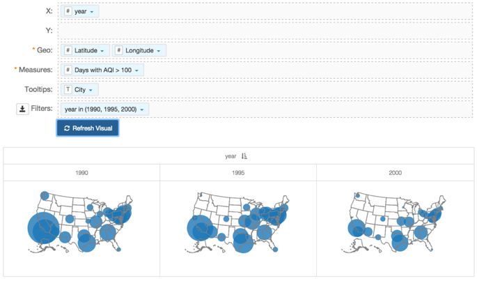
- Under Dimensions, select
yearand drag it over X shelf on the main part of the screen. - On the Filters shelf, click the icon (down arrow) on the
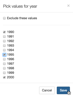
yearfield, and select Pick values from list. In the Pick values for year modal window, select 1990, 1995, and 2000, and then click Save.
Click Refresh Visual.
The new trellised maps appear.
-
Click (pencil icon) next to the title of the visualization to edit it, and enter the new name.
- Change the title to
US Air Quality by Latitude and Longitude, Yearly. At the top left corner of the Visual Designer, click Save.