Network Visuals
Network visuals may be used to represent many systems and structures. Our implementation is dynamic, with ongoing optimization adjustment. It also includes many manual setting adjustments.
We are working with dataset NYC Taxi Data for year 2013.
You can download a subset of this data for trips made within Staten Island boro, upload it, and create the dataset NYC Taxi Data.
- Start a new visual based on dataset
NYC Taxi Data; see Creating Visuals. -
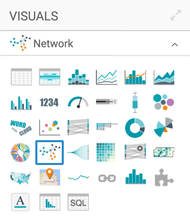
In the visuals menu, find and click Network (row 4, column 2).
-
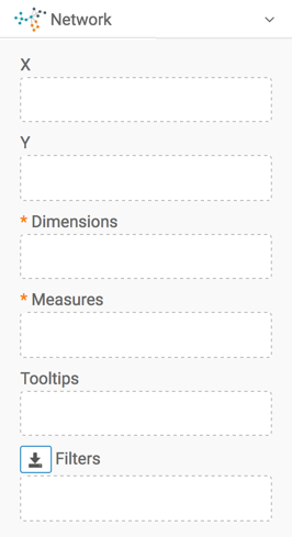
Note that the shelves of the visual changed. They are now X, Y, Dimensions, Measures, Tooltips, and Filters.
The mandatory shelves are:
- Dimensions: specify two dimensions, because there are two nodes for each network connection
- Measures; specify one measurement plotted on the connections between nodes
-
Populate the shelves from the available fields (Dimensions, Measures, and so on) in the Data menu.
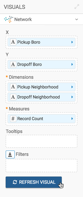
- Under Dimensions, select
Pickup NeighborhoodandDropoff Neighborhood, and add them to the Dimensions shelf. - Under Measures, select
Record Countand add it to the Measures shelf.
- Under Dimensions, select
- [Optional] Trellis the visual:
- Under Dimensions, select
Pickup
            Boro
and , and add it to the X shelf. - Under Dimensions, select
Dropoff Boroand , and add it to the Y shelf.
- Under Dimensions, select
-
Click Refresh Visual.
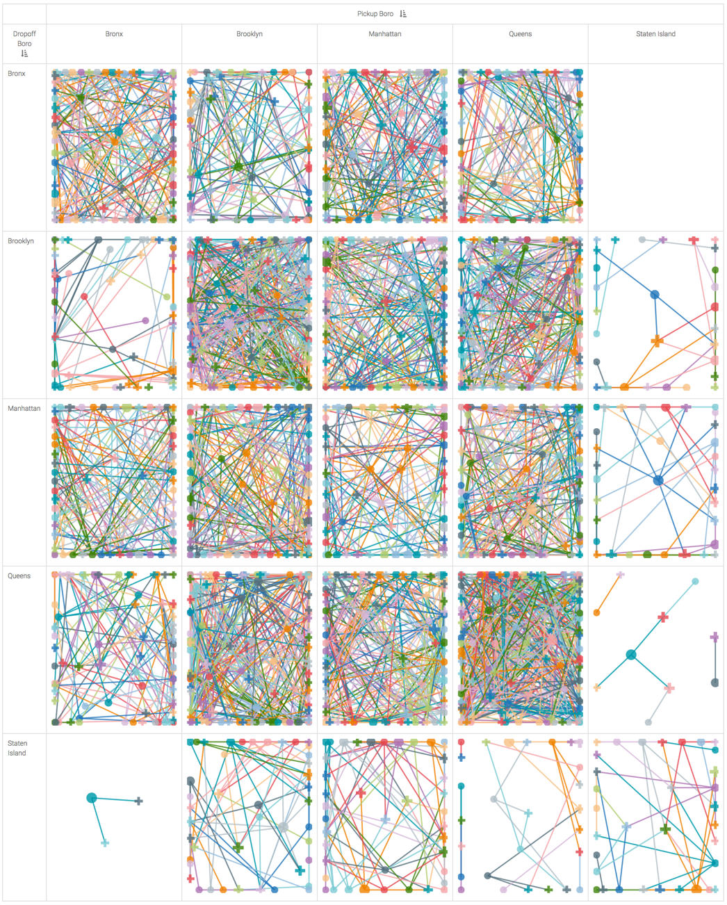
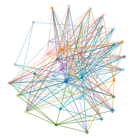
The new network visual appears.
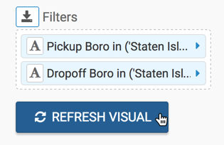
[Optional] To examine only one of the cells in greater detail, add
Pickup BoroandDropoff Boroto the Filters shelf, and set them to a single value.Here, let's examine all rides that originate and end in Staten Island.
Click Refresh Visual.
Examine the network for rides within Staten Island:
-
Change the title to
NYC Taxi - Network.-
Click (pencil icon) next to the title of the visualization to edit it, and enter the new name.
[Optional] Click (pencil icon) below the title of the visualization to add a brief description of the visual.
-
At the top left corner of the Visual Designer, click Save.
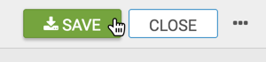
At the top left corner of the Visual Designer, click Close.
To adjust the network display, check all the available settings for this visual.