Adding Size to Scatter Visuals
This dataset, World Life Expectancy, has several other dimensions and measurements that you can use to enrich the scatter visual. Consider how using the Size shelf, which controls the size of the individual bubbles, changes our immediate understanding of the dataset and further informs its analysis.
For this visual, we will start with the existing visual World Population - Scatter, which is developed in Basic Scatter Visual.
Above the left navigation bar, click Clone to create a new visual that has the same properties as the original.
- Under Measures, select
populationand drag it over the Size shelf on the main part of the screen. Drop to add it to the shelf. - On the
sum(population)field, click the (down arrow) icon, select Aggregates, and then select Average. Click Refresh Visual.
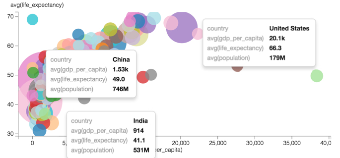
The scatter graph appears, with its own visible population size 'outliers': China, India, and the United States.
-
[Optional] It is important to realize that the relative size of the bubbles is not linearly proportional to their values. At the lower range of population levels, the visual shows the same size marks for countries with very different average populations, such as Tokelau, where
avg(population)=1.23K, Greenland, withavg(population)=34.5K, Luxembourg, withavg(population)=318K, and Kuwait, withavg(population)=751K. This is because by default, the size of marks ranges from 10 to 50 pixels. Divided equally across the range of values, this squeezes too many disparate measurements on the lower end to use the same mark size 'bucket'.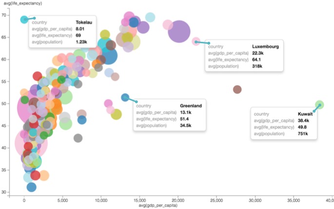
World Population Figures with Mark Size Range of 10 - 50 Pixels It is easy to somewhat alleviate this problem by changing the range of sizes of the bubbles, as described in Changing the Mark Size Range. This graph shows the size range of 1-50.
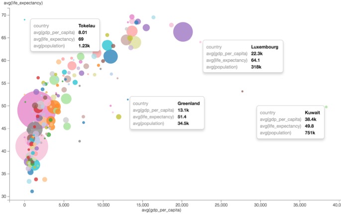
World Population Figures with Mark Size Range of 1 - 50 Pixels Incidentally, and obviously, the increased size range generates a more realistic representation of relative population size.
- Change the title to World Population - Scatter with Size.
At the top left corner of the Visual Designer, click Save.

While we can see the average data for individual countries more clearly, these measurements do not help us see the changes that occurred over the entire time domain of the dataset.
Let's next look at how we can add the concept of time back into the visual by animating the scatter plot, as described in Adding Transition Animation to Scatter Visuals.