Making Line Visuals Interactive with Legends
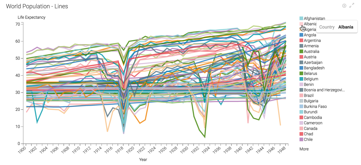
A line chart display can become very crowded, making it difficult to discern which line models a particular series. For example, the World Life Expectancy dataset models data for over 200 countries. Arcadia Enterprise makes it easy to find a particular series by making the chart legend interactive.
The following steps demonstrate how to add a legend that makes a line chart interactive. We are using the line of the World Life Expectancy dataset [data source samples.world_life_expectancy]. To create this chart, follow the instructions in Line Visuals.
- Find the visual World Population - Lines. We are demonstrating it inside a dashboard.
- Make sure that the visual displays the legend. Follow the steps outlined in Changing Legend Style and Removing the Legend to turn it on.
-
Switch to Dashboard View mode.
-
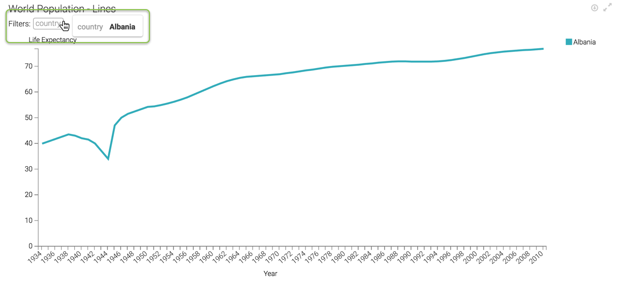
Click on one of the options in the legend for the visual, to see only the data for that country. We chose Albania.
-
Notice that the new chart displays the line for Albania only. Additionally, the horizontal axes adjusts for the dimension range; Albania reports data starting in year 1934.
Arcadia Enterprise lists all applicable filters at the top of the vertical axis. Hovering over them shows the values of the filters.
This graph is also interactive in Edit mode, either as a visual (by itself), or inside a dashboard.