Customizing Visual Colors
The type of color customization available for each visual in Arcadia Enterprise depends on the visual type. To see what options map to specific visual types, see the Visual Settings matrix.
For example,
- Most visuals that support color have the option of changing the color palette, or to reverse the color palette.
- Visuals with optional color, such as cross tabulation, have an option to enable or disable colors.
- Visuals that rely on color as a principle method of conveying information, such as a bar chart, have an option to customize color opacity.
- Most commonly-used visuals support color assignment based on dimension value.
- All visuals that use the Color shelf also support specific color assignment for dimension values.
- Some visuals, such as table, do not support color customization at all.
To get to the options in the Colors menu, follow these steps:
On the right side of Visual Designer, click the Colors menu.
-
In the Colors settings of Arcadia Enterprise, perform any of the following tasks:
- Reverse Color Palette
- Change Color Palette
- Enabling Color
- Changing the Foreground Color
- Changing the Pointer Color
- Changing the Background Color
- Changing Color Opacity
- Changing Projection Opacity
- Changing Background Opacity
- Making Colors Consistent on Dimension Values
- Assigning Color to Dimension Values
- Changing the Colors for KPI Visuals
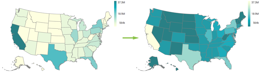
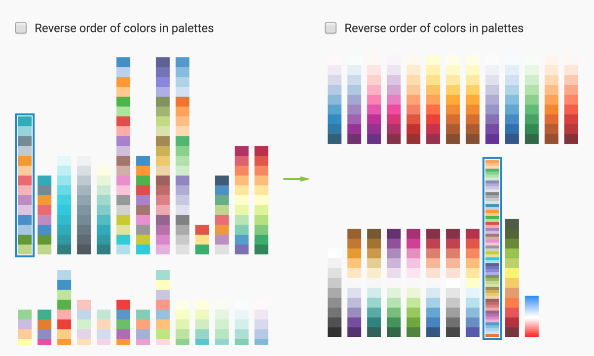
Reverse Color Palette
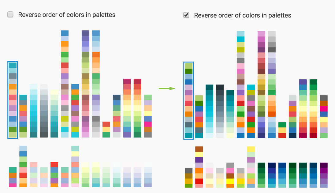
Note that the colors in the visual flip; the legend is a good indicator of this.
The color reverse effect is particularly noticeable on monochromatic and dichromatic color palettes, which typically use a gradient legend.
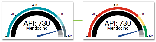
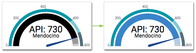
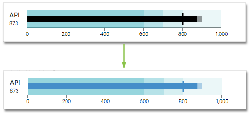
Change Color Palette
Note that the colors in the visual change; the legend is a good indicator of this.
For gauge visuals, this change affects the representation of qualitative ranges.
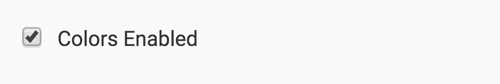
Enabling Color
To enable or disable the color option for your visual, such as cross-tabulation, navigate to the Colors settings, and check Enable Colors catalog.
Compare the 'enabled-color' cross-tabulation visual (default behavior) with the appearance of the 'disabled color' visual.
Changing the Foreground Color
Applies to Gauge and Bullet visuals.
To choose a different color for the value on the Measurement shelf, navigate to the Colors settings, and make changes in the Foreground Color selector. You can select one of the palette colors, or specify a custom color.

Note how the change in foreground color changes the gauge visual; the main measurement that this option affects is on the inner arc.
Note how the change in foreground color changes the bullet visual; the main measurement is the narrow central bar.
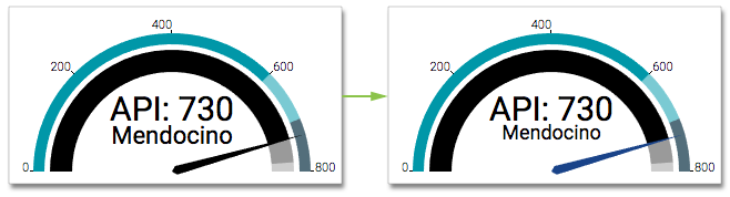
Changing the Pointer Color
Applies to Gauge visuals.
To choose a different color for the pointer on the dial of gauge visuals, navigate to the Colors settings, and make changes in the Pointer Color selector. You can select one of the palette colors, or specify a custom color.
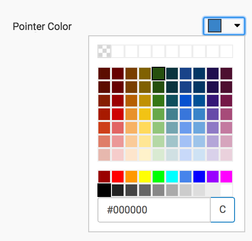
Note how the change in pointer color changes the appearance of the visual.
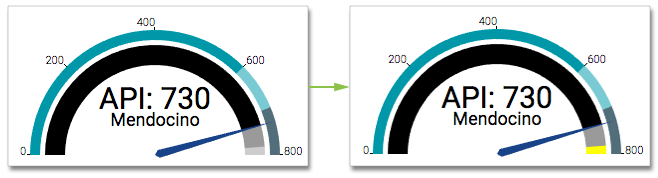
Changing the Background Color
Applies to Gauge and Bullet visuals.
To choose a different color for the background of gauge or bullet visuals, navigate to the Colors settings, and make changes in the Background Color selector. You can select one of the palette colors, or specify a custom color.
Note how the change in background color changes the gauge visual; this option affects the inner arc, at the at the maximum end. It does not change the appearance of qualitative ranges. To do that, change the color palette.
Note how the change in background color changes the bullet visual: in this visual, it controls the appearance of the qualitative ranges.
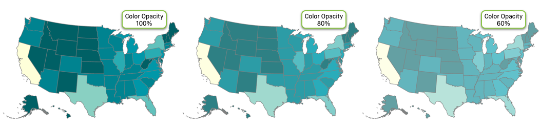
Changing Color Opacity
To choose a different opacity (color saturation) for your visual, navigate to the Colors settings, and make changes to the Color Opacity selector.
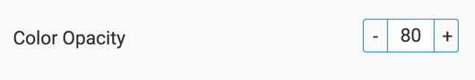
The default value is 80 %. Click the - sign to make the colors more transparent by decreasing color opacity by 10% with each click. To increase color saturation, click the + sign to increase color opacity by 10%. Edit the number in the center of the selector to get a custom value. Valid values range from 1% for the palest through 100% for the brightest colors. A value of 0 generates a visual with full saturation.
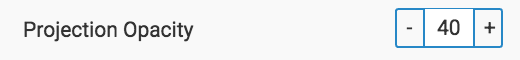
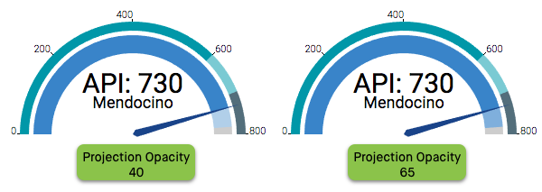
Changing Projection Opacity
Applies to Gauge and Bullet visuals.
To choose a different opacity (color saturation) for the projection indicator of your visual, navigate to the Colors settings, and make changes to the Projection Opacity selector.
For example, examine the differences in the appearance of the projection for the bullet visual
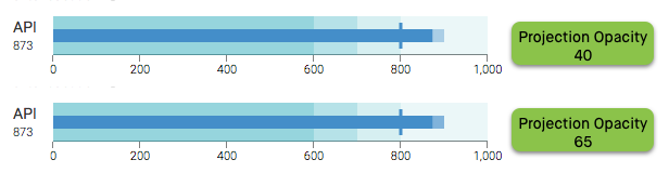
Remember that the projection appears on the inner arc of a gauge visual.
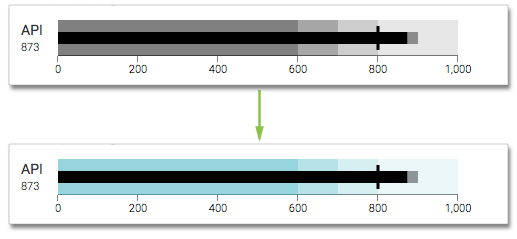
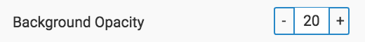
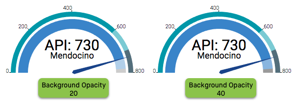
Changing Background Opacity
Applies to Gauge visuals.
To choose a different opacity (color saturation) for the background of the measurement arc in gauge visuals, navigate to the Colors settings, and make changes to the Background Opacity selector. The default value is 20.
For example, examine the differences here in the appearance of the background for the gauge visual. Note also that because the projection color is semi-transparent, a 'stronger' background also changes the appearance of the projection color.
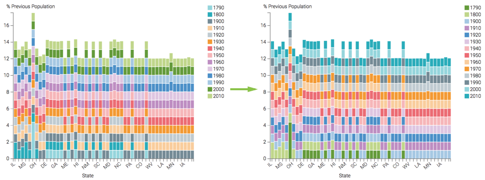
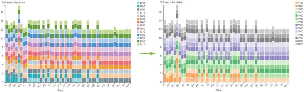
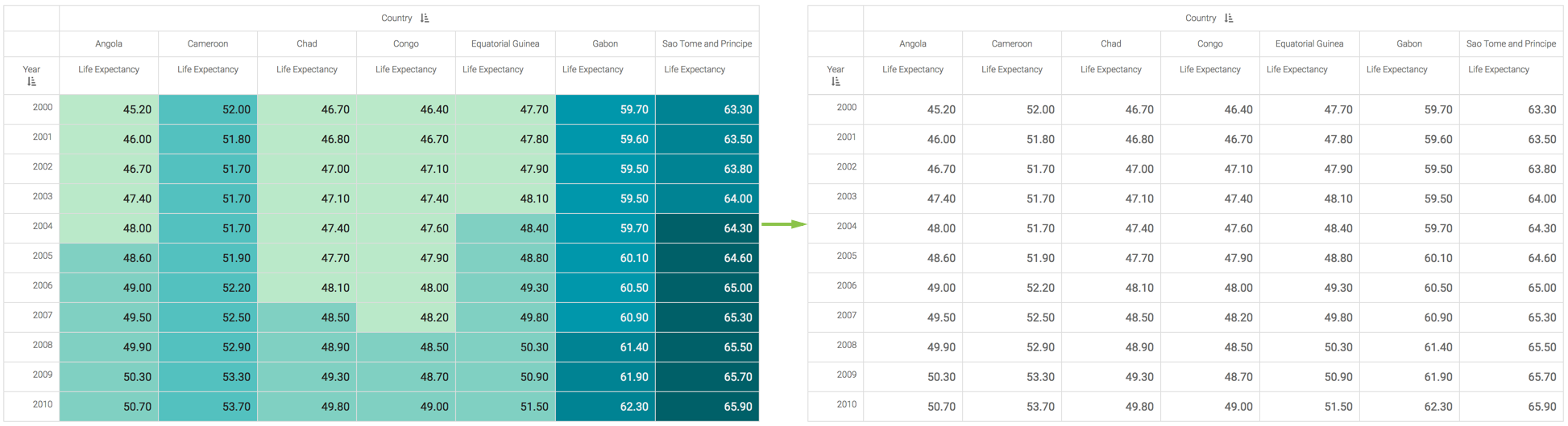
Making Colors Consistent on Dimension Values
This feature applies to Bar visuals, Line visuals, Area visuals, Combined Bar/Line visuals, and Pie visuals.
In apps where several visuals include same dimension values, it is helpful if these values are colored identically. It also removes the need for multiple legends on the same app.
For this feature to work properly, you must ensure that the target visuals use the same color palette.
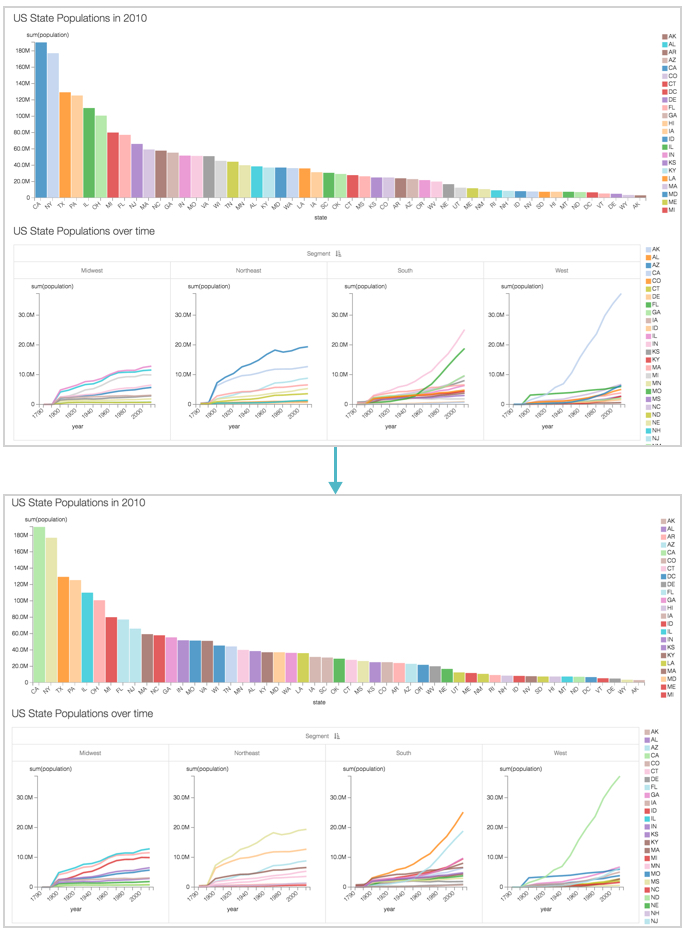
In the following example, we show how to standardize colors for a US State Population app that uses a bar visual and a trellised line visual.
To ensure that the colors are consistent across the visuals when they appear in the same dashboard, navigate to the Colors settings, and select the optionBase colors on dimension values. You must do this for each visual in the dashboard.
Compare the color values for the two visual in the top graph. It can be easily seen that the legends for the visuals don't match. However, they are identical in the bottom dashboard, where we enabled the color consistency feature.
Assigning Color to Dimension Values
This feature applies to all visual types that use the Colors shelf: Bar visuals, Line visuals, Area visuals, Combined Bar/Line visuals, Interactive map visuals, Radial visuals, and Pie visuals.
Mapping colors to a specific dimension's values enables you to choose and modify a meaningful representation of values, such as 'green | red | amber' for 'success | failure | soft-fail'.
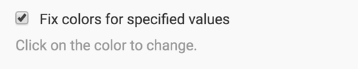
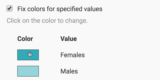
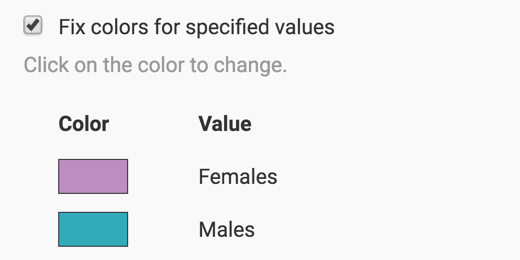
To adjust the colors, navigate to the Colors settings, and select the optionFix colors for specified values.
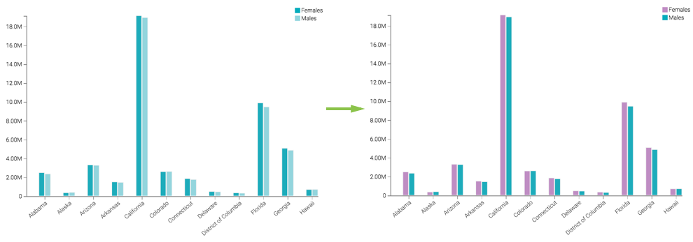
In the colors that appear for each value, make changes. For example, in a grouped bar visual that shows values for Female and Male segments, we can adjust colors in the following manner:
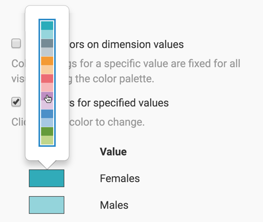
Below the selected option Fix colors for specified values, click on the color you want to change. Let's change the color for Females.
In the expanded palette, select the new color. Here, we are changing the color for Females from dark turquoise to mauve.
- Similarly, change the color for Males from light turquoise to dark turquoise.
This is how the color indicators appear after your make the changes:
After refreshing the visual, notice the change to its appearance:
You can ensure that these colors are used consistently across all visuals within a dashboard by combing this feature with Base colors on dimension values, described in Making Colors Consistent on Dimension Values.
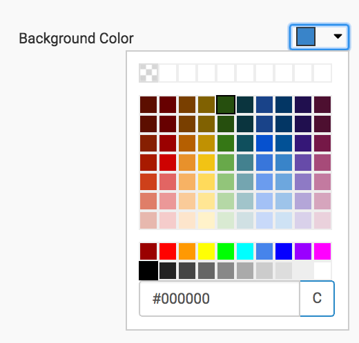
If the color you want to use is not in any of the palettes available to you, you can define it through the Custom Colors interface.