Creating Dashboards
Arcadia Enterprise dashboards consolidate related visualizations. Dashboards contain one or more sheets for organizing visualizations. This gives you the flexibility to place all necessary information about a dataset, a line of inquiry, or a business on the same screen, and still have quick access to related or supplemental visualizations on other sheets. It all depends on the needs and wants of your enterprise.
Dashboards can display and link visuals that are based on different datasets across different connection.
After you create a dashboard, you add visuals and filter controls. You can customize its settings and styles, and add custom styles.
To become familiar with the basics of building dashboards, see the overview of Visual Designer for Dashboards.
The following steps demonstrate how to create a new dashboard in Arcadia Enterprise.
- There are several possible starting points for creating new dashboards:
- Click the New Dashboard button on the main Visuals interface, in the top left corner.
- On the Data interface, click on the (new dashboard) icon next to the name of a particular dataset.
- On the Dataset interface for a particular dataset, click the New Dashboard button in the top right corner.
- In the Visual Designer, by selecting New Dashboard from the supplemental drop-down menu, either in Dashboard/Sheet view, or in the Visual view.
-
The Visual Designer opens on an untitled dashboard. See Visual Builder for Dashboards to familiarize yourself with the interface.
-
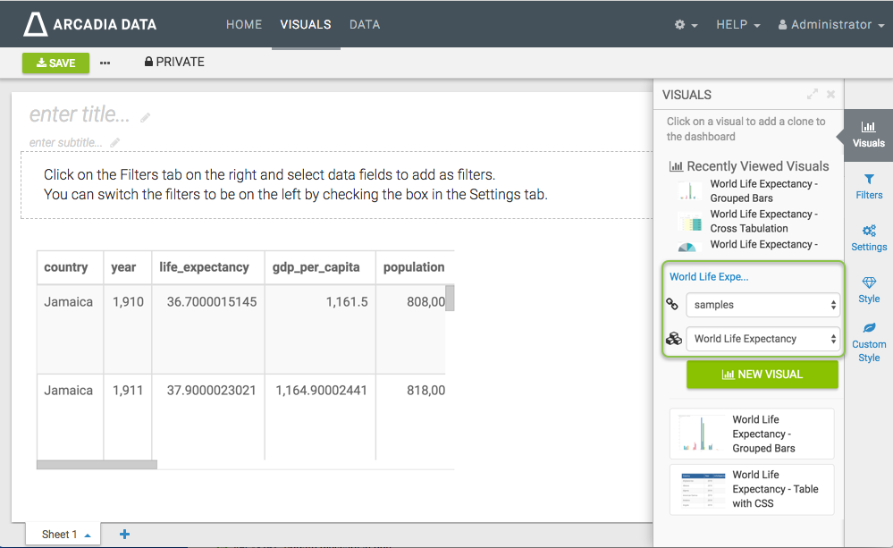
[Optional] Change the Connection and/or Dataset. Even though the dashboard is automatically connected to the parent connection and dataset, you can add visuals and filters based on other connections and datasets.
-
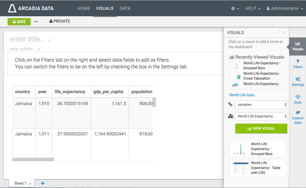
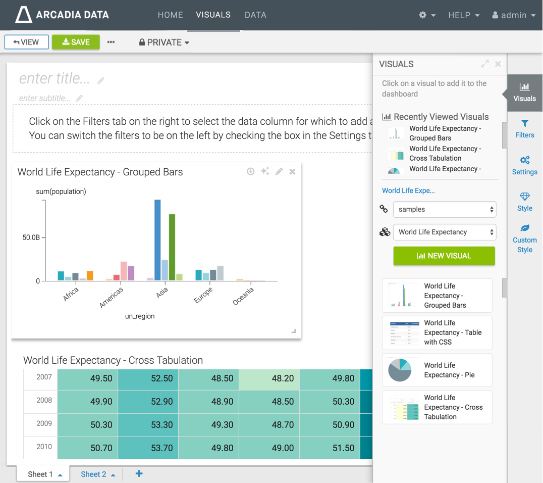
In the Visuals menu, click to add one or more existing visual to the dashboard, either from Recently Viewed Visuals, or from the listed visuals of this dataset. Alternatively, you can create a new visual by clicking the New Visual button. See Creating Visuals.
We used the visuals World Life Expectancy - Grouped Bars and World Life Expectancy - Cross Tabulation.
-
Click the Filters menu, and click on fields to add the filters. Alternatively, you can click the Create a Custom Filter button, for custom selections.
Remember that you can change the dataset and the connection in this menu, also.
Here, we used filters based on the
un_regionandcountrydimensions.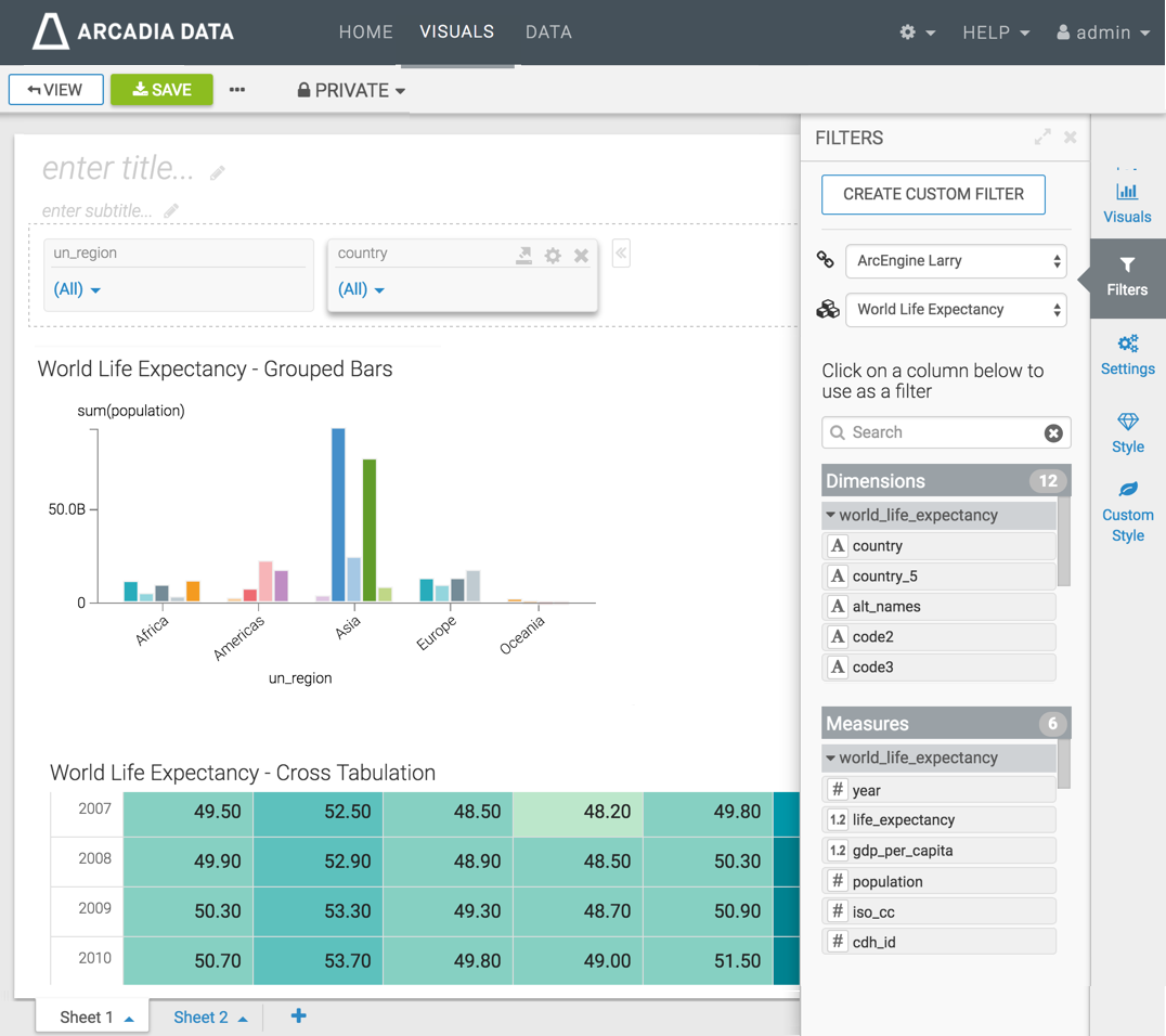
-
Enter the Title for the dashboard, and an optional Subtitle.
We used World Life Expectancy and A new perspective, respectively.

- [Optional] You can also customize Settings, Styles, and Custom Styles for the dashboard.
-
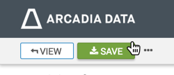
Click Save to save the dashboard.
-
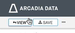
Click View to preview the dashboard at runtime.
- To move the dashboard to a new workspace, click Private in the top menu of the dashboard, and follow the instructions in Moving Dashboards.
-
At the top right corner of the Visuals menu, or any open pane, click the (expand) icon to increase its width. To shrink the size of the pane, click the (compress) icon.