DMA Map, Choropleth
A DMA map shows various measurements plotted relative to Nielsen Designated Market Area Regions.
We are working with the dataset DMA TV Home Viewing, built on the dma-tv-home-viewing.csv. datafile.
-
Start a new visual based on dataset DMA TV Home Viewing.
See Adding Data, Creating Datasets, and Creating Visuals.
-
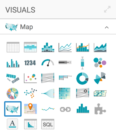
In the visuals menu, find and click Map (row 5, column 1).
-
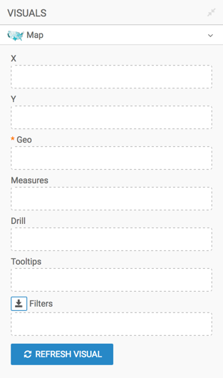
Note that the shelves of the visual changed. They are now X, Y, Geo, Measures, Drill, Tooltips, and Filters.
The only mandatory shelf for map visuals is Geo.
Populate the shelves from the available fields (Dimensions, Measures, and so on) in the Data menu.
- Under Dimensions, select
dmaand drag it over the Geo shelf on the main part of the screen. Drop to add it to the shelf. - Under Measures, select
homesand drag it over the Measures shelf on the main part of the screen. Drop to add it to the shelf.
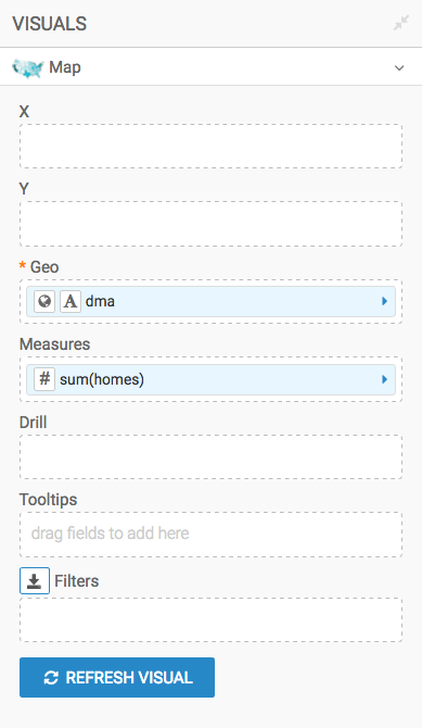
- Under Dimensions, select
- Alias the field
dmaasDMA, andsum(homes)asNumber of Homes. See Alias. - Add the dimension
dma_nameto the Tooltips shelf, and then alias it asDMA Name. - [Optional] Enable panning and zooming option, as described in Customizing Zoom.
- [Optional] Change the color palette, as described in Change Color Palette.
-
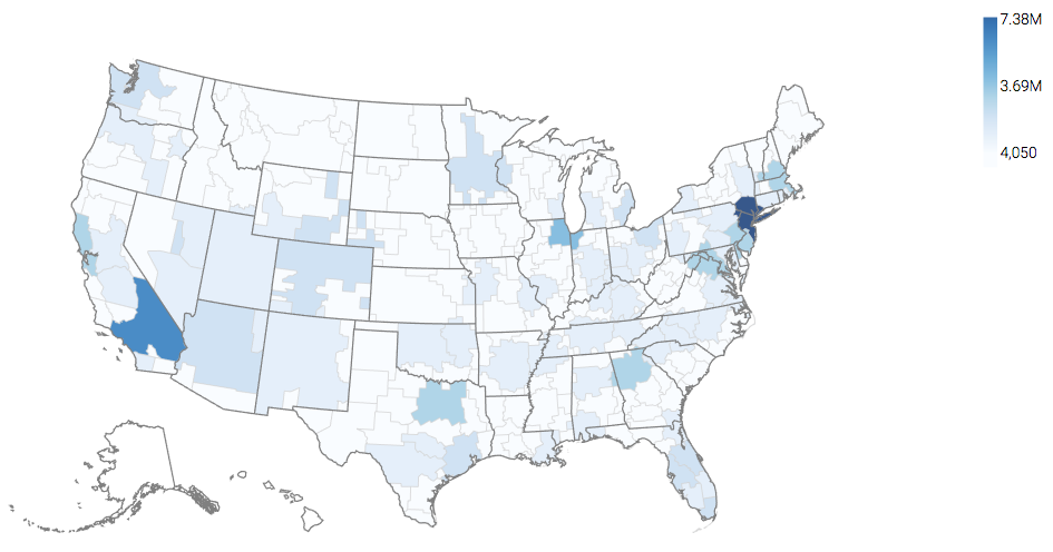
Click Refresh Visual.
The map visual appears. You can move the visual (pan), zoom in and out, and see the details in the Tooltips text.
-
Click (pencil icon) next to the title of the visualization to edit it, and enter the new name.
- Change the title to
US DMA TV Viewing Map. At the top left corner of the Visual Designer, click Save.