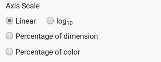
Changing the Axis Scale
To change the scale for a visual, navigate to the Axes menu, and select one of the options below the heading Axis Scale.
- Linear (default)
- log10
- Percentage of dimension
- Percentage of color
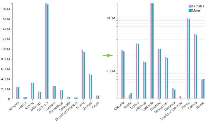
For example, selecting a log10 scale changes the visual by re-calibrating the Y axis, and helps compare the relative values of smaller aggregates, such as for Alaska and Delaware. In the case of Alaska, it clearly shows the relatively lower number of females vs. males in the survey data.
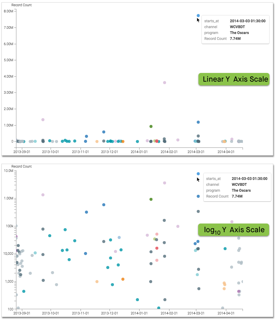
Note that not all options are available on all visual types that support changing axis scale. For example, the Scatter visual has both X Axis Scale and Y Axis Scale options, but only for Linear and log10.
In this example, The Oscars viewing audience is more than twice the size of the next 'runner-up'. This squeezes the plot towards the origin, and makes it very difficult to understand the data. Switching from Linear to log10 axis scale enables us to see the lower-performing categories better.