Labelled Bars
To improve the comparison of relative measures on bar visuals, use the Labels shelf to display the measurement value.
Tip. This demonstration uses the visual previously created in Stacked Bars. Clone it, and make the changes to the duplicate
visual.
To add labels to bar charts, follow these steps.
- Click inside the Labels shelf.
-
In the Data menu, select the field for the label.
We are using the
populationfield. [Optional] Set the Filter shelf to hold the following fields:
year in (2010)un_subregion in ('Eastern Europe')
- [Optional] Increase the width of the bars, as described in Bar Size Range.
- Your shelf setup should look something like the following:
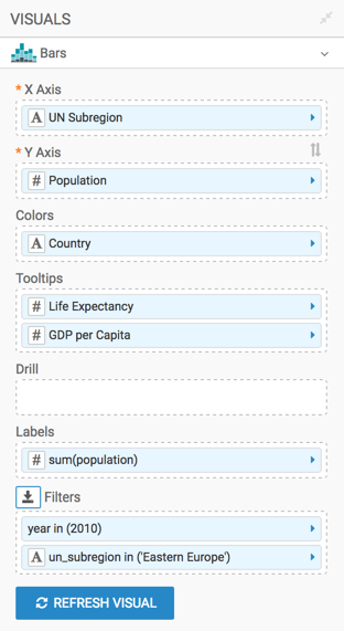
- Click Refresh Visual.
-
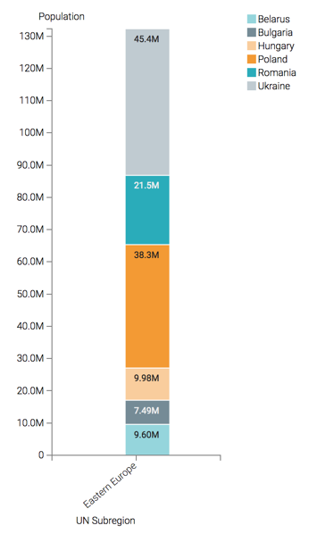
Note how the visual changed. You can see the relative size of total populations for the UN Subregion on one bar, and read off the value.
- Rename the visual.
At the top left corner of the Visual Designer, click Save.