Enabling a Continuous X Axis
You can customize a scattervisual according to your data type. To look at trends and the rate of change, use a continuous axis, that shows data at equal intervals.
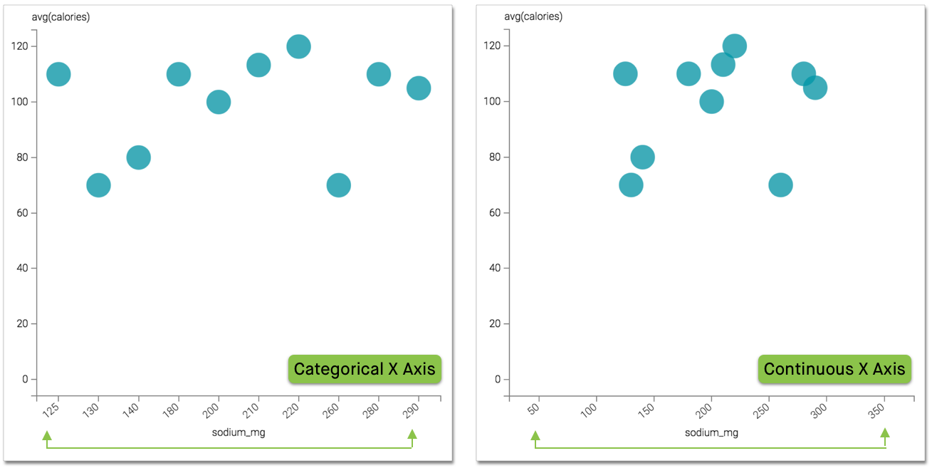
Compare the continuous axis to a categorical axis that only plots values in the dataset.
- Available only on Scatter visuals.
- Available only on numeric and non-aggregate fields.
To use regular intervals on the X axis, navigate to the Axes menu, and select the Make X axis continuous option.

This option is on by default.
The image on the left shows a categorical X axis with each label representing a value in the
dataset, from 125 to 290 in irregular intervals. Image on
the right shows a continuous X axis where labels are auto-generated to use equal intervals,
from 50 to 350. Notice how enabling this feature gives a
clearer visual representation of where the sodium levels fall within a range of values.