Plotting Routes on Interactive Maps
With Arcadia Enterprise, you can plot routes over a map by specifying distinct IDs on the Color shelf, a time series on the Tooltips shelf, and enabling routes as described in Enabling Routes.
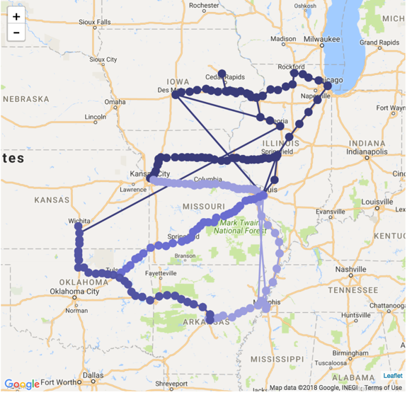
The following steps demonstrate how to plot routes on an interactive map. We are using truck movement data.
- Select the appropriate dataset, and create a new dashboard; in the dashboard, open the default visual and change the visual type to Interactive Map.
-
Enable the Routes, as described in Enabling Routes: click the Settings menu, select Routes/Pins and then select the Enable Routes option.
- [Optional] Disable heatmap and cluster. We recommend that you leave the circles in place, so it shows the individual elements of the route. If you choose to hide the circles, the graph only shows the route connectors.
-
Populate the shelves from the available fields (Dimensions, Measures, and so on) in the Data menu.
-
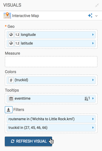
Geo Shelf
Under Measures, select
latitudeandlongitude, and add them to the Geo shelf.If your longitude and latitude measurements are not automatically recognized (appear with a (globe) icon on the Geo shelf), cast them to the appropriate Geo Type. Click the filed on the shelf; in the Field Properties menu, select Change Type, and then select Latitude or Longitude, as appropriate. See Change Type and Geo Data type.
-
Colors Shelf
Under Measures, select
truckid, and place it on the Colors shelf.You may need to remove the aggregation from the field on the shelf.
- Tooltips Shelf
Under Dimensions, find the
eventtimefield, and add it to the shelf.Click on the field on the shelf, and in the Field Properties menu, click Order and Top K.
Choose the Ascending order.
- Filters Shelf
[Optional] To restrict the number of routes, you can choose the filter on the
routenamefield. To restrict the number of trucks displayed, you may choose to restrict ontruckidfield, and so on. - Measure shelf
[Optional] You can display a measure in addition to the ...
-
Geo Shelf
[Optional] Change the color palette to ensure that the routes stand out sufficiently over the regular features of the map.
Click Colors, and select an appropriate palette.
-
Click Refresh Visual.
-
The visual appears.
- Change the title of the visual, and Save it.