US State Map, Choropleth
Arcadia Data lets you plot measurements, as areas, over US State regions.
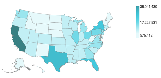
A map of the United States shows a comparison of measurement values among US States.
The following steps demonstrate how to create a new map visual on the dataset US
County Population [data source samples.us_counties]. It produces
colored regions for the measurements that correspond to the state field.
- Start a new visual based on dataset
US
        County Population
[data sourcesamples.us_counties]; see Creating Visuals. -
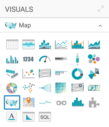
In the visuals menu, find and click Map (row 5, column 1).
-
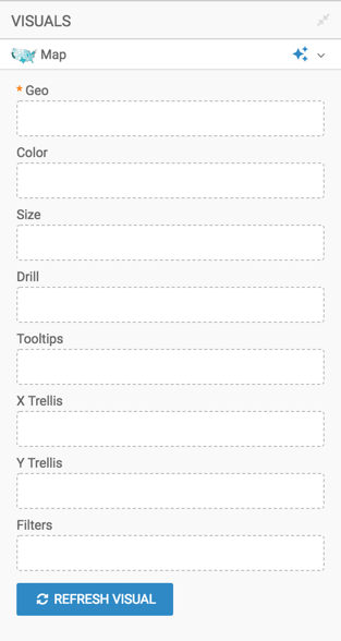
Note that the shelves of the visual changed. They are now Geo, Color, Size, Drill, Tooltips, X Trellis, Y Trellis, and Filters.
The only mandatory shelf for map visuals is Geo.
-
Populate the shelves from the available fields (Dimensions, Measures, and so on) in the Data menu.
-
Under Dimensions, select
stnameand add it to the Geo shelf.Click on the field to open the Field Properties menu, expand the Change Type option, and select the Geo Type State.
-
Under Measures, select
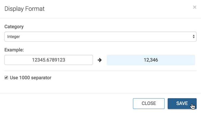
tot_popand drag it over the Colors shelf.Click the field to open the Field Properties menu, select Display Format,Category Integer, and select the thousands separator option. Click Save.
-
-
[Optional] Alias the field
stnameasState, andsum(tot_pop)asPopulation; see Alias. - [Optional] Enable panning and zooming option, as described in Customizing Zoom.
- [Optional] Change the color palette, as described in Change Color Palette.
-
Click Refresh Visual.
The map visual appears.
-
Click (pencil icon) next to the title of the visualization to edit it, and enter the new name.
- Change the title to
US State Population - Choropleth Map. At the top left corner of the Visual Designer, click Save.