Filter All Data Discovery
You can discover your data, by filtering all visuals in the dashboard, based on the selected element of the source visual.
The Filter All data discovery mode lets you to define a visual in the dashboard as a 'source', so clicking on a specific element of the source controls the appearance of other visuals in the same dashboard. The source sends filter parameters to the target visuals, which they use to define the output. Keep in mind that any visual can be both a source and a target when passing filter parameters.
To discover data in View mode, you must first enable the context menu, as described in Displaying Context Menus Within Visuals.
The following conditions apply to Filter All functionality:
- This method of data discovery works across visuals in a single dashboard.
-
Scope matters:
- By default, the source visual sends parameters with Explicit Scope. To change this, select the Dataset Scope. See Sending Parameters with Dataset Scope.
-
By default, the target visuals receive parameters with Dataset Scope. To change this select the Explicit Scope. See Using Parameters with Explicit Scope.
When the target visual receives filter parameters with Explicit Scope, it must have the corresponding dataset fields on the Filters shelf.
-
Depending on your use case, you may have to de-select the sending of aggregates as parameters. See Sending Aggregates as Parameters.
Preparing Target Visuals
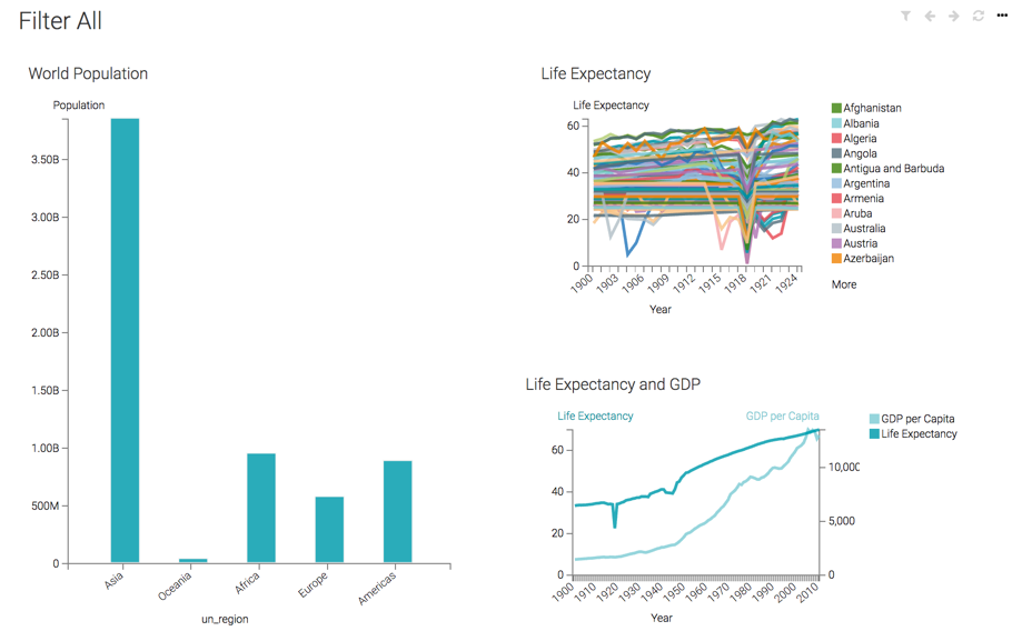
Here, we are using the following two visuals:
A line visual Life Expectancy that has the following settings:
- X Axis shelf:
year, sorted in chronological order. - Y Axis shelf:
life_expectancy, asavg(life_expectancy). - Colors shelf:
country. - Under Settings, select the Parameters menu, and make sure that the, Receive parameters with explicit scope option is not enabled.
Another line visual Life Expectancy and GDP that has the following settings:
- X Axis shelf:
year, sorted in chronological order. - Y Axis shelf:
life_expectancy, asavg(life_expectancy). - Colors shelf:
gdp_per_capita, asavg(gdp_per_capita); select the field on the shelf to view the Field Properties menu, expand Axis, and select Secondary Axis. - Under Settings, select the Parameters menu, and make sure that the, Receive parameters with explicit scope option is not enabled.
Preparing the Source Visual
For the source (controlling) visual, we are using a bar visual World Population, with the following configuration:
- X Axis shelf:
un_region. You can also choose to use a dimensional hierarchy that represents the [un_region|un_subregion|country] tuple. - YAxis shelf:
population, assum(population); alias it asPopulation. - Filters shelf:
year, set to 2010 - Under Settings, select the Parameters menu, and enable the Send parameters with dataset scope option. Do not select other options in this menu.
.
Preparing and Using the Dashboard
-
Create a new dashboard, and add the three visuals to it. We re-sized the source visual so it occupies the left side of the dashboard, while the target visuals share the right side of the dashboard.
- Switch to View mode.
-
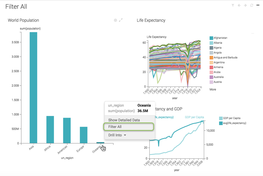
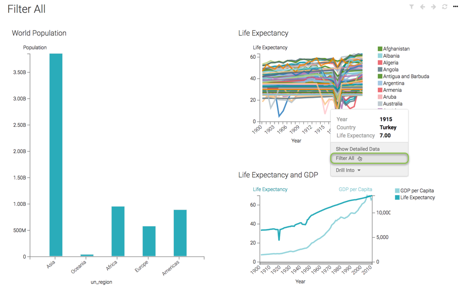
Click on one of the bars of the source visual (we used Oceania), and select the Filter All option.
-
Arcadia Enterprise refreshes the dashboard to show the target visuals that contain information about the selected
un_regiononly. You can see the value of the filters on each visual when you hover the pointer over them, or the value of the dashboard parameters when you hover over the (filter) icon.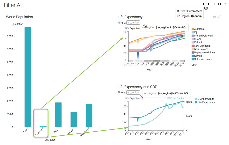
-
Note that any visual can be both a source and a target when passing filter parameters.
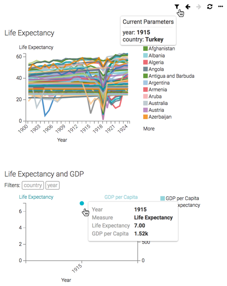
To examine data outliers in one of the 'target' visuals, click on that element. In this example, we can check for more details in the Life Expectancy visual by investigating the drop reported for Turkey in 1915.
Click on that part of the line chart, and select Filter All.
-
Arcadia Enterprise refreshes the dashboard to show the effect on the other visuals. For example, the Life Expectancy and GDP shows that the GDP per Capita in Turkey for 1915 was 1.52k.