Hierarchical Cross Tabulation Visuals
Arcadia Enterprise has an alternate solution for hierarchical dimension representation in cross tabulation visuals.
The following steps demonstrate how to create and configure a de facto dimensional
hierarchy on the shelves of a cross tabulation visual. We are using dataset World Life
Expectancy [data source samples.world_life_expectancy], to build a
cross tabulation table that can switch between representations at three different levels of
data granularity.
-
Start a new cross tabulation visual on the World Life Expectancy dataset.
See Cross Tabulation.
-
Populate the shelves from the available Fields under Dimensions and Measures in the Data menu.
- Under Dimensions, select
un_regionand drag it over the Row shelf. Repeat withun_subregionandcountry, adding them underun_region. Note that your placement of these fields is from the smallest to the greatest , top to bottom. - Under Measures, select
populationand drag it over Measures shelf. Ensure that the default aggregation issum(population).
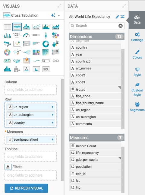
Building a Cross Tabulation with Three Related Dimensions - Under Dimensions, select
-
On the Row shelf, on the
un_regionfield, click the (down arrow) icon, and select Enable Expansion.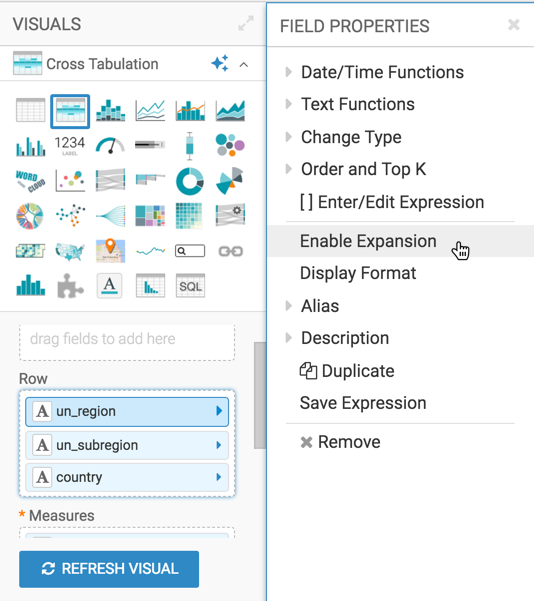
Enabling Expansion on the Primary Hierarchical Dimension -
Similarly, on the Row shelf, on the
un_subregionand thecountryfield, click the (down arrow) icon, and select Enable Expansion. -
Click Refresh Visual.
The cross tabulation table appears with a icon in the
un_region,un_subregion, andcountrycolumns. This indicates that you can expand the data in these columns.The sum(population) column shows the combined population for all
un_regions.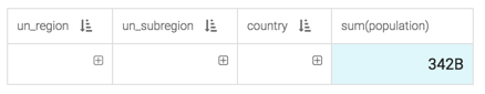
Cross Tabulation with Collapsed Hierarchy -
To see more detail, expand the
un_regioncolumn of the visual by clicking the (plus) icon under the column header.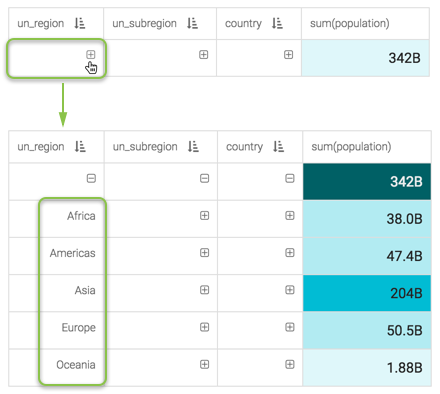
Expanded Primary Hierarchical Dimension -
Similarly, expand the
un_subregioncolumn of the visual by clicking the (plus) icon in the field next to one of theun_region. We chose to expand Africa.When you expand Africa, it generates a complete tabulation aggregated by
un_subregion.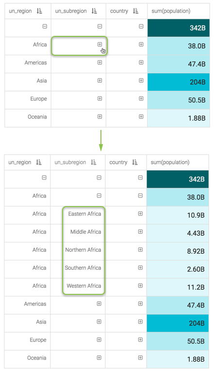
Expanded Secondary Hierarchical Dimension -
Finally, expand the
countrycolumn of the visual by clicking the (plus) icon in the field next to one of theun_subregions. We chose to expand Middle Africa.When you expand Middle Africa, it generates a complete tabulation aggregated by
country.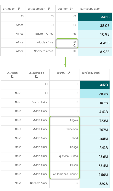
Expanded Tertiary Hierarchical Dimension -
Change the title to
Hierarchical Cross Tabulation of Population. At the top left corner of the Visual Designer, click Save.