Flow Visuals
Flow visuals enable us to explore user behavior across a sequence of discrete time-stamped events, towards a defined goal. They only plot data that achieves this goal.
Flows are an implementation of a Sankey plot: blocks represent individual events, and the width of the connection is proportional to the size of the measurement connecting any two events. The plot is defined by a path, or sequence, through time-stamped events. To learn how to identify and define events of a dataset, see Events.
For contrast, see Funnel Chart.
- Flow visuals are available in Arcadia Enterprise, not in Arcadia Instant.
For convenience, we divided this discussion into the following sections:
- Best Practices
- Basic Flow Visual
- Modeling the Min/Max Range of Events
- Modeling the Goal Event
- Reorganizing the Flow Visual
- Using Tooltips in Flow Visuals
- Comprehensive Workflow Model
Best Practices
Keep in mind the following best-practices when defining the path of a flow visual:
- Use a single common event as a 'start' of the flow visual. This makes it easier to understand the sequencing and the pattern of the following events.
- Define the intermediate event to include more than one event type, and use range bounds (minimum and maximum) to correctly model the business use case. Also, ensure that the intermediate event excludes the end goal.
- Define the goal event to show the flow terminating when that goal is achieved.
Basic Flow Visual
The following steps demonstrate how to create a new flow visual on a dataset Campaign. This dataset is based on data previously imported into Arcadia from the datafile campaign.csv. For an overview of shelves that specify this visual, see Shelves for Flow Visuals.
- Start a new visual based on dataset Campaign; see Creating Visuals.
-
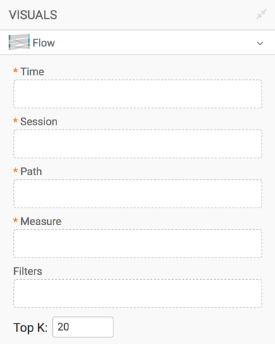
In the visuals menu, find and click Flow.
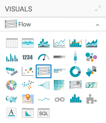
- Note that the shelves of the visual changed. These are:
- Time sorts events by the value of the timestamp.
- Session uses the unique identifier, such as user ID, to track the events of a session.
- Path specifies the series and order of the events; in this article, we use events that were previously defined in Events of the Campaign Dataset.
- Measure aggregates the measure that controls for the thickness of the 'flow' connections, such as Record Count.
- Filters selects for particular conditions.
- Top K selects the top N number of entries.
All shelves, except Filters and Top K, are mandatory.
-
Populate the shelves from the available Fields:
- Under Dimensions, select
timestampand place it on the Time shelf. - Under Dimensions, select
user_idand place it on the Session shelf. - Under Events, select
Startand place it on the Path shelf. Similarly, addAll non-purchase application eventsandPurchase, in that order. - Under Measures, select
Record Countand place it on the Measure shelf. - Leave Filters and Top K empty.
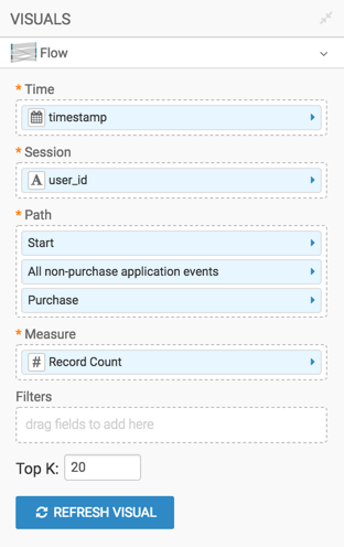
- Under Dimensions, select
-
Click Refresh Visual.
-
The flow visual appears.
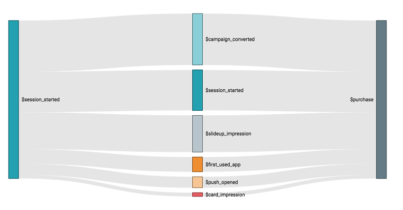
Flow Visual -
Click (pencil icon) next to the title of the visualization to edit it, and enter the new name.
- Change the title to
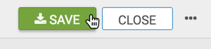
Campaign - Flow. At the top left corner of the Visual Designer, click Save.
Modeling the Min/Max Range of Events
Note that on the visual we just constructed, each connection has only two segments. This
does not model the real business case, so let us refine the visual. To model more of the
path that satisfies the event conditions, we need to modify the intermediate event,
All non-purchase application events, on the Path
shelf. Note that setting a higher maximum models more of the data.
On the Path shelf, click the
All non-purchase application eventsfield.In the Event Properties menu, set Min Rage parameter to 0.
-
Similarly, set the Max Range parameter to 5.
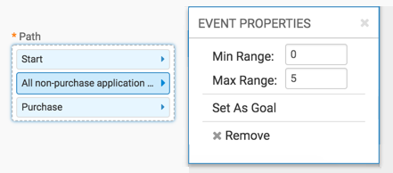
Set Minimum and Maximum Range for Intermediate Events -
Click Refresh Visual.
-
The flow visual appears, showing multiple paths towards a
Purchaseoutcome. Note that in this form, the numbered steps include thePurchaseevent along the way, and eachPurchaseblock terminates the flow of connections that flow to it, in a step-down manner.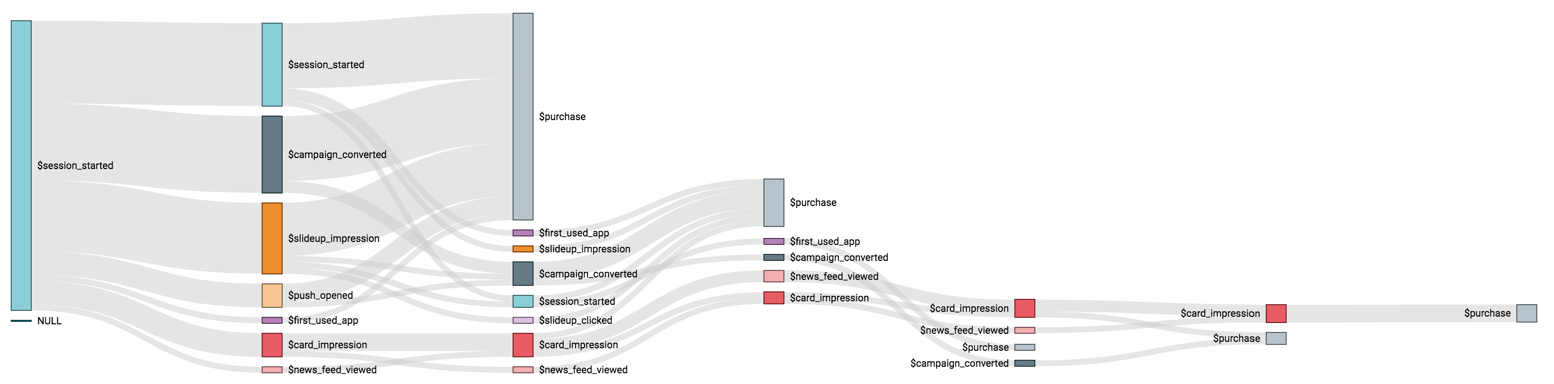
Flow Visual, Intermediate Events Range 0-5
Modeling the Goal Event
Notice also that we can specify the Goal of the flow visual, to generate a plot with a single terminating goal block. To do that, perform the following steps:
- On the Path shelf, click the
Purchasefield. - In the Event Properties menu, click Set as
Goal.
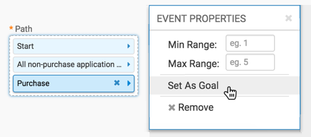
Set the Goal Event -
Click Refresh Visual.
-
The flow visual appears, showing multiple paths towards the
Purchaseevent.Note that in this form, the numbered steps exclude the
Purchaseevent, which collects all flows on the extreme right, and then terminates them.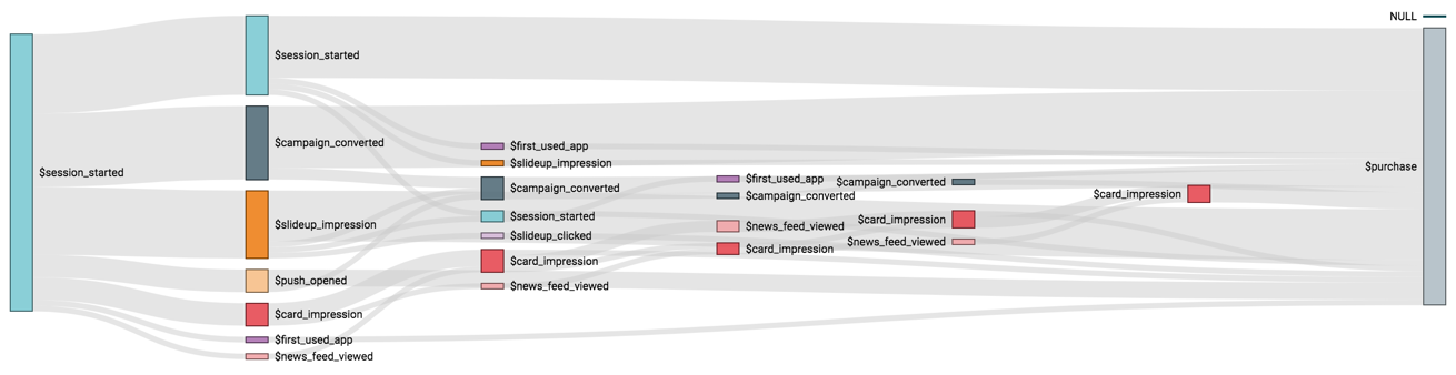
Flow Visual, Goal Set -
To remove the Goal option from an event, click the
Purchasefield on the Path shelf, and de-select the Set as Goal option.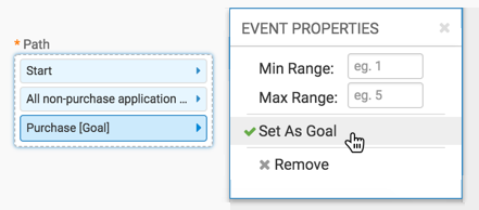
Remove the Goal Event
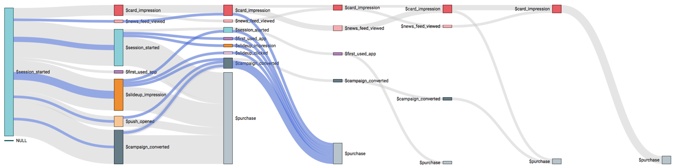
Reorganizing the Flow Visual
You may wish to examine a particular business case scenario, such as how card impressions influence the final decision to purchase. To see this path, simply click on a flow leading to the first card impression, and the flow highlights the entire path.
If the path is complicated, you can change the order of the nodes in any step of the flow visual, simply by clicking on that node and dragging it up or down.
In Figure Changing the Node Order, with Goal, we demonstrate how you could re-arrange the flow visual, step-by-step, to highlight a specific path you wish to examine.
In Figure Changing the Node Order, Without Goal, we removed the goal, and arranged the nodes to place all card impressions at the top, and all purchases at the bottom of each step.
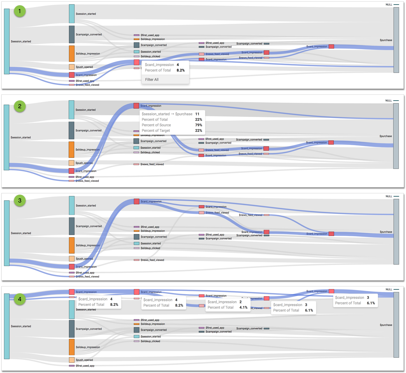
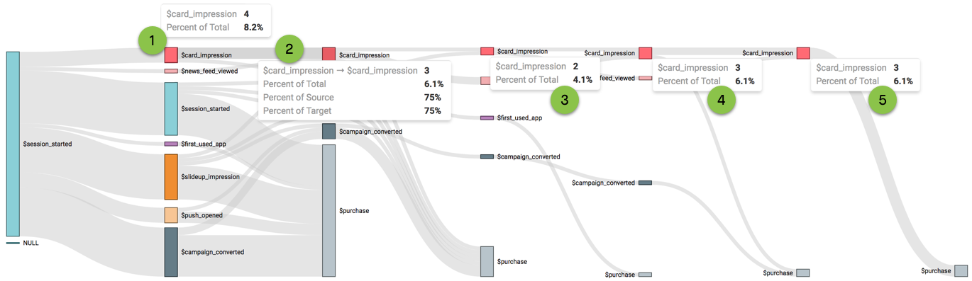
Using Tooltips in Flow Visuals
The flow visual is very good at demonstrating a sequence of events, and the proportion of events that pass through a particular node. However, because it does not use an axis, there is no relative scale that conveys the actual size of measurements on the chart. Thus, tooltips become a very important component of the flow visual.
Consider the Tooltips in the following chart.
- Tooltip 1 shows the information for the first card impression event: that there are exactly 4 items and that it represents 8.2% of the total.
- Tooltip 2 demonstrates the correlation between the first two card impression events: that it represents half of the source and all of the target, as well as all of the link.
- Tooltip 3, Tooltip 4, and Tooltip 5 are very interesting because they demonstrate that when the user starts their application interaction with card impression events, it typically takes 4 or 5 additional steps to get to a purchase event.
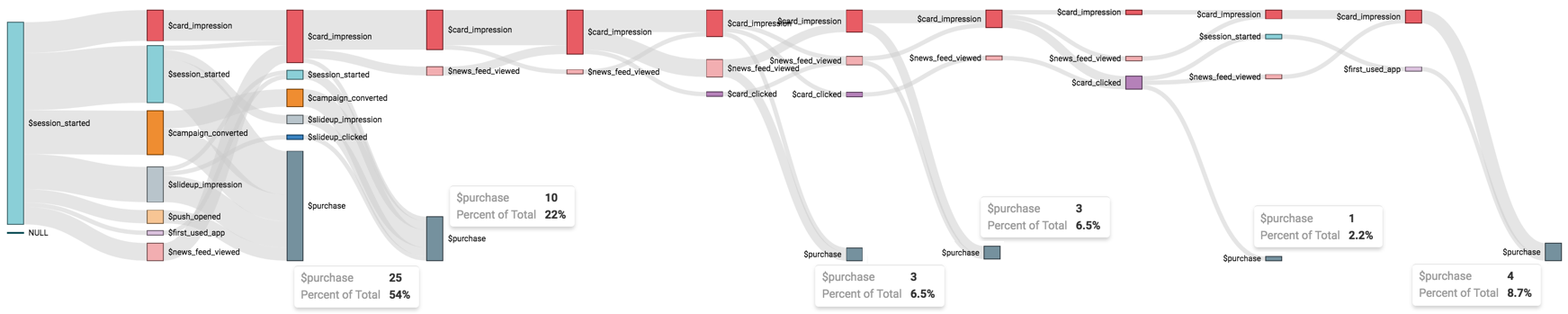
Comprehensive Workflow Model
Lastly, remember that flow visuals only show data that achieves the desired goal, in the specified number of steps. The following image shows only 5 intermediate steps (specified as maximum), and contain 48 purchases altogether.
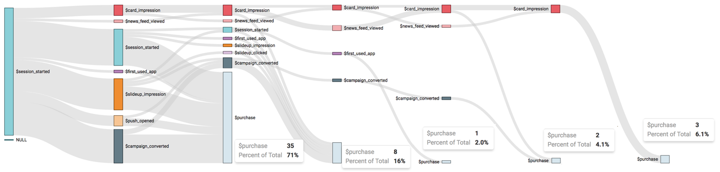
Contrast this with a visual that covers 10 intermediate steps (specified as maximum); it contains 51 purchases.