Using Alphabetic Values on Color Shelf of Interactive Maps
Arcadia Enterprise interactive map visuals support both numeric and non-numeric values on the Color shelf. As a result, aspects of named categories can be viewed simultaneously on the same visual as a distinct series.
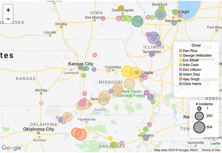
We are using truck movement data demonstrate how to plot incident counts for several drivers, and differentiate them by the color.
- Select the appropriate dataset, and create a new dashboard; in the dashboard, open the default visual and change the visual type to Interactive Map.
-
Enable the Circles, as described in Displaying Circles: click the Settings menu, select Circles, and then select the Enable Circles option.
- Similarly, enable both the area and color legends of the Circles option by selecting the Add Circle Area Legend and Add Circle Color Legend options.
- [Optional] Disable all the other layers: heatmap, cluster, marker, and route.
-
Populate the shelves from the available fields (Dimensions, Measures, and so on) in the Data menu.
-
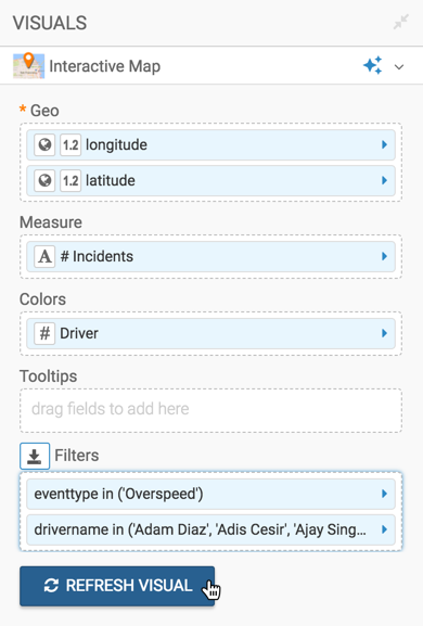
Geo Shelf
Under Measures, select
latitudeandlongitude, and add them to the Geo shelf.If your longitude and latitude measurements are not automatically recognized (appear with a (globe) icon on the Geo shelf), cast them to the appropriate Geo Type. Click the filed on the shelf; in the Field Properties menu, select Change Type, and then select Latitude or Longitude, as appropriate. See Change Type and Geo Data type.
- Measures Shelf
Under Measures, select
eventtypeand place it on the measures shelf.Change the aggregation function to
count(), and Alias the field as # Incidents. -
Colors Shelf
Under Measures, select
drivername, and place it on the Colors shelf.You may need to remove the default field aggregation from the field on the shelf.
Alias the field as Driver.
- Filters Shelf
Add the field
eventtypeto this shelf, and select the single value 'Overspeed'.Add the field
drivernameto the filters shelf, and select a small number of drivers to see details.
-
Geo Shelf
[Optional] Change the color palette to ensure that the routes stand out sufficiently over the regular features of the map.
Click Colors, and select an appropriate palette.
-
Click Refresh Visual.
-
The visual appears. Note that the colors are defined by the names of the drivers, which are non-numeric.
- Change the title of the visual, and Save it.