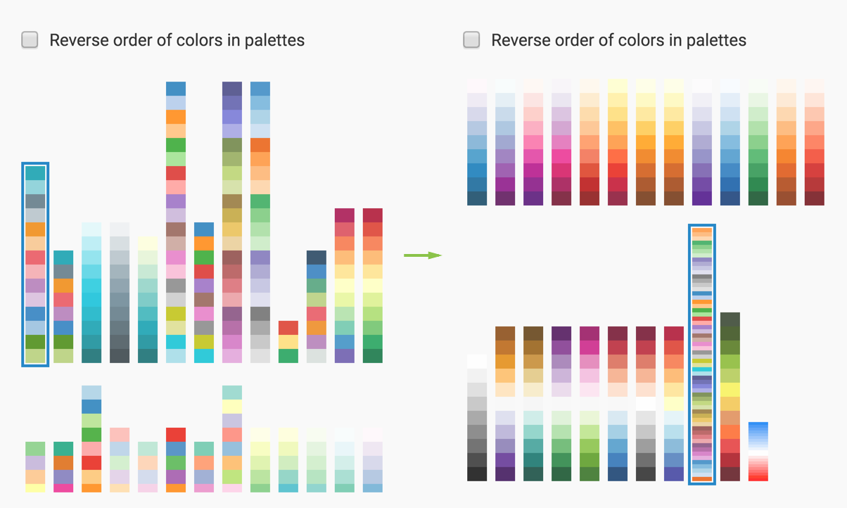
To choose a different color palette for your visualization, navigate to the
Colors settings, and
click on a different color palette in the Colors catalog.
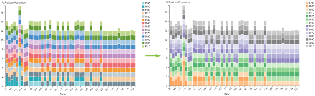
Note that the colors in the visual change; the legend is a good indicator of this.
Changing color palette in bars visual, with legend
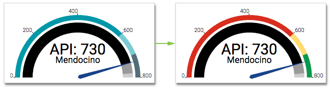
For gauge visuals, this change affects the representation of qualitative ranges.
Changing color palette in gauge visual
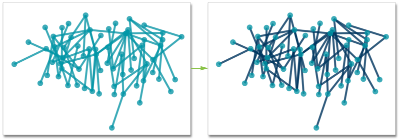
In network visuals, you can specify two separate palettes: one for the nodes, and one for the links:
Changing color palette for links in network visual